Search This Lamp

 
Comments Policy
 

1. Be courteous.
2. Don't make it personal.
3. Keep it Clean.
4. Don't be a troll.

See more about the comments policy here.  

Note to Spammers: All comments on this blog are moderated. This means that when you post comments linking to your imitation designer handbags, you are wasting your time because I will not approve them. Moreover, I will report you, and your IP address will be banned from all Squarespace sites.

Recent Comments 


Powered by Squarespace

Entries in Apple (15)

Wednesday
May132015

Apple Watch: One Day In

My Apple Watch arrived yesterday (42mm space gray Sport). There are plenty of reviews out there, repeating much of the same information. I'm not going to offer another one of those, but I will offer you a bulleted list of thoughts and reflections after wearing it (except when sleeping and showering--although, evidently, the latter is okay) for almost a full day.

If you do want to read a "good" review of the Apple Watch, I recommend Walt Mossberg's post at Re/code, "A Month With the Apple Watch: Does It Pass the Test of Time?" because he's actually been using it every day for an entire month, which is something very few reviewers can claim. And I also recommend all the Apple Watch coverage at iMore. There you will find not only reviews, but also "how to" articles written by people who are enthusiastically using the Apple Watch in a variety of contexts.

One friend asked if I was going to do an unboxing video. I was not interested in doing that because there are undoubtedly thousands of those out there, and I didn't know what I could possibly add. I did take a few photos while unboxing the Apple Watch, mainly for myself and interested family members, but if you are interested, too, you can find those photos here.

Here are my thoughts and reflections, one day in:

  • My order was in within 10 minutes after midnight PST on April 10, but it did not make the April 24 ship date. Evidently, the 42mm space gray Sport was the most popular Apple Watch ordered--the "nerd gear of choice," as some have suggested. Mine was promised to be delivered between May 13 and 27; it actually arrived on May 12.

  • UPS tracking stated that the Apple Watch would arrive between 2:30 and 6:30 PM. It arrived at 11 AM. Since it required a signature, I did not have to sit at the house all day, but what if I had been aiming to come back at 2:30?

  • Evidently, I had not watched any unboxing videos because I didn't realize what kind of packaging the Apple Watch would arrive in. I don't know about the stainless steel or gold Apple Watches, but the aluminum Sport comes in a 3 lb. box that is 15" long (see my photos). I had already noticed on UPS tracking how heavy the package was--2.2 lbs stated there. And this was for a watch? Gold is heavier than the aluminum; did they send the wrong one? Did they send me multiple watches by mistake? The box is as long as it is because the watch is laid out flat rather than wrapped in a circle like watches I've purchased in the past. Granted, the package also carried the charger, but it's actually the packaging itself that is so heavy. I kept the box, and as I put it on top of a bookshelf last night, I noticed how heavy it was even without the watch and charger inside. The Apple Watch packaging may not win any of the earth-friendly praise that Apple has received lately.

  • Minor issue, but there was no Apple sticker in the watch packaging. I would have thought there would have at least been a quarter (as in 25¢)-sized Apple logo, but no.

  • The Apple Watch came with a 75% charge on the battery. I started using it soon after 11 AM, and by 8 PM, the battery was down to 10%, so I put it on the charger. I'll chalk this up to heavier than normal use having it the first day. At least that's what I hope. [side note: I wish Apple would invest a few of their extra billions of dollars into battery technology. If they could make devices that would stay charged for days or even weeks at a time, the world would beat a path to their door.]

  • In normal wear, the Apple Watch screen is black for the purpose of saving battery. It kinda reminds me of the original digital watches from the 70s that stayed dark, requiring the wearer to press a button to see the time. The face of the Apple Watch is activated by wrist action, but it seems very similar--at least for telling the time (this is a watch, right?) to where we were four decades ago. Again, if Apple will do something about battery life, maybe the screen could remain lit up all the time.

  • Speaking of battery, while there's been lot of talk about having to charge the Apple Watch daily, I discovered that the battery on my iPhone ran down faster than usual, no doubt because of a continuous Bluetooth connection between the phone and the watch all day. I keep a vehicle charger in my truck and another on my desk, but users should be prepared for not just worrying about the watch's battery life.

  • When I initially set up the Apple Watch, I was asked if I wanted to install all the apps on my iPhone that also had Apple Watch components. I said yes which resulted in way too many apps for what I need. Later, I pulled most of these off. I can see the possible use of Skype, but I do I really need a OneDrive app on my Apple Watch? Do I need the Fandango app? It's cool that these are possible, but just not so necessary for my purposes. Once I removed most of the Apple Watch apps (you can't remove the native Apple apps, of course), it was much easier to navigate the app icons.

  • On a related note, I have also turned off most notifications, with a few exceptions, from the Apple Watch. In 2013, I had a Pebble Watch for about four weeks. I was intrigued by the technology, but the constant vibration as the watch mirrored every notification on my iPhone drove me crazy. Honestly, in regard to both apps and notifications, I think it's probably a good idea to start with everything--the entire firehose--and then determine what you really need and remove the rest.

  • Initially as I pared down what I actually wanted to have on the watch, I left text messages and email in place. By last night, I had removed email notifications. For me, email notifications don't serve much purpose. You can't actually reply to them. The email app itself remains, so you can check email manually if you want.

  • Evidently, I sit too much because the Apple Watch tells me to stand every now and then--I'm guessing about once an hour, but I haven't timed it. Our pastor is on a sabbatical, but I told the fellow who is filling in next Sunday that if he sees me standing up in the middle of his sermon, he's gone too long.

  • As others have said, it's the fitness aspects of the Apple Watch that may be one of its greatest benefits. There's no doubt that I'm not active enough, but the watch sets realistic individualized goals for each day in regard to movement and exercise. There's a desire to try to meet these goals--at least for me. And supposedly, if I start meeting my goals on a regular basis, the Apple Watch will raise the bar of expectation. Nice.

  • Let me say a word about wristwatches in general: I've lost almost every wristwatch I've owned (I need an Apple Pocket Watch that will stay tethered to me). Here's what happens: I get uncomfortable with this foreign thing on my wrist, so I take it off--usually without even consciously knowing what I'm doing. I've left watches in restaurants, classrooms, churches, parks, and all kinds of places. Therefore, other than pocket watches--again these would be tethered to me, I've tried to buy inexpensive watches the last few years knowing there was a possibility they would disappear. What makes matters worse is that although I usually wear watches fairly loosely on my wrist, the Apple Watch requires a more snug presence so that the sensors fully work. I really try not to think about it! Therefore, Kathy has forbidden me on threat worse than death to take off my Apple Watch. I admit, even now as I type this, I have a great desire to take it off and set it beside me. However, I'm trying to tough it out. It only takes something three weeks to become a habit, right? In the meantime, I'm afraid the palm rest of my MacBook Pro is going to get scuffed because I don't keep my hands raised like Mrs. Smith taught me in my high school typing class.

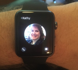
  • In Mossberg's report that I linked to at the top of this post, he complained that the speaker is not good enough for phone calls on the watch. No offence to Mr. Mossberg, but his older ears probably aren't as good as they used to be. I have taken two calls so far on the Apple Watch, and I thought the experience was not only good enough, but also darn convenient. I don't have to stop what I'm doing and hold onto my phone. The speaker is not the same quality as the phone, but I could hear fine. And when I talked to Kathy over the Apple Watch last night, she didn't even know I was doing anything differently until I told her that I was talking to her over the watch. Then she expressed disappointment that she was not the first person I talked to over the watch (the first call I engaged in over the Apple Watch was with Time Warner Cable when they called me; I figured that if the quality wasn't good, they deserved what they got).

  • I have a hunch that the interface of the watch will be completely different in two years. It's not that it's bad now (but there is room for improvement), but widespread use will bring refinement and change.

  • With all the "fashion" talk surrounding the Apple Watch, I don't look at my space gray aluminum Apple Watch Sport and think of it with any connection to fashion. Maybe if you had the gold Edition, but I don't know. It still seems a bit thick, though not as thick as I first feared. Again, two years will make a big difference, and I would predict (as many others have before me) that later versions of the Apple Watch will be much thinner. They may be more like fashion accessories then. If you're holding out for the time being, I'd say wait for the thinner version that is surely to come. And then spring for at least the stainless steel version with the assumption that it will be supported for years to come.

  • Which brings up another thing--there's has been lots of talk about the difference between a gold Apple Watch Edition, costing $10,000 or more and a traditionally expensive timepiece such as something from Rolex or Tag Hauer. These traditional time pieces are designed to last long term and can be passed down from generation to generation. Obviously, a device with an operating system at its center is probably not going to be passed down across generations. I would predict this, however: although the operating system on the watch will continue to be improved, I believe Apple will continue to support each iteration of the Apple Watch long term. There will be a way for the watch to still function years from now. Really, I believe they have to plan for that if they want to be successful as a watch maker.

  • While I don't think of the Apple Watch as a fashion accessory, it definitely looks nicer than the Pebble Watch I briefly used a couple of years ago and the Android Wear watches that I have not used. This is probably the best of class in its field, but there's still a lot of room to grow by all smartwatch designers.

  • The black "fluoroelastomer" (a fancy kind of rubber, evidently) band is of a nicer quality than what I anticipated. However, I still want to find a cheap, 3rd party knockoff of the red band that Apple sells only with the 18-karat Edition. 3rd party bands will be the new thing and will no doubt explode onto the Apple Watch accessory scene, which will also unfortunately bring things like the hideous Apple Watch cases I've already seen. In regard to inexpensive 3rd party bands, consider my wife, Kathy. She loves watches and accessorizes the color of watches with what she's wearing. She has not jumped onto the idea of an Apple Watch yet because she would not want to be tied down to one accessory. However, if she could easily change out bands (and Apple has made the ability to switch them quite simple to do), then she might be interested.

  • There's been discussion that there's no "killer app" yet for the Apple Watch. This is true, but Mossberg dismisses this as a non-issue. Nevertheless, now that millions of people are using the device, I believe we will discover some extremely beneficial use case that hasn't even been realized yet. The health aspects alone may be the killer app. The idea of the quantified self is interesting to me (although it also seems narcissistic at some level) as long as I don't have to go to great effort to record my own data. So, for instance, I have no desire to figure out how many calories I'm burning through in a day, but if a device will keep up with that for me, great.

  • Once I got the hang of it, texting over the watch is pretty easy, and Siri's ability to dictate my voice is much improved. But in the first attempt, I accidentally sent an audio version of my message, complete with my instructions for punctuation. Embarrassing.

  • One more very important issue: distracted driving. I thought that having the Apple Watch on my wrist, up on the steering wheel at eye level, would be a convenient way to respond to a text that would not be a distraction. Not true. If anything, trying to look at anything more than time on my watch is an even greater distraction than interacting with a phone because of the smaller focus space and less-familiar interface. As always, keep your eyes on the road and take care of texts, emails, and whatever else after you have parked.

So there's my initial rundown. Maybe I'll come back and update my thoughts after the first month or so. What has your experience been like? Be certain to add your questions, thoughts, comments, or rebuttals in the Comments Section.


Thursday
May072015

3 Reasons Apple Might Create Their Own Search Engine

Yesterday there was much stir in the tech press (see here, for instance) after Apple offered details on its much rumored web crawler known appropriately enough as "Applebot." Apple says the web crawler is merely for use with Siri and Spotlight. Nevertheless, this revelation has led to much speculation that Apple might actually be creating a search engine to rival Google. 

Although presumably Apple has the kind of massive data centers to back their own search engine, why would they want to do that? What would be the point? Could they possibly match what Google, the de facto search standard, is already doing? 

Well, there are at least three reasons for doing this I can think of off the top of my head. Here they are in order of significance.  

  1. Apple's own search engine would provide means to remove dependency on yet another Google service. Granted, Apple's own map service was nowhere near what Google Maps was, and it certainly got off to a very rocky start. But these days, it's fairly comparable--or at least good enough. In fact, millions of people use it every day and don't even realize they're using something that's not Google Maps. And maybe that's the point. An Apple search engine doesn't have to be as good as Google. It only has to be good enough. 
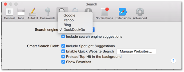
  2. Apple could provide its customers with ad-free search. Tim Cook has famously said that Apple's customers "are not the product." Google's services are supported through monetization of information gained through the habits of their users. Already Apple provides its users with a choice of search engines: Google, Yahoo, Bing and the lesser known Duck Duck Go. I've been using this last choice for nearly six months. I use it because of the four choices, Duck Duck Go is the only one that doesn't monetize my searches or even keep a record of them. How does it stack up? Just fine. Occasionally I have to use Google, but when I used Google, I occasionally had to use Bing. The point is that a search engine just needs to be good enough to be useful most of the time. 
  3. Apple creating its own search engine and making it the default choice on its devices will hurt Google financially. With Steve Jobs gone, no one at Apple is declaring "thermonuclear war" against Google anymore. Honestly, I doubt this is a reason that Apple would create its own search engine; but nevertheless, "Apple Search" (you heard it here first) as a default could seriously put a dent into Google's finances and threaten its position as king of search.

Google has become so dominant with internet search that even Microsoft has not been able to gain more than a minority share of searches on the internet. Apple controls the default settings of hundreds of millions of devices sold each year, so they could make a significant effort. But they may have no desire to become the top search engine on the internet. Apple likes to control the whole widget and not remain dependent on other companies. When it comes to search, they just need to be good enough. 

What are your thoughts? Does Apple have plan for their own search engine, or is this just a minor technology service for Apple devices. Leave your thoughts, questions, comments and rebuttals in the comments section. 


Friday
Jun212013

New -Jobs- Trailer: Does It Look Any Better Now?

Released today: new trailer for -Jobs- with Ashton Kutcher as Steve Jobs. The clip released a few months back looked terrible. This first official trailer looks a bit better.

Thought? Opinions? Go!

Friday
Jun142013

Proofreading Apple

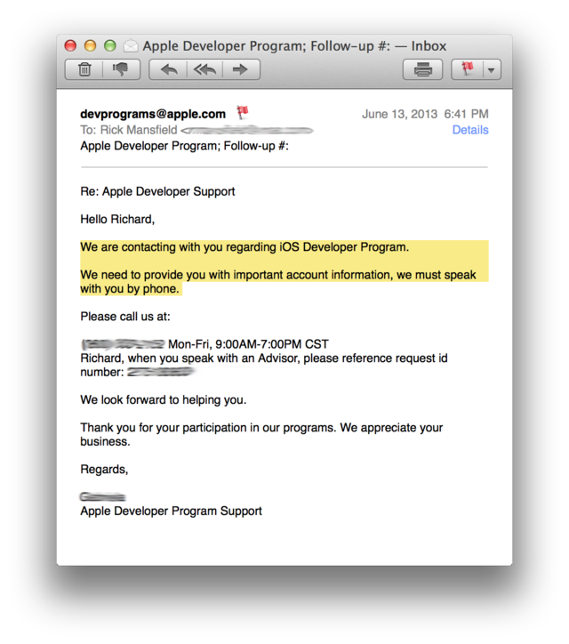
I got this email from Apple yesterday:

Granted, Apple is made up of fallible people just like any other company, and I'm the first to admit I make enough errors of my own. Nevertheless, I was still surprised to see the two sentences that I have highlighted above. 

The first sentence should probably read, "We are contacting you regarding the iOS Developer Program." The second sentence contains a comma splice (two independent clauses joined by a comma instead of a period or semicolon). 

When I first read the email, I honestly thought it was perhaps a phishing scam and not from Apple at all. I later determined the email really was from Apple, and this surprised me because I expect a level of professionalism from the company greater than this based on my years of experience with them.

Again, this is a good reminder to me that companies are made up of real people who make mistakes--just like I do. However, it should also be a reminder to all of us to proofread what we send out!


Your questions, thoughts, comments and rebuttals are welcome below.

Friday
Jun102011

More Thoughts and Questions on iCloud

We now know there will be an option in iOS 5 to purchase more space in iCloud above our free 5 GB allotment. However, there's no indication yet as to how accessible space will be. What if I want to post a video to iCloud and password protect it for only my family to see (something I can do now with MobileMe Gallery). Will that be possible? Could I purchase extra space and move significant portions of files and folders from the current Documents folder on my MacBook Pro to space on my iCloud—something that I can do right now with the MobileMe iDisk? We don't know the answers to these questions yet or the original questions I asked on Tuesday.

Perhaps I simply want iCloud to be more than Apple wants it to be, and I'll need to look elsewhere for other, less integrative solutions.But that makes me go back to a more fundamental question: Is iCloud just about syncing content? So, it will sync calendar, contacts, email, and Safari bookmarks like MobileMe currently does. It will let me access any song I've ever bought from iTunes (already implemented this week) as well as songs that it can match or I can upload for an extra yearly fee. But do I really gain all that much from that over what I already have now?

Why stop there? I notice that while iTunes on my iPad and iPhone show listings for songs I've purchased and can now be downloaded as needed, why can I not also download movies and television shows I've bought through iTunes? Some have suggested that video is not included because of bandwidth—that AT&T and Verizon don't want heavy video downloads on these devices over their networks. And yet I can buy videos on them now and download them, assuming they're under 20 MB, and when they aren't, I have to use WiFi. Again, why can't I keep my video in iCloud, too?

And put entertainment aside for a moment. Do you know what would be really helpful to me? I would find it extremely advantageous if I could sync my entire documents folder to iCloud. Imagine being able to use any mobile device, to sit down at any computer—Mac or Windows—and have access to all your stuff. Why can't I simply keep everything there?

I currently have two hard drives in my MacBook Pro, after removing the optical drive (which I rarely need) and replacing it with a second hard drive using a Data Doubler kit from OWC. There are 142 GB of files in my Documents folder and 298 GB in my itunes folder alone. Why can't I just upload ALL of this to iCloud?

I don't plan to buy a new Mac this year, but one day when I do upgrade, do you know what Mac I'd really like to get? I'd love to get an 11" MacBook Air and use it as my only Mac. I'm totally mesmerized by its small size. The diminutive screen is not an issue. Already, whether I'm at my desk in my office or at my desk at home, I plug my 15" MBP into an external monitor. I've been doing this for a couple of years now. Yes, I sometimes use my Mac by itself, but I really don't need a 15" laptop screen anymore. I could get by just fine with an Air...

Except for one thing: hard drive space. There simply aren't flash memory cards for the MacBook Air—from Apple or third parties—large enough for the data I carry around on a regular basis. Therefore, Apple's iCloud isn't offering me a whole lot of new solutions based on what we've seen so far. It's still going to sync my PIM-type data, and while the easy access to purchased music on any device is nice, that wasn't really a pressing issue for me. I've been given a solution to something that wasn't an immediate problem.

But who knows? Maybe the iCloud will also work like an iDisk. Maybe I'll be able to access it directly just like any other drive mounted on my desktop. Since I'm already used to paying $100 a year for MobileMe, maybe I could pay the same amount for 200 or 300 gigabytes of space and upload everything. This would offer a solution to a real problem and let me upgrade to a computer with a much smaller hard drive requirement next time.

What about you? Does iCloud solve your problems or does it not go far enough? As always, your questions, thoughts, comments and rebuttals are welcome below.

Tuesday
Jun072011

In the Transition to iCloud, Questions Remain for MobileMe Users

Late last year, Steve Martin appeared on Leo Laporte’s The Tech Guy radio show and referred to a phenomenon that sometimes occurs in software development. At about the 22 minute mark, Steve says this:

“I want to tell you my term for when you’re very happy with a piece of software, and then they ‘improve’ it, and then it’s no longer functional, and they’ve taken out your favorite parts. I call those deprovements.

Well, I fear that in the transition from MobileMe to iCloud, some of us are about to receive a deprovement.

According to the MobileMe preference settings on my MacBook Pro, I’ve been a member since January 5, 2000—the very first day it was offered. Of course, it wasn’t called MobileMe back then. Way back in 2000, it was called iTools, and it came free in OS 9. Then in 2002, the name was changed to .Mac (pronounced dot-Mac). And of course, 2008 saw the catastrophe of the transition to MobileMe.

My MobileMe settings on my MacBook Pro

I realize that MobileMe (or any of its predecessors) has received plenty of criticism and has often been the joke of the tech world—plenty of which was justified, but not all. In fact for heavy users of MobileMe, of which I would include myself, MobileMe has been a very good all-in-one solution for a number of services. Outside of slower-than-I-would-prefer iDisk transfers, the 2008 fiasco has been the only real downside in my experience, and that was temporary. Rather than having a half-dozen services, all with separate logins and passwords, I had this one service that did everything I needed and had connections from a number of software applications developed by both Apple and third parties.

I use MobileMe as my primary email service. In fact, I have a number of MobileMe email addresses including RMansfield@mac.com (or me.comeither one works). Other aliases, such as thislamp, cast.iron, and GoSP, all forward to my primary account and cost me nothing above the $99 yearly fee I've paid since the service transitioned from iTools to .Mac.

MobileMe has been a great way for me to sync email, contacts, calendars, and internet booksmarks among my iPhone, iPad, Mac, and for that matter, any computer I need access to—Mac or Windows. From what I understand, in Apple’s transition to the new service iCloud (which will now be free instead of the $99 cost of MobileMe), the above features are safe. They will transition over to iCloud. Yesterday, Apple sent MobileMe members an email which reads—

Dear MobileMe member,

We'd like to share some exciting news with you about iCloud — Apple’s upcoming cloud service, which stores your content and wirelessly pushes it to your devices. iCloud integrates seamlessly with your apps, so everything happens automatically. Available this fall, iCloud is free for iOS 5 and OS X Lion users.

What does this mean for you as a MobileMe member?

When you sign up for iCloud, you'll be able to keep your MobileMe email address and move your mail, contacts, calendars, and bookmarks to the new service.

Your MobileMe subscription will be automatically extended through June 30, 2012, at no additional charge. After that date, MobileMe will no longer be available.

When iCloud becomes available this fall, we will provide more details and instructions on how to make the move. In the meantime, we encourage you to learn more about iCloud.
 

Sincerely,

The MobileMe Team


So, from the above message from Apple, I understand that my email (even the old .Mac addresses), address book, calendar, and bookmarks will still sync. But there are other features of MobileMe that aren’t mentioned here which have a number of users similar to myself scratching our heads to wonder what the future holds.

Webhosting. Two of my websites reside on MobileMe. The first of these is my original This Lamp website, which still resides at a mac.com address. The other is a site for my local homeowners association.

I’ve stated that I want to gradually move all of the posts on the original This Lamp website over to the new site where you’re reading this. Part of my concern for the move has been that the .Mac domain will eventually go away and the site would simply be gone unless I moved it elsewhere. But even if I moved it somewhere else, there are thousands of internal links that would be broken as well as incoming links from other websites.

And although I do not use iWeb, there are tens of thousands of users who publish iWeb websites directly to MobileMe. There are plenty of reasons to pick at iWeb or hosting a site on MobileMe, but the fact remains that it has been a very convenient way for many Mac users to quickly publish a website. After June 30, 2012, what happens to all of these websites? What happens to my non-iWeb websites which reside on MobileMe? I had planned to gradually move my posts to the new site over the next three years. It looks like I may only have a year to do so now.

iDisk. All those above-mentioned websites reside on what is called the iDisk, a virtual drive in the cloud that can be directly accessed from any computer or iOS device. Think Dropbox, but the iDisk has been around longer. Like Dropbox, I can even make certain files public or password protect them for specific users to download.

I use my iDisk nearly every day. I use it the same way lots of folks use flash drives. I often create a Keynote presentation on my Mac and then transfer it to my iPad via iDisk. The other night, my wife Kathy, who is currently on the personnel team at church, had over 100 resumes to sort through because our church is looking for a new youth minister. We converted all of them from their original format (mostly MS Word) to Adobe PDF, dropped them in a folder on her iDisk, and then imported them into GoodReader on her iPad. This was an easy solution in spite of a slower file transfer than I’d prefer. Regardless, it worked and we knew it would work before we began.

Besides iWeb, a lot of other programs use iDisk including Quicken Essentials which has a backup feature specifically for use with iDisk. I use this twice a month to create a separate backup from my regular full-system backup. I realize that I could simply copy the file elsewhere, but the convenience of the service lies in the fact that it’s built into the Mac version of Quicken.

As you can see in the first graphic of this post, I have 17 GB of content in my iDisk. That includes websites, photos, videos, backups, transferred files, password-protected files for specific individuals to download, files linked to other websites (hosted both on MobileMe and off MobileMe—including individual files and videos linked from this site) and who knows what else. The issue is not simply moving it to another service. I do have a free Dropbox account, and I know I could pony up some cash and get more space. But in addition to the hassle of moving to another service, if iDisk goes away, I’m going to end up with hundreds  of broken links and loss of the simple internal functionality that I have now.

The new iCloud service doesn’t offer 20 GB of space; users only get 5 GB. If this were simply a name change as has been done in the past, and I got to keep my iDisk, none of this would matter. Perhaps Apple will allow users to purchase more space, but they haven’t made this clear. In fact, there’s not even a hint, as of this writing, that a user will be able to purchase more space.

MobileMe Gallery. Also residing on the iDisk is all the content I have in my MobileMe gallery. That includes thousands of photos and quite a few videos. There are lots of both that I share primarily with family that I don’t care to share on this site or on my Facebook page.

Yes, there’s Flicker and yes, there’s YouTube. But MobileMe Gallery has been a one-stop shop for both photos and video.  Moreover, YouTube limits the length of my videos to about 15 or so minutes. I’ve posted videos to the MobileMe Gallery that are well over an hour in length. I can set options in iMovie that allow my videos to be downloaded from MobileMe Gallery in a variety of sizes and formats.

There are direct publishing features in iPhoto, Aperture and iMovie (and scores of third party software) to MobileMe Gallery. Is Apple really going to remove functionality from these apps and kill this service?  The new photo streaming function in iCloud only keeps the last 1,000 pictures a person has shot. It’s no substitute for MobileMe Gallery, which is where I often keep much older pictures for completely other purposes. I don’t know of any comparable service to the MobileMe Gallery on the market. If you do, please let me know. I may be looking.

So now we wait. According to Apple’s communiqué above, more details about the transition will be made available when OS X Lion and iOS 5 are released. It would be helpful, though, if we knew the status of these other features now, so we could determine whether we need to begin making transitions to other services or if we're okay to sit still.

The fact that I’m a “charter” member of iTools/.Mac/MobileMe means nothing to Apple, and I understand that. They are a company designed to make money, and Steve Jobs has never been one for nostalgia or sentiment. Fine. But when a person finds services such as these that simply work, with connections from lots of other programs, creating a unified system and experience, one is inclined to invest plenty of time and resources to those services and that system. One expects it to be around for the long haul, regardless of name changes. It would therefore seem that 11 years of investment count for something.

I’m not asking Apple to give me anything for free, in spite of the new iCloud services, which will be free. Instead, I’d ask that I could continue with the same functionality I have now, and I’d be willing to pay for the privilege. I’m certain I’m not alone. Overnight, literally thousands of posts have been added to Apple’s MobileMe support forums. Hopefully, this will prod the PTB at Apple to give us more details about the MobileMe to iCloud transition now instead of later.

As always, your thoughts, comments, questions and rebuttals are welcome in the comments section below.

 
Tuesday
Mar152011

iPad 2: Not Another Review—Just Some Observations

Some may see it as predictable, but honestly, as early as Friday morning last week, the day of the iPad 2's release, I was denying that I was upgrading from the first gen iPad. And I meant it. But then my circumstances changed about mid-day, and thanks to a very generous gift, I was able to procure the iPad 2 from the Apple Store in Louisville, Kentucky.

This is not a review of the iPad 2. Those are a dime a dozen at this point. Rather, here are a number of mostly disconnected observations based on my experience over the last four or so days.

Black's Always Cool, But White's the New Black.
I don't know if I was fully decided about which color to get—black or white—until I got in the store, but I was leaning toward white. As I assume most of you know, the original iPad came with only a black bezel around the screen. Now consumers get a choice, albeit limited to only one more choice. In the end, I chose white. It wasn't a nailbiter choice, mind you. I just thought I'd like to have a slightly different experience.

It's interesting that since last Friday afternoon, if you walk into just about any Apple Store, you will primarily see white iPads everywhere. Even the employees are carrying the white models.

I had initially one concern about getting a white iPad: it might show dirt more easily. I wasn't alone in this fear since a friend of mine voiced the same thing, and I heard people interviewed on various tech podcasts say this, too. My hunch is that this concern is especially relevant if you ever owned a white plastic iBook or MacBook. After a few weeks, the white plastic, especially on the palm rest, frankly looked gross. You could clean it, but good luck getting it back to the original pristine white.

The iPad's different though because regardless of whether you get white or back, the plastic is under glass. It's not going to absorb the grime from your hands regardless of how much you refuse to wash them.

And an added benefit? Fingerprints show up less against the white than on the black.

If You Use It to Teach, the iPad 2 Is a Significant Upgrade.
The phrase being thrown around in a lot of reviews is that the iPad 2 is an "evolutionary and not revolutionary upgrade." And this is true (and probably by design). However, there was one major new feature that will benefit anyone who teaches with an iPad: the ability to fully mirror the screen.

With the original iPad, video out was implemented on an app-by-app basis. So presentation programs like Keynote for the iPad could send slide images to a projector if connected with the iPad VGA adapter, but most programs could not.

The ability to throw anything on the screen is pretty exciting. This means that if I'm teaching a New Testament class in Keynote, and I want to switch over to a Bible software application such as BibleReader or Accordance, I can switch to these and perform live instruction from these apps. Every teacher with an iPad and a related educational app has no doubt been frustrated about not having the ability to mirror every screen. Now all that has changed. In fact, this past weekend at church, when I switched between programs, one fellow who's seen me use Keynote on the iPad dozens of times, asked "What's that?" when he saw my desktop of icon folders.

Of course, the first gen iPad has always had this ability as evidenced by Apple's own internal use of this feature during presentations as well as a fairly popular app for this that works with jailbroken iPads. Sadly, Apple has not allowed first generation iPads to have this feature even though they are certainly capable of it.

Contrary to What You May Have Heard, Mirroring Works with the VGA Adapter.
Part of the announcement of iOS mirroring, mentioned above, included a new adapter for connecting the iPad via HDMI to an HD television or an HD projector. This led to a question as to whether video mirroring worked with the original VGA connector released with the first gen iPad. In fact, I waited in line with a buddy of mine who was buying his first iPad. The Apple Store sales rep actually told him that mirroring would only work with the HDMI connector. I told her that this did not square with what Apple's own website states: "Video mirroring and video out support: Up to 1080p with Apple Digital AV Adapter or Apple VGA Adapter (cables sold separately)" (emphasis added; see the iPad Tech Specs page under "TV and Video").

I had already confirmed that the first gen iPad would not mirror with the 4.3 update, but one of the first things I wanted to test was the ability to mirror an iPad 2 with merely the VGA adapter. Using the VGA adapter, I have successfully mirrored the iPad 2 with both my television and an Epson projector. It works great. My main use of the iPad for this is with data projectors, but none that I have access to at the moment use HDMI. So, the VGA adapter works great.

Contrary to What You May Have Heard, the Keyboard Dock Works with the iPad 2.
Recently, I read somewhere that only about a quarter or less of iPad owners use an external keyboard. That's probably a testament to how well the on-screen keyboard works, but I occasionally find myself in situations in which I want to use a regular keyboard with my iPad.


I bought Apple's keyboard dock at the same time I bought my original iPad last year. I liked that it provided a very stable stand for the iPad while typing and that it also had an iPad specific row of function keys. However, I didn't like that it's odd shape made it difficult to fit in a bag or that the iPad could only be used with it in portrait mode. I do a LOT of Keynote work on the iPad, and Keynote will only run in landscape mode. That means using the keyboard dock with the iPad can give you a sore neck really fast. For what it's worth, I have tried the iPad with one of Apple's Bluetooth keyboard and that is probably what I'd recommend that most folks use who want a physical keyboard with their iPad, even though there aren't iPad specific function keys. Incidentally, if you use one of Apple's new "Smart Covers," the iPad is quite stable in upright mode to use with a Bluetooth keyboard.

FYI: stability is an issue in these contexts, because even when using an external keyboard, you still have to use the touch interface of the iPad's screen. You want it to be stable so that it doesn't fall over every time you touch it.

Regardless, the new iPad 2 rests in the original keyboard dock just fine despite its slightly different dimensions. In fact, I used the two together for a faculty observation I was performing last night, and I noticed no difference from the performance with the original iPad. Having said that, though, I still may eventually go with a Bluetooth keyboard myself. It would certainly be easier to carry the two together.

About Those "Smart" Covers.
Apple likes to refer to the iPad as "magical." While that may be a bit of silly hyperbole, the new Smart Covers are the closest thing I've seen yet to anything that might be called magic. It was really somewhat amazing when I first attempted to place the cover on the iPad 2. There seemed to be a bit of AI in play as the cover didn't even wait for me to line it up, but immediately grabbed onto the iPad and was lined up perfectly. The ease of placing the cover on the iPad 2 is quite a contrast from putting Amazon's Kindle cover on their eReader. The first time I tried that, I nearly broke one of the hooks, not understanding how it was supposed to be attached.

This automatic "physical syncing" between the Smart Cover and the iPad 2 is achieved through magnets--31 total between the cover and the iPad 2 according to folks who have taken both apart. Somehow this feels dangerous. I remember when we were told to keep magnets away from our computers!

As amazing as these covers are, somehow my new iPad seems a bit naked. The screen is protected, which is a good thing, but the aluminum backside is bound to get scuffed and scratched after a while. There are numerous companies that provide protective films for screens, and now we might need something similar for the back of the iPad. Or at the very least, all those companies that make iPad cases can breath a sigh of relief because I imagine some iPad owners will opt for a bit more protection.

I actually liked Apple's original folio case with one exception. With the case on, it wouldn't fit in the keyboard dock (which, again, evidently only I liked). So, as some of you remember, I "modified" mine with scissors, but Kathy said it looked unprofessional because I can't cut straight. I also liked how the iPad looked and felt in the folio case when I could carry it into a meeting as if it were a very thin Daytimer.

Besides the gee whiz aspect to the Smart Covers, I have to wonder why Apple went this route. I can only imagine it might be because they got tired of seeing the iPad covered up (or more likely, their logo covered up) whenever an iPad was used in real world situations or on television. With the increasing number of new tablets appearing on the market this year, and inevitably appearing in media and in the workplace, Apple probably wants to make certain that their iPad is distinguishable from the rest of all the forthcoming tablet noise.

Get a Grip.
I wonder if whether longterm, I'll want to put the iPad 2 in a more traditional case. The way it folds to prop itself up, either vertically or at an angle for typing, works great. But Sunday, when I was trying for the first time to use my new iPad with Keynote, connected to a projector, the iPad wouldn't stay at the top of the podium I was using. This was never a problem with the original, black folio case. I could turn the cover back, slip it into its notch to put it at an angle, and it would hold its place, even on a slanted podium. With nothing on the back of the iPad 2, there's nothing to grip the underlying surface. I wanted it to stay at the top of the podium, but it insisted on sliding to the bottom.

With the Smart Cover folded into a triangle, I've found that I also could hold the iPad in one hand, in portrait mode, providing I kept my thumb over the bezel. These magnets are strong, but the cover can still come off quite easily and the entire iPad should never be left hanging from the cover. In fact, I've already dropped mine this way, but fortunately, it landed on my living room couch. But how many of us dropped our first gen iPads and were thankful we had them in a full case? I predict with Smart Covers alone, we're going to see a lot more broken iPads this year.

I wouldn't recommend anyone use an iPad regularly without some kind of protection for it. I believe there are going to be better ways to protect the iPad 2 (none of the first gen covers fit the iPad 2, incidentally) than the Smart Covers, but at the very least you need to have something on your iPad.

Professionalism Comes with a Price.
It's nice to see Apple bringing some visual variety back to its products. In some ways, I miss the colorful days of the fruit-flavored iMacs and original iBooks. Most Apple products in recent years have been black, silver, and sometimes white. Last year's iPad folio cover from Apple only came in black, although third parties supplied a wide variety of colors and designs. Nevertheless, Apple's return to colors, even in this small way, is a welcome change.

The new covers come in either polyurethane or leather. The difference in price is significant—$39 for plastic and $69 for animal hide. I would have been fine with a polyurethane cover, having given up on any need for "real" leather a long time ago, if it were not for one thing. What was not immediately clear to me (and probably a lot of others) is that only the neon/pastel colors are polyurethane, while the darker colors—what I consider to be a better fit for most "professional" contexts—come only in the leather. I would have been more than willing—no, preferred—to buy a lower priced polyurethane cover, but I didn't want ANY of the polyurethane colors. In the end, I opted for the dark blue leather. As already described, there are pros and cons to these covers, but they are pretty amazing for what they are. However, when you hold it by itself in your hand and realize that you just paid $70 for it, well...that's a bit hard to take.

How Much Faster Is It?
When Steve Jobs introduced the iPad 2, he said it was up to twice as fast as the first iPad. It has a faster dual core processor as well as twice as much RAM (although Apple never wants to talk about the RAM in its iOS devices). As everyone has said, the first gen iPad was no slouch, so how distinguishable is the second one? Well, I have no idea; the first iPad was fast enough and in most apps, the difference is imperceptible. However, I do see a real difference in a couple of apps.

First, I see a difference in some Keynote transitions. I'm not one to use too many distracting transitions between slides anyway. A plain dissolve is usually fine with me. However, I do like the "Anagram" transition in Keynote which, when advancing from one slide to another, will use a few letters on the first slide to create the word on the second slide (here's a brief YouTube video of it in action). I like Anagram because it's subtle, but also because I feel it can visually link the concepts in one slide to the next.

On the original iPad, sometimes the Anagram transition would stall a bit. I'd be ready to go to the next slide, but I could tell that Keynote was processing a number of algorithms to get the transition to work. Often I would go through a presentation ahead of time, and if an Anagram transition took too long, I'd simply use a simple dissolve. Sunday, I noticed that none of my transitions were slowed down. The Anagram transition worked without a hitch, no doubt benefitted by the extra RAM and faster processor.

Second, I keep quite a few PDF files on my iPad in GoodReader. Some of them are quite large, hundreds of pages long. I use GoodReader, not because I liked its interface best (I really don't), but rather because it's been more robust than a lot of the other readers, crashing less often than other apps when viewing extremely large documents.

But as good as GoodReader is, I could still crash it on the the larger files, especially if I moved through pages too quickly. With the new iPad, while I don't imagine that the extra memory and faster processor make a program like GoodReader completely crash proof, I have noticed that larger files are much more stable, and I'm seeing fewer crashes.

About Those Cameras...
The biggest criticism the iPad 2 has received relates to the lesser quality of the iPad 2's cameras, although from what I understand, the front facing camera is the same quality as the front facing camera in the iPhone 4. It's the rear camera that receives the bulk of criticism as really lacking in quality. Believe it or not, that rear camera is LESS than one megapixel!

Now every once in a while, for sake of full disclosure, I do remind readers that I own a small amount of Apple stock. However, I have no desire to defend Apple on the quality of the camera, as I would like to have better ones, too. However, I do try to understand Apple's reasoning in issues like this—beyond the mere suggestion most often offered that crummy cameras were offered now, so the better cameras can be a feature of the iPad 3. I'm certain each iteration of the iPad will continue to get better cameras, but why not offer something better right at the beginning?

I can't fully answer that question, but here's my theory. I think that for right now, although the lack of a camera on the first gen iPad was lamented even before it was released, Apple's main goal for cameras on the iPad 2 is to help further solidify FaceTime. Whether this will be successful in the long run, I have no idea. I have FaceTime on my iPhone 4, my Mac and now my iPad, but I think I've only used it a couple of times. I have no doubt that there is a Windows version of FaceTime in the works, too. I really believe Apple is trying to make Facetime as much of a standard as Skype.

And for FaceTime, these cameras are perfectly fine. Of course, I have no doubt that many will use the iPad for photos and recording video, and while I don't believe it's going to be the best tool for that job, Ken Rockwell is surely correct when he says that the best camera is the one you have with you. Fortunately, I usually have my iPhone 4 with me, which is an undecidedly better camera, although not as nice as my Canon Digital Rebel (which I don't often have with me).

If Apple didn't intend for people to shoot video, why would they release iMovie for the iPad? Well, if they didn't, someone else would release a similar product. More on iMovie on the iPad in a bit.

Economics 101.
Another criticism of the iPad 2 is that there is no drop in price from last year's iPad. We're accustomed to seeing technology gradually come down over time. And it's no secret that the cost for production of a product goes down after a time, although I guess the iPad 2 would at least partly count as a different production run.

Again, I'm not wanting to defend Apple here so much as simply understand their motives, and in this case, I think I do. Again, I'm no different than any other customer in that I'd like to pay less for an iPad, too. However, from Apple's perspective, keeping prices the same for right now is good business sense.

Why should Apple drop its prices? You drop your prices in order to be competitive. And here's the key: at this moment, Apple has no competition in this market. I have no doubt that eventually, the tablet field is going to get very crowded. When there's some real competition for the iPad, Apple will decide to drop the price of its device. This will competitively undercut the competition who will still be under the obligation of a higher cost of production to keep their products at a higher cost just to recoup their investment. This is Economics 101, really.

I have no idea if it's true, but I remember when the iPad was first released, reading that some Apple insiders were surprised when the bottom tier iPad was announced at $499 instead of $399. In the big picture, $499 surprised everyone a little bit because Apple rarely sells anything for under $500. A lot of early predicters were expecting the iPad to be higher. But knowing that it costs less than $300 to make, evidently many inside Apple were supposedly told that the iPad would start at $399. And then, according to the rumor, Steve Jobs/Apple changed his/its mind.

And again, why not? Economics 101 again: prices are set by what the market will bear. If customers hadn't gone gangbusters over the iPad, I have no doubt it would have been dropped down to $399 for the starting level within six months. But people kept buying it at the prices set and no competition emerged during 2010, so prices remain the same today.

Competition from other companies will be good for consumers because it will bring iPad prices down as well as prices for competing tablets. Further, competition will result in a better iPad 3, 4, 5, etc. and that will cause better results from the competition as well.

And the Rest...
Here are a few more minor observations:


  • iMovie: My upgrade to iMovie on the iPad was free because I had bought the earlier version released for the iPhone. I tried using it one time on the iPhone a while back and gave up. The iPhone's screen is simply too small for editing video. It was difficult simply based on the impracticality of it. However, iMovie on the iPad is quite handy and pretty easy to use. I doubt I'd ever do much video recording with the iPad, but I did transfer over about four minutes of video I'd recorded on my iPhone. Editing on the iPad was easy and even enjoyable. The themes save a lot of time. There are a number of ways to share the final product, but oddly the MobileMe gallery is missing.

  • GarageBand: Okay, if you've never been into GarageBand on your Mac, don't let  that stop you from taking a look at the iPad version. It's the touchscreen that makes the difference because you can actually play instruments. Even I, with zero musical ability, can fake my way through it with the so-called "Smart Instruments." In fact, I found that doing some basic strumming on the guitar to be quite relaxing, even though I'd have no desire to do so on a real guitar. GarageBand works on all iPads, even last year's, so for $5 give it a try. See a demo video here.

  • Elbow Room: I realize that my use of  an iPad is probably not typical, but with the original iPad, I had run out of room in recent months with the 32 GB version I'd bought last year. I regularly had to move files on and off the iPad based on what I needed for the week, often having to put them back on if I need them again the next week. So, this time, I got the full 64 GB iPad. I'm very pleased. In fact, it was a bit thrilling to be able to download my entire Accordance library over the weekend to my new iPad. I've been using Accordance on the Mac since 1998 and over the years, I've built up quite a digital library. Before, I had to be very selective as to what titles I carried on the iPad. With this larger iPad, I can load everything and not worry about it.


So, those are a few observations. I agree with most who say that if you already have an iPad, the iPad 2 is not a "must have" upgrade. In fact, my wife, Kathy, says that while she wouldn't mind having a new one, doesn't feel any rush to get one. Nevertheless, I feel very fortunate to have mine, especially in light of the ability to mirror screen and the upgrade to the 64 GB model. Feel free to ask question or add your own in the comments.

I've said before that I'm excited about tablet computers in general and the potential they bring. Some are going to prefer the Xoom, or the Playbook, or the Galaxy Tab, and that's fine. These devices, while not currently replacing everything a computer can do, certainly give us greater freedom and mobility when we can use them instead of a computer. Yes, there will always be the next big version of each of them coming down the pike, but if you don't have one yet, I encourage you not to wait, but instead, jump in and enjoy the party.

Saturday
May082010

Apple Finally Approves OliveTree's BibleReader for the iPad

OliveTree Software had their iPhone BibleReader  app  updated for the iPad well in advance of the iPad's April 3 launch day. Then, for some inexplicable reason, at the last minute, Apple flagged BibleReader and did not give it approval. This was a big disappointment for me and a lot of users who were looking forward to BibleReader on the iPad immediately when we got our iPads. Many of us checked multiple times a day, assuming that any moment Apple would give the green light.

Greek LXX & Hebrew Bible side by side. Note popup with English gloss and parsing information. Notepad icons next to Gen 1:1 represent personal notes.In the end, it took over a month for the iPad BibleReader to get the go-ahead from Apple. Why they took so long, I have no idea. OliveTree's been making Bible software for quite a long time, so by now BibleReader is quite mature, feature-wise (I was even using it way back when on Palm devices). The iPad BibleReader app has an in-app store for purchases of new biblical texts, commentaries and other add-ons which at this moment even Amazon's Kindle app for the iPad doesn't offer. This makes it convenient for adding texts without having to go to OliveTree's website, but it also makes me wonder if this level of sophistication wasn't also part of the holdup from Apple.

The NLT Study Bible adapted for the iPad. Study notes can either be viewed in a separate pane at the bottom of the screen or by clicking on NLT logo icons within the text.Regardless, it's out now and none too soon. Next week, I'll have a full review of BibleReader for the iPad in the same vein of the two iPad Bible apps I've already reviewed on This Lamp.

I can tell you right now, though: if you could only have one Bible app on your iPad, you'd want to make it OliveTree's BibleReader. It's that great.

Monday
Apr052010

Two Days with the iPad: 41 Reflections, Discoveries, Critiques & Tips


No, I'm not going to write a formal review of the iPad. There are a thousand of those out there, and I doubt I could add anything relevant. After having spent the last couple of days with the device, though, I've discovered a number of interesting things in my poking around that I thought I'd share. These aren't in any particular order, but I'll try to keep similar items together.


  1. Yes, as everyone else says, the iPad is heavier than what one first expects. While some have criticized this aspect, I like it. The iPad feels solid.

  2. Those who still criticize the iPad for not having a widescreen display don't get it. It would be so awkward goofy to hold it and turn sideways if it were widescreen. Watching movies would benefit from a widescreen, but few other things. This is more akin to holding a book. I don't want a widescreen book.

  3. While the screen seems just the right size at the moment, I don't know if other sizes might be appreciated, too. A full 8.5 x 11" screen might be nice to use. I've heard rumors that Apple may offer different sized screens in the future.

  4. Immediately upon turning the iPad on for the first time, you will have to connect it to a computer to set it up. This is not an independent machine at all. While I think the iPad would be great for taking notes in a classroom setting, the university that announced a few days ago that all incoming freshman would get an iPad instead of a MacBook need to rethink that strategy. The students will have to have a computer, too. This situation may change in a few years, but right now, the iPad is not an independent platform.

  5. Those who criticize the iPad for not replacing a computer, don't understand it. The iPad is clearly intended to be a secondary machine. Of course, it's also criticized over this. "Why do I need another device to carry around?" That's not getting it either. I still remember the first time I saw an entire computer dedicated for use as a cash register. I thought that this was a waste as this computer could do so much more. An entire computer wasn't needed to simply function as a cash register in my opinion. Regardless of whether you agree with that (or even if I still agree with that), the reality is that often I take my MacBook Pro into situations in which a much lesser device would better suffice. I'm not getting rid of my MacBook Pro. I still need it for "heavy lifting," but there are many contexts in which all I need is something like the iPad. I am thinking of those times such as going to a faculty meeting or a deacons meeting at church in which I basically need to take a few notes and have access to my calendar. Yesterday, I took my iPad to church and taught our Bible study using Keynote for the iPad. It was a nice change of pace to not have to lug my entire laptop bag.

  6. For both Kathy and me, the first sync was excruciatingly long. We both opted to include our photos in iPhoto on the iPad. I have over 10,000 pictures, and she has over 6,000. iTunes has to "optimize" the photos for the iPad just as it does for the iPhone. Then, it still has to copy them. This took about two hours for each of us.

  7. When connected to WiFi, the iPad continues to receive mail—even beeps—just like the iPhone when turned off (or technically in sleep mode). That may seem like an obvious feature, but my computer doesn't do that. What's really weird is having my Mac running with my iPad and iPhone in the same room. Three beeps for every one email!

  8. Like I've always done with computers and my iPhone, I turned up the brightness to full capacity. I soon found this hurting my eyes. Really, all the average person will need is the brightness set to the middle position in preferences. Really.

  9. The interface animations are extremely fluid. Pick one up and slide from the first screen to the second. You'll see what I mean.

  10. Speaking of interface, I'm very impressed with the aesthetic detail of some of the iPad apps. I can't remember such attention to visual interface details on standard computers since...well...ever. To me applications like Contacts and Calendar look gorgeous. Not all agree. Paul Thurrott wrote yesterday, "Contacts is ridiculous. Apple needs to get over its desire to ape real world interfaces. That does not work." To each his own. I think it looks great. It has an old school charm, even down to the stitching in the center of the address book. Perhaps, this is why Paul prefers Windows :-)

  11. I love reading and respond to email on the iPad. It's not just a great interface, but also a very handy and comfortable form factor. However, I dislike not having a junk mail filter. I could easily see myself using the iPad for email more than my Mac, but I don't like the junk mail that gets through.

  12. Biggest complaint against Mail app on the iPad: no integrated inbox—not even an option for this. I thought Steve promised this a couple of weeks ago in an email? Hopefully that's coming.

  13. The virtual keyboards work great. In landscape mode, the keys are the size of a regular keyboard. In portrait mode, I'd equate my typing to that on some of the smaller netbooks I've tried. I've actually got the external keyboard dock on order and it should arrive this week. But I've found that I'm actually pretty fast in landscape mode. It's easily the size of a regular keyboard sans the numeric keypad. However, I keep trying to hit an apostrophe and end up hitting the return key. Actually, one really doesn't have to enter apostrophes at all as the interface will simply add them to common contractions and even some possessives. Like the iPhone, the apostrophe key is on a second keyboard layer. Yet the exclamation mark and question mark are included on the regular comma and period keys, respectively, by using the shift key. I understand having two separate keyboard layers (really three) on the iPhone, but with the larger keys on the iPad, I believe many of them could serve for two separate characters like most keyboards. That means adding an actual number row above the character rows.

  14. The iPad offers four different slide show modes: Cube, Dissolve, Ripple, Wipe and Origami. The last is easiest the most fascinating and fun to watch. Unfortunately, when I connected the iPad to a projector yesterday to show a shuffled rotation of over 1300 photos in our Bible Study group, I could only choose from the Dissolve transition. Clearly, that's the least interesting. I don't know why it would be limited to just this one.

  15. My biggest gripe about the iPad is the lack of an accessible file system. Each application has to hold its own files and you cannot create folders. Why would this be an issue? Well, for instance, I'd like to see if I could use the iPad in the classroom. For any given course I teach, I have multiple files: syllabus, gradebook, Keynote presentations, etc. It's convenient to keep them in one folder or a grouped nest of folders. The iPad simply doesn't work that way. Each file has to be transferred to its own program.

  16. One would think that the above issue could be overcome by placing folders in my MobileMe iDisk. And while the MobileMe iDisk can be accessed on the iPad via its iPhone app, I can't simply tap on a Keynote file and have it open in Keynote on the iPad. I have to transfer a Keynote file either through iTunes on my computer or email it. Why the iWork apps don't have access to my iDisk built in is beyond me.

  17. PDF documents create an interesting issue. Yes, if someone emails me a PDF file, I can view it in the Mail app, but there's no way for me to group a batch of separate PDF files. To me there ought to be some kind of application built in just for reading emails. Fortunately, I found an excellent app for 99¢ called GoodReader. It will connect to a MobileMe disk, email account, network server, Dropbox, Google Docs and more to retrieve documents and group them in the application. It works well and has a very intuitive interface.

  18. I spent quite a bit of time in the three iWork apps: Pages, Keynote, and Numbers. Here's what's interesting. The iPad apps are not actually sharing a common file format with their counterparts on the Mac. It doesn't matter whether you have a Pages file or a MS Word file, both have to be imported to Pages on the iPad and then exported back out. I guess in the final analysis, it doesn't really matter, but I do find it very interesting.

  19. If you have iWork '08 or earlier, you're out of luck. iWork on the iPad won't read your files. You have to have iWork '09.

  20. Some things about the iWork apps are not intuitive at all. There's no menu system because the interface has been completely rethought for touch. But this can cause problems. How do you rename a file? How do you perform a "Save as" for a file. I had to go online for these answers. You have to rename a file in the "My Documents" section of your app by tapping on it. I don't think I could have figured that out on my own. If you want to do a "Save as," do it before you edit the file by choosing to duplicate the file.

  21. Interface conventions are not always consistent across the board, but some are. Double-tapping a word in programs like Safari, iBooks, and the iWork apps selects the word. The iWork apps allow you to triple-tap a word to select the entire paragraph, but this doesn't work in any of the other apps. You might want to do this in the other apps to copy text.

  22. Neither text nor graphics can be copied out of the iBooks app or the Kindle app.

  23. I bought the initial April 12, 2010 issue of Time Magazine released for the iPad. I like the interface in which each article can be read on one screen with vertical swipes while swiping horizontally to move to the next article. However, Time is extremely overpriced at $4.99 an issue. Last week, I updated our print subscription to Time for the entire year for $20. That's about 40¢ an issue. There's no way I'd choose digital over print at those prices.

  24. I'm astonished at the fact that Pages does not allow footnotes. Really. Or even endnotes. In fact, if you import in a document with footnotes or endnotes, it removes them—completely strips them out! There's an alert upon conversion to this regard, but frankly it's startling to me. I cannot even write a thank-you note without footnotes! I've seen text conversions between word processors on the computer in which footnotes might be converted to endnotes, but strip them out completely? If Apple wants the iPad to receive heavy use from students, let alone academics, Pages will have to include the ability to add footnotes. Either that, or another company has a chance to come along and create a much more robust word processor for the iPad.

  25. I've already noted that the iWork apps on the iPad are not truly sharing the same file format. That also means that like the footnotes that are stripped out, other things can be stripped out as well. First page headers and footers get deleted. An alert is offered if a particular font is not available. Keynote will accept some video formats in a presentation but not others. I'm not certain yet which ones work and which ones don't. As soon as you import a file, an alert is offered to tell you what will be missing. Needless to say, you need to fully check any imported files before rushing out the door to a context in which you'll need them.

  26. Some apps like the iWork and iBooks app do not reset when closed. I was initially worried about this based upon my experience with the iPhone in which many apps have to completely "restart." In iBooks, the page opens right where you left off. If you are working on a document in Pages, you can go read your email and then come back to pick up right where you left off.

  27. The most egregious missing feature in iWork for the iPad for me is presenter notes in Keynote. And it doesn't make sense because when connected to a projector, the iPad creates the equivalent of an extended desktop. It's not a plain mirror of what's on the iPad. So why not have a presenter's screen with notes like on the Mac version of Keynote? I haven't printed out notes in at least three years and to do so seems like such a step backwards and the antithesis of what the iPad is supposed to represent. I hope that a future revision will remedy a lack of presenter notes. .

  28. I've actually managed to completely crash the iPad once. I imported a particularly media-heavy Keynote file that I used on Sunday a few weeks ago, only to watch as Keynote crashed during the import process. Then the entire iPad rebooted. There's no warning if an app crashes; the iPad just goes out to the desktop. And if the iPad itself crashes, it simply reboots on its own.

  29. I was particularly interested to see how Pages (and Keynote) would handle biblical original languages texts. Since there is a Logos app on the iPad (no Accordance app yet and Olive Tree's iPad-specific BibleReader app has not made it to to the app store as of this writing), I thought I'd try copying text from the Greek New Testament and Hebrew Bible. After struggling a while to copy text, I realized that the Logos app doesn't allow for copying. A comment on their website forums says it's coming in a future revision. So, on my Mac I copied unicode texts of Genesis 1:1 from both the Hebrew Bible and the Greek Septuagint from Accordance into a Pages file and imported it into Pages on the iPad. Both texts showed up great, and the Hebrew text even read from right to left correctly except for bere’shit at the beginning of the Hebrew text. I could change the font size, but I could not edit text. I couldn't even place a cursor in the middle of the Hebrew text, and while I could do that in the Greek text, neither would allow me to edit in Hebrew or Greek. I have no idea how to switch to a unicode keyboard in the application for this level of editing.

  30. There is an updated WordPress app for the iPad. It's somewhat better than the iPhone version, but really with the larger screen, I don't know why one wouldn't want to simply use the WordPress admin site in Safari. I'll have to try this later and get back to you.

  31. iWork apps come with 43 fonts. From what I can tell, they're not system-wide for other apps to use, but I could be wrong.

  32. Pages and the other iWork apps don't convert straight quotation marks to "curly" quotation marks. A lack of such is so 1991. You can achieve them manually, however, by holding down the quotation mark key and selecting the symbol you want (do you have any idea how difficult it was to get that screenshot?).

  33. I would not want to do a lot of data entry in Numbers using the virtual keyboard. I updated our monthly budget for April using Numbers on the iPad based on last month's budget file. Although Numbers is smart enough to change the keyboard based upon what kind of data fill you're in, a spreadsheet is just a bit awkward. It would definitely be better with an external keyboard—one that had both a tab key and a numeric keypad, to boot.

  34. There are too many steps to change fonts and font sizes in Pages. I recognize the power of predetermined styles, but that doesn't mean I don't want to occasionally make minor changes to a selection of text that I don't need to create a style for. Right now, simply to change the font of a word (without using a predetermined style), here are the steps: (1) selection your text, (2) select the inspector, (3) scroll down past all the styles, (4) tap "Text Options," (5) tap "Font," (6) scroll through the fonts, and (7) tap the font you want. This should be easier.

  35. Ironically, iWork Pages on the iPad autosaves in spite of the fact that its Mac equivalent does not.

  36. As I mentioned,  took my iPad with me to church yesterday. It was a nice change of pace to simply carry my Bible and and the iPad in its case. It really looked and felt like I was carrying two books with me. This is again why I say that the form factor on the iPad is just right. So why did I need to carry a Bible if I have Bible apps on the iPad? I needed it because I planned to teach from Keynote on the iPad, so I needed a separate Bible. This is really not a big deal as I usually have my Bible, MacBook Pro and my laptop bag. I felt much lighter yesterday!

  37. While sitting in church as our pastor gave his message, I decided to use my iPad instead of my printed Bible to follow along. Lately they've been turning the lights too low during the message to actually see a Bible anyway. Although my pastor was teaching from the NLT, I decided to use Crossway's dedicated ESV iPad app. It opened to Genesis, and it took me a moment to figure out how to get to John 21 which was the text of the day. After I figured it out, I was delighted to see what a nice app for the iPad that the Crossway ESV app is. Certainly, it doesn't have all the frills of a larger suite of software like the offerings from Logos or Olive Tree, but it doesn't have the distractions either. At one point, I accidentally double-tapped some of the text only to see a window pop up showing the single verse, cross references, and a place to add my own notes. As an added bonus, text can be copied out of the ESV iPad app and pasted into other apps such as iWork Pages. I was very impressed by this app as having more depth and features that I originally realized. I know that some of you reading this are heavy ESV users, and I think that you would probably want to check out this app if you have an iPad.

  38. Also, toward the end of my pastor's message, I had an idea for an extra slide in my Keynote presentation which I was going to use in our Bible study that was to follow the service. It was so easy with my iPad already opened to simply add a new slide and the text I needed. Previously, opening my entire MacBook Pro would have seemed just a bit too conspicuous.

  39. Speaking of my Keynote presentation, I created the entire file with nine slides on the iPad. While it's very nice to be able to do that, and especially nice to do quick updates unnoticed, I imagine I will normally want to create them on my Mac. Like my mention of spreadsheets above, I believe that some things are still going to be easier and faster to do on a regular computer as opposed to a touch interface.

  40. On Saturday, when I tried logging into the Logos app (you have to log in to access the books that you own in the desktop software), I was initially confused by the process. There was a place for my user name and password and two buttons: one that read "Skip" and one that read "Sign Up." Well, I didn't want to do either. But I went ahead and entered my information and checked "Sign Up." That took me to a screen to create an account which is not what I wanted to do. After going back to the first login screen, I noted that the virtual keyboard had a "Go" button instead of the normal "Return." I've discovered that the iPad will often change types of keyboards based on what type of task the screen requires. So this time, I hit the Go button and—voila!—I was logged in. Although I tend to use Accordance primarily and Logos secondarily on my Mac, I can see very real potential for reading some of my Logos books from beginning to end on the iPad because of both the book-like form factor and the higher resolution screen that will be easier on the eyes. Although I have thousands of books on my Mac, I use them more for reference than straight reading because I find it difficult to read for long periods of time on the computer.

  41. Speaking of reading books, I tried out both the iBooks app and the Kindle iPad app. The Kindle app downloaded my four previously acquired Kindle books with no difficulty. Both are very straight forward, although the iBooks app has animated page turning. I don't know if this will get annoying or ignored in reading, say, a 300 page book. There should probably be a preference to keep the animation from occurring. Regardless, it seems to impress those to whom I've shown my iPad.

All in all, despite having some "version 1" gotchas, I'm very pleased with my iPad. Again, it's not made to replace anything, but can be a very nice secondary alternative. It has that "curl up on the couch" feel that a laptop or even a netbook does not have. I plan to carry it with me instead of my laptop to those places that don't require the extra computing power that a laptop or desktop computer offers. The iPad is my way to go "lite" and realistically, this may be for half or more of my normal computing needs.

When I bought my MacBook Pro in 2008, I purposefully spent extra money and bought a high end model that could be upgraded and would last me for a while. I even said at the time that this was my main computer and I wouldn't replace it for at least five years. I still plan to hold to that time frame, but in 2013 when I go to buy a new Mac, maybe I won't need a laptop after all. Maybe I can go to a less expensive iMac desktop Mac, knowing that the iPad of 2013 may very well be all I need for portable purposes.

Friday
Apr022010

Armed Guards & "Big" Problems for UPS. Will You Get Your iPad Tomorrow? Probably.

Security's been tight around hundreds of thousands of iPads sitting at Louisville's major international UPS hub. Earlier today I posted that a UPS employee I personally know told me that they were having "problems." Evidently the sheer number of iPads was overwhelming. My friend equated it with "Mother's Day."

Earlier this afternoon, a completely different UPS employee posted this on my FaceBook wall [which I've since removed]:

"I was so close to the iPads @ UPS last night it wasn't even funny.  they had them stored in the tunnel and armed guards were around them, along with customs, all night."


Then my original UPS "source" sent me a text message earlier this afternoon. Here is our ongoing conversation:

1:35 PM EST

UPS employee: "there are ipads as far as the eye can see."


2:01 PM EST

UPS employee: "you may not get it tomorrow. big problems"


3:24 PM EST

Me: "I hope you're kidding."

UPS employee: "nope. big issues"

Me: "you better get my ipad to me!" [kidding]

UPS employee: "man I am looking at thousands and thousands"

Me: "what's the problem?"

UPS employee: "long story...I'll email later...alot of stressed out peeps :-)"


5:24 PM EST

UPS employee: "it's like looking at the warehouse at the end of Raiders...boxes & boxes"


My friend got off work at 5:30 PM, so he called me. He said he's pretty far down the chain and doesn't have all the information, but he thinks some of them got processed but didn't get tracking numbers. He's pretty confident that individual customers who have tracking numbers beginning with "1Z..." will get them on time. He thinks most of the problems were with the ones going to the stores. However, he said that there was another crew coming in that was going to work all night, so no one should lose hope yet in regard to Saturday delivery. He said that everyone at UPS was taking this very seriously and bending over backwards to ensure delivery by April 3.

I also asked him about the security mentioned in the post from another employee on my FaceBook wall. He said they had armed Brinkley guards to make certain that none of the iPad shipments turned up missing. UPS takes such things very seriously.

For what it's worth, although my original Apple shipping notice said delivery by April 3, UPS tracking still has nothing under "Scheduled Delivery:

Nevertheless, after talking to my friend, I'm pretty confident regarding Saturday delivery. Heck, the UPS hub is only a half-hour's drive from my house. If they can't deliver here...

But you know what? In the big scheme of things, who cares whether it's a Saturday delivery or a Monday delivery? That won't even be remembered a month from now or even a week later for that matter. It's fun to look forward to a new gadget and the dynamics of delivering hundreds of thousands of them is kind of fascinating, but these aren't really life and death issues, are they?

If I have any kind of update to the delivery issue, I'll add it to this post.


UPDATE 4/3/2010: Although my tracking information never updated to say our iPads were on the truck for delivery, they both arrived right around noon today. Lots of fun playing. I'll update more later.