I won't drag out any suspense to the end: I like the new touchscreen Nook from Barnes & Noble. It's not a perfect device, and there are some aspects that B&N needs to address, but it has great potential and already does a few things better than its competitors. This new Nook incarnation has been positioned by Barnes & Noble to squarely take on the dominance of the Amazon Kindle, which currently controls about 65% of the eBook market, with the Nook coming in second at 25%.
I never owned the first generation Nook, so this review will not spend much time comparing the two beyond a few anecdotal notes told to me by those who had the earlier eReader. However, I will compare the new Nook to Amazon's Kindle, which is where the most significant comparisons rest anyway. Would I recommend the Nook over the Amazon Kindle? Maybe, maybe not. That's a tough call and would certainly depend upon the needs of the user. I now have both, but I realize that most people will choose one platform or the other.
For the record, there are some aspects to the Nook that I actually like better than the Kindle, including its much more modern interface, which is enhanced greatly by a touchscreen. There are clear advantages to a touchscreen with these devices, and I've looked on amused when someone asks to look at my Kindle and immediately tries to turn a page by swiping at the screen. This assumption that all such devices have touchscreens is undoubtedly the influence of the iPad. For better or worse, touchscreens are here to stay. Will the next Amazon Kindle have a touchscreen? Undeniably; I have no doubt of this, although I'm certain that some current Kindle owners will be resistant. But if you want a touchscreen dedicated eReader right now, the Nook is the clear and easy way to go.
 The "Home" screens for the Kindle (left) and Nook (right) suggest a difference in philosophy regarding what a home screen is in the first place.
Early descriptions of the Nook described it as only having one button. This is not quite true. It has a power button on the back and a home button on the bottom front in the shape of a lower case n (which looks like an upside down capital U). In addition to these, there are four raised strips, two on each side of the screen, that serve as page forward and page back buttons. These are not required to "turn" the page, of course, since a page can be advanced (or reversed) simply by touching the edge of the left (reverse) or right (advance) sides of the screen. Swipe motions in the corresponding directions can be used as well.
If you're a regular reader of This Lamp, I know what you're thinking: "Wait...you've got an iPad, you've got a Kindle...why on earth would you want (let alone need) a Nook?" That's a fair question. I've written previously about how it was the iPad that actually made me decide to get a Kindle, and in getting the Kindle, I became sold on reading an E Ink screen for straight reading of ebooks. But thanks to the iPad, not only did I accumulate Kindle-formatted books, I also built up a library of about 40 books in the Nook app for the iPad. It was great to have these books, but I had no desire to read them on a backlit screen. My preference for e-reading is now solidly colored in E Ink.
The Good
Physically, the new Nook is a radical departure from its predecessor in both look and navigation. And although it's not more than a millimeter or two wider than the Kindle, it seems like it is significantly wider. Both the Nook and the Kindle have 6" screens, but the Nook's lack of a physical keyboard, which shortens its length, makes for a very different device. This Nook is shorter. It fits into the hand differently, especially with its concave backing, which allows for a comfortable one-handed grip with little concern for dropping it. Like the Kindle, the Nook can easily slide into the front pocket of Dockers-like pants.
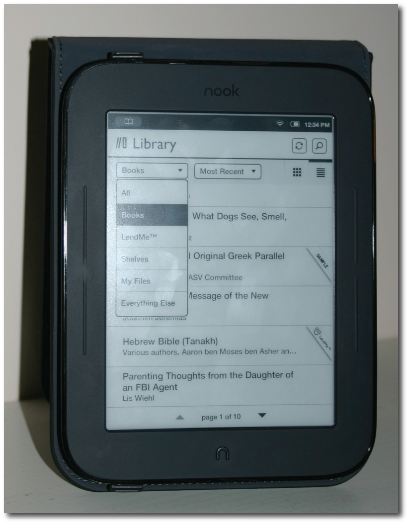
The "Library" screen. Pardon the fingerprints.
The wider bezel is a lesson that touchscreen makers have learned from the iPad, which was initially mocked when first displayed. Yet the reality is that a touchscreen quickly loses its value and becomes a source of frustration if there's not ample room to grip it without accidentally touching the screen, resulting in unintended behavior.
The shell of the Nook, both front and back, is essentially a type of rubber. It's soft and could doubtlessly withstand much more abuse than the average eReader. In fact, this Nook may not even need any external case as its natural covering is tough enough, and the device itself begs to simply be held without anything extra. Nevertheless, I bought a case so as to protect the screen, but I imagine that many will decide it's not necessary.
In fact, when I see the new Nook, the way it's designed, the rugged materials from which it's made, I can't help but think that B&N is not simply trying to create something more clever than the Kindle. Rather, they're also designing the perfect eReader for students—especially young students who would throw them in a backpack to be tossed and dropped throughout the day. Honestly, I believe the new Nook would stand up to much greater abuse than the current Kindle 3.
In spite of the Nook's rugged design, I bought a cover for it, primarily to protect its screen when I'm transporting it; although the screen itself is recessed, which will undoubtedly add a level of protection of its own. All of the cases made by B&N declare that they give full access to all of the Nook's controls. I initially thought this wasn't true as having the Nook in its case seemed to block access to the power button at the top back of the device. Then I discovered that the case includes a Nook symbol on the back, positioned right against the power button on the Nook. The Nook symbol on the case conceals an extra layer of what is probably plastic that enables the user to press on the back of the case to turn the Nook on or off.
I got my Nook a few days before I bought a case for it. Early on, I noticed two cavities on the top of the Nook and two more on the bottom. I thought that perhaps these were present to allow taking the device apart if it needed to go back to B&N for repair. However, when I got the case, I noticed immediately that the Nook is held in place by hooks that use two of those cavities. I found that to be quite ingenious, and it shows me that B&N has really thought through the details of this new eReader.
A few months back, I spent some time in a physical Barnes & Noble store looking over their first generation E Ink Nook. I'll be honest: I hated it. You may remember it as this odd combination of an E Ink screen on top with a color LCD screen for navigation on bottom. I respect B&N for trying to be innovative, but the original Nook was just an exercise in frustration (although admittedly it did/does have its fans). I decided to wait, and I'm glad I did. B&N announced their new Nook on May 24 with promises to ship them by June 10. In a surprising case of "under promise and over deliver" (I mean, when does anything in technology ever ship early?), many who pre-ordered the new Nook (including myself) began receiving them in the first two or three days of June.
 Options for adjusting the reading experience.
People often praise the Kindle's interface with phrases like "zen-like simplicity" (really, they do). And in truth, I appreciate the Kindle's basic, non-complicated approach. However, when looking at the home screen of the two devices side-by-side, the Kindle begins to look a bit long in the tooth compared to the second generation Nook.
On the Nook, whether looking at the home screen, looking at one's library (which is different from the home screen), or shopping for new Nook titles, every screen is a combination of text and graphics. The library has tabs and drop down menus. The home screen has a rotating, animated advertisement of recommended books. I'm sure that some Kindle diehards will be aghast by this, but this interface comes across as neither intrusive nor overly busy. It's intuitive, and perhaps even more intuitive than the Kindle's menu-driven, text-based interface. The Nook's interface is intuitive because it draws upon modern computer interface, which the Kindle's really does not.
The touchscreen interface is very responsive, more so in my experience than the touchscreen on the Nook Color, which I often found myself tapping multiple times because of delayed response. Speaking of responsiveness, the new Nook is significantly faster than the Kindle. Turning pages—even multiple pages—is much faster on the Nook than the Kindle. And the Nook now caches up to five pages, so that only on the sixth page turn will you see the black flash that occurs at every page turn on the Kindle as the E Ink refreshes to go to the next page.
The loss of a physical keyboard does not mean that text cannot be entered. The Nook uses a touchscreen keyboard akin to that on the iPhone, but significantly bigger. The virtual keys are quite responsive, and I've been quite pleased that I can thumb-type a note fairly quickly or simply use my index finger to hammer a comment out.
Another advantage of the touchscreen can be found in accessing endnotes. On a Kindle, I always have to determine whether a hyperlinked endnote is closer to the top or the bottom of the page since I can move the five-way controller from either end. Then it's a series of multiple taps as I go down (or up) line by line, and finally over word by word until I reach the superscript number or asterisk that I'm after. On the new Nook, however, accessing an endnote is as simple as touching the symbol in use. The screen changes to the section of the book containing the endnote with a small square labeled "Back," which returns me to the originating page.
In reading physical books, I've always preferred footnotes to endnotes because I like to see the information of the note right there in the context of the main text. However, eBooks don't offer any way to create footnotes, and endnotes become the exclusive method for extra information or the listing of sources. On the Kindle, honestly, it's a pain to maneuver to the endnote symbol. Doing so takes the reader "out of the moment" to have to maneuver to the extra content. On the Nook, it's now a breeze to touch and then touch back without shifting much thought outside of the book's message.
The Nook is also getting a lot of attention in regard to its battery. Supposedly it will last for two months, twice the life of the Kindle's battery. The fine print on these numbers is quite dubious though. Neither the Kindle nor the Nook will get keep their advertised/promised battery life unless the wifi antenna is turned off and the device is only read for less than an hour or two a day. Real use will see much less time between charges. But who cares? The battery life on both devices is very good. You can go days, perhaps a couple of weeks between charges through normal, regular use. Supposedly the Nook's battery is better than the Kindle, and maybe it is, but I will never know for certain since I keep wifi turned on for both devices, and I regularly let my Kindle read to me when I'm driving, which drains the battery slightly faster. The key is to know where your charging cables are. When my devices get below about a half charge, I recharge them. Better safe than sorry.
The Not So Good
Yet in the midst of all the positives, the Nook is not a perfect platform and actually has a number of shortcomings—some of them quite significant. Some of these issues may be corrected by software updates since, as of this writing, the second edition Nook has only been officially released for less than a week.
First, let me start with a couple of items imparted to me from owners of the first generation Nook such as the fact that this Nook is silent—literally. The original Nook, as well as the Nook Color, can play audio, whether music or audio books. They have a headphone jack, built in speaker, and volume controls. All of these are conspicuously missing on the new Nook. This would not be surprising if it weren't for the fact that the first Nook did have these abilities.
For a device that is mostly more advanced than its predecessor, why would B&N opt to lose audio features? My only guess is that perhaps they want to strongly differentiate the low-end E Ink Nook strictly as a reading device, while positioning the Nook Color as the device that it is—a multimedia tablet with strong eReader capabilities.
Of course, this disappoints those Nook loyalists who had hoped that the Nook would eventually get a text-to-speech feature, like that of the Amazon Kindle. However, I think this Nook really is intended to be the low-end model, for reading only. And this may mean that a mid-point device with features between the Nook and the Nook Color will eventually be released. It also means that the Nook's current price of $139 is probably just inflated for the early adopters who are always willing to pay more. I've said before in regard to devices like the Nook and even the Kindle, that these eReaders should really be priced below $50 based upon the actual materials from which they're made. And I've no doubt that eventually the price will settle below that line, perhaps significantly below it.
I also had a friend tell me that he really missed the display of the current time that was ever-present in the top of the original Nook's screen while reading a book. He said that it was convenient to have a clock right in front of him that he could glance at, instead of having to pull himself from his book and look elsewhere for the time. The good news is that the time can be summoned as easily as touching the middle of the screen while reading, also displaying a number of options such as search, go to, and the ability to change text size, layout and font.
While the Nook uses the same Pearl E Ink screen that's on the Amazon Kindle 3, when held side by side, viewing the same book, with the same approximate typeface, it appears to me that the Kindle's screen is mildly sharper. I thought that perhaps it was just me until I read that others had noticed the same thing. This may just be a contrast issue, but there's no way for the user to adjust the contrast in the settings. Perhaps this issue can be corrected in a software update. On the other hand, I must emphasize that the screen looks great, and if I didn't have a Kindle to put beside the Nook, it would not be something that stands out.
 The Nook allows for highlights and personal notes (see icon for note in the right margin).
In my use of the Nook, I've had difficulty syncing notes and highlights between it and the Nook app on my iPad. I've heard similar difficulties in regard to the platform across the board on all devices. For instance, I wanted to add a note earlier today that due to its length, seemed as if it would be easier to enter on the larger virtual keyboard of the iPad. I had already highlighted the text for which I wanted to add the note on my Nook, but it wasn't showing up on the iPad. Then I discovered the iPad Nook app has a sync icon designed to pull information from B&N's servers and create identical interactions across all devices. There's a sync button on the Nook, too, but touching it does not always deliver instantaneous delivery of notes and highlights added from another device. In trying to get my Nook to sync with content added to the Nook app on my iPad yesterday, I tried turning the Nook on and off, leaving the book I was reading and coming back, but nothing helped. Late last night, I noticed that my note had finally appeared on the Nook. But this is nearly 12 hours later (although I would think it surely couldn't have taken that long).
Related to this difficulty in syncing notes is a difficulty entering them at all. One aspect of computers that I've always appreciated is that they're patient with me. If I don't respond immediately or in short fashion, most of the time a computer will continue to wait without any time limit or pressure. But I've noticed twice now that the Nook will close a note window if I take too long to enter or finish the note. And if I already had entered partial content, it is not saved and I have to start over! This is why I decided to enter a longer note on my iPad today where this technological impatience is not an issue.
Adding highlights on the Nook is as difficult for me here as it was on the Nook Color. To add a highlight, I have to hold down my finger on a word until two "handles" appear on either side of the word. I can then "grab" one of these handles with my finger and drag to the endpoint of where I want my highlight to appear. Simple enough, right? Well, not so simple to me. I always have trouble knowing where to end my highlight because my finger is in the way of the actual text. I mentioned this issue in my review of the Nook Color, pointing out that on the iPad, if one highlights text, there is usually a magnified view of the text above a location, showing the user exactly where the endpoint currently rests. Moreover, the "handles" are above and below the line of text, so that grabbing them doesn't obscure the text itself. There're no such conveniences on the Nook. Not only is it difficult to know where a highlight is ending, if I do stop, it seems nearly impossible to grab the handle again to complete my highlight, and the progress I've made so far disappears, requiring me to start over. I also find it nearly impossible to add ending punctuation to my highlights.
 Editing a note in a Nook eBook. The virtual keyboard is superior, in my experience, to the Kindle's physical keyboard.
Earlier I mentioned the onscreen back "button" that allows the reader to go back to the main text after viewing a endnote or other hyperlink in a book. This works well enough unless the reader decides to go to the next page after that endnote, or if the endnote is simply long enough to go to the next screen. Then the back button completely disappear and the reader has to manually find the original place in the book. Contrast this with the Kindle's physical back button on its keyboard. The Kindle's button can be pressed repeatedly, taking the reader back to an indefinite number of previous screens (okay, maybe not truly indefinite, but I've never tested out the limit).
Having grown used to the page advance and reverse buttons on my Kindle, I still prefer to use these as opposed to touching the screen, but this is probably more habit than anything else. However, the problem comes when reading the Nook for any significant length of time in that the optional page advance buttons take considerable pressure to use. Pardon me if this sounds wimpy, but my thumbs actually began to feel tired the other day after reading for a couple of hours. I realized it's often too easy to accidentally turn the page on the Kindle (something I've heard lots of complaints about), but at least I don't get sore thumbs doing it!
Kindle users have long enjoyed social features in their reading, and B&N is trying to catch up with the Nook. Quotations from books can be shared from the Nook over Twitter and/or Facebook as can Kindle users. On the other side, though, a Nook user still cannot "follow" the highlights and notes of another Nook reader as Amazon allows for Kindle users.
Recently, B&N instituted "Nook Friends" (in beta) that allow the Nook reader to create a social reading circle of sorts among his or her friends and family who also read from Nook devices. Nook Friends makes it easy to see what books others in your group have available for lending. Nook Friends sounds like a great idea, but honestly, I've yet to get it to consistently work. One friend of mine, who is also a Nook user, has tried and tried with me to get connected via Nook Friends. He's never been able to see my loanable books, and I've been able to see his only once before he disappeared from my device. The last time I looked, he was no longer listed as a Nook friend. So, I sent him yet another invitation. We'll try yet a third time. Update: as of this morning, we can see each other's books. So maybe it's working now.
Oddly, though, for me to see any books belonging to my Nook Friends, I have to go to the settings screen, click on "Manage my NOOK Friends," and then the person's name. It would seem more logical to me to have an option on the Library screen to see someone else's books in my Nook Friends circle. Why in the world do I have to go to my settings screen? And how is anyone going to find these books?
Deal Breakers for Some?
On a more serious note, those who spend a significant time pursuing biblical studies, especially at the most serious of levels, will probably be better off with a Kindle over the Nook for a couple of reasons. First, there are simply more books related to biblical studies available for the Kindle than the Nook. Yes, we've always known that Amazon had more titles, but in this particular area, it's striking. Most of the larger religious publishers are represented on both platforms, but when I started tracking down title for title between the two, I often found the Nook coming up empty on a fairly consistent basis. I've been told that part of the problem is that the ePub format used on the Nook is not near as robust and feature capable as the mobi format used by the Kindle. I'm no expert on that issue, so if anyone who works for a publisher would like to speak to this issue, I would welcome your comments at the end of this post.
Second, and this will the real deal breaker for some, it's nearly impossible to do biblical languages correctly on the Nook. There are, for example, no quality Greek New Testaments available for the Nook. I learned that part of this problem stems from the fact that the Nook cannot display polytonic Greek. I did come across a Wescott-Hort/ASV diglot, but the Greek was text only—no accents or breathing marks to be found.
 The Nook will display Greek, but in unaccented text only.
I tried to see if I could make my own Greek New Testament. I exported a few chapters from Matthew's Gospel in Unicode Greek from Bible software—I tried using both Accordance and Logos for this—and then converting the text to ePub. After side-loading the text onto the Nook, I was disappointed to find missing characters in the text, which essentially made it unusable.
 The Nook simply won't handle polytonic Greek. Compare the Kindle on the left and the Nook on the right.
It's true that you can get a book like Daniel Wallace's Basics of New Testament Syntax for the Nook, but the Greek text is represented as graphics interspersed with the English text. These graphics can't be adjusted in size, so it makes for a very awkward book to read. Bible software makers will be glad to know that eReader platforms aren't going to replace them anytime soon.
On the other hand, there are at least two quality-formatted Greek New Testaments on the Kindle, including the SBL Greek New Testament, which I recently wrote about.
In regard to Hebrew, technically, neither the Kindle, nor the Nook can display right-to-left text. However, that didn't stop Miklal Software from recently publishing a Hebrew Bible (see my review here) on both Kindle and Nook platforms. This is done through high quality graphic representation of the words in the Hebrew Bible, and of course page turning has to be implemented from left to right because of the limitations of the devices, but it's usable nonetheless. Yet I suspect we shouldn't look for any books that use Hebrew heavily, let alone finding a Hebrew grammar for the Nook.
 Hebrew Bible for Nook from Miklal Software
Future Use?: Undocumented Features
New gadgets are never out long before they're dissected (as in physically taken apart), hacked, and used in ways that the creators may not have ever imagined. Since the Nook runs Android 2.x in a proprietary interface, some folks have already hacked the device to run the straight Android install, which allows for other software, including games like Angry Birds and other eReader apps such as that of the Kindle app for Android.
Early on, users discovered that the new Nook has a hidden web browser. However, it's pretty useless at the moment with its ability to load some webpages, but not others. The web browser is discovered easily enough by searching for a URL instead of a word or string of text. There are even bookmarks already in place such as specific B&N pages some third party sites such as YouTube (although I can't imagine any scenario in which I'd want to watch YouTube videos on an E Ink display. The user can add a bookmark linking to any site, too. Again, in it's present state, the browser is pretty useless for actual surfing, but at least the potential is there.
The Kindle has a web browser, too, but it's been in the "experimental" stage since its release, accessible from the menu on the home screen. Many have wondered if perhaps there's no direct access to the Nook's browser because it's not ready for prime time. That may be, but then, why include a browser right now at all? That's a good question, but the answer is pretty straightforward. A number of public wifi spots, especially those in places of business, require the user to log in or agree to a particular use policy. This requires a browser. So, if you're in Starbucks with your Nook, and you want to connect to the AT&T wifi, you have to first select the AT&T signal from a wifi screen, and then the Nook's browser will launch so that you can agree to the terms and conditions of using AT&T's/Starbucks' internet access.
Just today, I read that Bluetooth has been discovered in the Nook, but with no way to directly access it in the current software. This may signal other future use of the Nook. Perhaps in a future update, users will be able to lend books to each other via Bluetooth. I'm not certain what other advantage Bluetooth would be for an eReader, although I'm certain some would have lots of creative ideas.
Undoubtedly, new features will come along and many of the Nook's current shortcomings will be addressed and hopefully resolved. Don't take my criticisms of the Nook to think that I don't care for the device. That's not true at all. I'm very impressed with the touchscreen Nook, especially with the areas in which it trumps the Kindle. But I point out its weak spots to help you better make an informed decision if you're needing to decide on one platform only.
Final Choice: Kindle or Nook?
You'll have to decide if any of my criticisms or frustrations with the Nook are a deal breaker for you. If I could only use one platform, and I needed to use titles that incorporated biblical languages, the Kindle would clearly be the better, although far from perfect, choice. If theological works are a big part of your library, the Nook's offerings, in terms of both quantity and quality, simply aren't up to par yet.
On the other hand, on both the Kindle and the Nook, I've enjoyed reading a lot of popular titles that I might not have ever read had I not had one or both of these devices. Therefore, if your main goal is reading for escape (always a worthy goal in my opinion), the Nook might be your best ticket to other realms, especially with the convenience of its touchscreen, which I find to be a superior interface to that of the current Kindle.
[Side note from behind the scenes: I would have preferred to offer direct screen captures for the images of the Nook's screen in the photos above, but as far as I can tell this is not possible on the touchscreen Nook. I asked about this in the Nook forums on the B&N website, and was hit with a barrage of questions and misinformation from Nook loyalists. Why would you want a screen capture for an eReader? was the first response. Perhaps they thought I wanted to capture screens, run the text through an OCR and bootleg eBooks! A couple of folks even suggested that with the nature of the E Ink display, a screen capture simply was not technologically possible. This is untrue as I can capture a screen on my Kindle (shift-alt-G), which uses the same display technology. After explaining my intentions (the writing of this review), I was told that even if I could get a screen capture, it would not give an accurate view of what the Nook's screen looked like in person. I realized this already, of course. This is not my first rodeo. For that matter, photos don't do E Ink screens justice either. I merely wanted to show layout of the various screens. From what I gather, there was no way to grab a screen on the original Nook either. The Nook Color, however, does allow them, and I used this feature fairly extensively in my review of it. ... Oh, and yes, I know there's a split infinitive in the first paragraph, but I didn't like the way it read when I corrected it.]
Full disclosure: while the new Nook was not directly given to me, I did acquire it by trading the Nook Color that Barnes and Noble sent me for it; so in a sense, it's a gift in that I did not expend any funds for it, although it was not directly given to me by any outside source.

As always, your thoughts, questions, comments and rebuttals are welcome below.

 The Ancient Faith Prayer Book
;)
 Books & Literature,