Search This Lamp

 
Comments Policy
 

1. Be courteous.
2. Don't make it personal.
3. Keep it Clean.
4. Don't be a troll.

See more about the comments policy here.  

Note to Spammers: All comments on this blog are moderated. This means that when you post comments linking to your imitation designer handbags, you are wasting your time because I will not approve them. Moreover, I will report you, and your IP address will be banned from all Squarespace sites.

Recent Comments 


Powered by Squarespace

Entries in Kindle (19)

Saturday
Feb112012

Elijah by Matt Schorr (A Review)

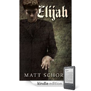
Matt Schorr's Elijah caught my attention when it was featured at Kindle Nation Daily last year. The description of the book intrigued me, so I picked it up then, but only recently got around to reading it. From the description on Amazon:

One Lord. One faith. One baptism. These are the dictates that rule Antioch, a small, rural community tucked away in the hills of Kentucky. There is no dissension. No discord or strife. All of Antioch's citizens gather each week without fail at one church. One church and no other: ChristPoint. The Rev. John Joshua Hutchinson serves as pastor for the church and indeed the entire community. As Antioch's sole spiritual leader, he holds near-absolute power over all who live there. But that's about to change. A mysterious stranger is about to enter Antioch, an unassuming man with a stranger power all his own. His name is Elijah, and he wields a power like no one in history--save one. But who is he? What is he? Can he be trusted? Elijah's presence will challenge not only the power Rev. Hutchinson holds over Antioch, but also the mindsets of everyone in his community.

I'll admit that I found the idea of the story better than the actual book itself. This is Schorr's first published book from what I can tell, so perhaps we should cut him some slack. This book had potential, but its flaws keep it from reaching them.

Certainly, the idea of a mysterious stranger from out of town, arriving to save the community from a local tyrant is not a new one. We've seen that in plenty of westerns. In fact, in case the reader misses the connection, Schorr even mentions the genre at one point in the story:

"Nathan had lain down on the sofa, and Joshua found something on television he liked, some old movie on cable starring the legendary Clint Eastwood Joshua didn’t recognize.   Nathan was plenty eager to see it.  He’d always loved westerns, especially the 'spaghetti westerns' that starred Eastwood.  'Give the Duke his due,' he’d once told Joshua, 'but the Man With No Name’s the best cowboy that ever lived'" (Kindle Location 4802).

And that is part of the problem with the book--it tells us too much. Like a kid having to explain his joke in case his listeners miss it, Schorr fills in too many of the blanks for us.

An example of this is at the end of the story, when we're given a summary of the future for every principal character like the ending of a National Lampoon movie. It's not even enough to know that one character is dead. Schorr writes, "Afterward, they had the body cremated.  And neither Lori nor Elijah ever learned what became of the ashes" (Kindle location 5397). Really? I'm not certain what became of my Uncle Edgar's ashes. Does this matter? And considering one of the characters mentioned in the above quotation leaves town soon after the events of the story, not knowing whatever became of the ashes makes little sense.

By itself, an example like the one above may sound picky, but the book is full of clichés and throwaway details such as this which should have been trimmed from the final story. Even the final scene contains a cliché, which could have possibly worked, but Schorr makes the mistake of bringing too much attention to it with the very last sentence.

In regard to the mysterious-stranger-arriving-in-town genre, the story always works best when the stranger remains mysterious. Yet in Schorr's story, we're given the entire backstory of the Elijah character. And not just his story--we learn his father's story, too. In countless movies and books, we've probably often wondered about the background of "the mysterious stranger," but Schorr gives us so much detail here that the enjoyment of the story is significantly lessened.

Perhaps Schorr could be defended by saying the backstory humanizes Elijah. Yet the problem remains that this character has unexplainable supernatural abilities. If the reader were left wondering at the end if perhaps Elijah was an angel, an alien, or the return of his biblical namesake, the story would have probably worked much better. 

The town's pastor, Joshua Hutchinson, is the story's primary villain. Schorr works hard to make certain he is a complex character, and he is, in fact. The pastor's history is intertwined with that of another main character in the story. His desire to be God's servant seems genuine, but like all of us, he's quite flawed. Unlike all of us (but certainly some of us), he's a bit of a narcissist. 

After his rise to power in the community and ultimate control, the pastor becomes more concerned for his own kingdom instead of God's kingdom. "The good Reverand [sic] wasn’t interested in spreading God’s message; he wanted everyone to listen to his message.  And only his message.  The only strength he was interested in was his own" (Kindle location 4864).

Of course we've all known or heard of pastors like this. They can be incredibly destructive to their faith communities, especially when the church becomes little more than a personality cult and their own personal playground. Unfortunately, Schorr doesn't really give Joshua any room for redemption. Unlike the flawed pastor portrayed by Robert Duvall in the movie The Apostle, the pastor in Elijah continues on a downward spiral with no hope of redeeming himself from his mistakes. This kind of plot course can often make for good tragedy, but only if the character has positive qualities in the beginning. Schorr never really presents Joshua with these. More on this subject in a moment.

A lack of parallel atrributes between the story's protagonist and antagonist bothered me, too. Elijah is clearly a mysterious character whose mysterious ability to heal is given numerous treatments by Schorr to demonstrate the supernatural aspect of it. Elijah offers no explanation for this power other than what he was told by his father, whose sanity we have great reason to doubt. Although Elijah is a bit of a seeker, the implication is that his power is from God whether he understands that or not.

Joshua, on the other hand, also demonstrates a seemingly supernatural ability: he has managed to merge all churches in his town into one non-denominational mega-church. He's presented as an extremely charismatic individual, capable of controlling the hearts and minds of all but a very few of the townspeople. Yet in the scenes of the book in which he plays a prominent part, he comes across--at least to me--as a bit wormy. If portrayed correctly, he should be attractive to the reader as well. 

For example, in the Bible King Saul is presented as a truly tragic (in the literary sense of the word) character. The close reader is drawn to him and identifies with the prophet Samuel's viewpoint, wanting Saul to do well. But like Samuel, the reader is let down and even saddened when Saul falls out of God's favor by his own actions and weak character. Schorr's story could have been much more powerful if he had portrayed Joshua in this way, but that never happens. The pastor remains the villain from the beginning. 

Moreover, if Joshua is not a naturally charismatic character to the reader, then how did he unite all the town's churchgoers under his pastoral reach? I mean, I live in a small Kentucky community, too, where the Methodist church is across the street from the Baptist church; and the Church of Christ and the Disciples of Christ churches are within walking distance of the other two. I honestly cannot imagine all four of these churches coming together under one individual if they can't even come together for a community Easter sunrise service anymore. 

So how did Joshua possibly gain control over all but a handful of believers in his small town? Hints are dropped along the way that he has a near-supernatural control over townspeople, but this is never really explored by Schorr. If it had turned out that Joshua had made some kind of literal deal with he devil early on in his ministry, his success of attraction would have been a good counterbalance to Elijah's ability to heal. This would have also worked nicely with Joshua's continued insistence in the story that Elijah's supernatural ability to heal came from his being a false prophet. There would have been a fitting element of irony if it turned out in the end that Joshua himself was actually the false prophet. 

Yet in the end, Schorr doesn't capitalize on any of these kinds of plot points that seem to be so readily set up in the story. It's one thing to diverge from standard plot devices to surprise the reader, but that only works if the alternative outcome is equally satisfying. And that just didn't happen for me in Elijah.  

Although Matt Schorr lives in the same state I do, I don't know him. However, if I had to armchair psychoanalyze his story, I'd have to guess that he is someone who grew up going to church (his knowledge of churchy vocabulary and dialogue indicate this), but at some point grew to distrust organized religion, perhaps because of a bad experience with a very controlling pastor or other religious authority figure. Thus, his book Elijah plays out like a spiritual revenge fantasy. The premise for the story is a good one, but unfortunately, it does not live up to its potential. 

On a more positive note, I often find in self-published books frequent grammatical errors, misspellings, comma splices and other issues that continue to indicate to me that good editors are still needed. However, other than the misspelling indicated in one of the quotations above, I found Schorr's book to be quite clean in this regard. Nevertheless, it's too bad Schorr didn't have access to someone who could trim extraneous information and smooth out incomplete plot devices. 

Saturday
Dec172011

Kindle Fire: A Bulleted Hands-On Review

I've had a Kindle Fire "loaner" for the past three weeks or so, and before I have to give it up tomorrow, I thought I'd write down some thoughts. I'll start with the more positive aspects and gradually merge my way into some caveats and concerns.


  • For what it is—a $199 customized Android tablet—the Kindle Fire is fantastic. Although Amazon has set a new price point with devices of this size, all reports indicate that they're losing money on each Fire, while presumably making it up on content. As long as expectations aren't greater than reality, the value of the tablet is a good deal.

  • I have not had the wifi problems with my Fire that some people have reported.

  • Some have reported the Kindle Fire is too heavy. I remember hearing similar things about the iPad when it was first released. To all these folks, I want to suggest a gym membership to go with their New Year's resolutions to get in shape. I will say that the Kindle Fire feels very solid, unlike some of the cheap-feeling tablets near this price point and even higher ones.

  • Streaming video services like those of Amazon's own Prime or Netflix (which is an app that can be added to the fire), significantly add to the value of the device.

  • The Kindle Fire might be the perfect device for a child not quite old enough to have a cell phone. I think in the right context, kids could make a lot of use out of the Fire for all it's major intentions: reading, music, video and games. Kids who are casual gamers will genuinely appreciate the screen, which is larger than that of an iPod Touch or Nintendo handheld.

  • One caveat for parents who want to give a Kindle Fire to a child: parental controls are very limited as compared to an iPad. There's very little to stop a child from purchasing books, apps, movies and music and a parent's credit card could get maxed out pretty quickly. Of course, I'm certain that Amazon will improve parental controls over time, but until then a Kindle Fire for a child ought to come with a discussion about responsibility.

  • I have not used the Fire with a cover, although I'd probably recommend one for sake of protection. However, without a cover, it's still small enough to fit inside an inside jacket pocket, but the addition of a cover might make the pocket a bit snug.

  • There was an initial moment of delight, when after entering my Amazon credentials, the device immediately populated with books, music and other media I've bought from Amazon over the years. If you're already in the Amazon "ecosystem" of digital content, the Kindle Fire will be highly personalized for you from the moment you begin using it.

  • With only 8 GB of storage, the Fire truly is designed to be a cloud based device. There's no "Archive" for my books. Rather, all books are on the "carousel" on the homescreen. If I want to read one, it is downloaded by touching it. Make certain that if you are planning to travel with the Kindle Fire and want to watch movies on it, you have verified the videos are truly downloaded and can be viewed without a connection to the internet.

  • Although my feelings are generally positive about the Kindle Fire, there's no practical reason for someone such as myself, who already owns an iPad and uses it heavily to get a Fire. I've got an iPhone (smaller screen) and an iPad (larger screen), and I simply can't figure out what I'd do with an in-between screen on a regular basis. And as regular readers of This Lamp already know, when it comes to reading ebooks, I prefer the E Ink Kindle, even over the iPad.

  • There's already a lot of quality apps available for the Fire in Amazon's curated app store. Note also there is a setting in the Fire's preferences that allows other Android apps to be installed. So, yes, that means that the Kindle Fire can not only read Amazon Kindle book titles, but if the Nook app is obtained by means outside Amazon's app store, titles obtained from Barnes and Noble can be read, too.


Above: Olive Tree's BibleReader app displaying a tagged Hebrew Bible on the left and the Brown-Drivers-Briggs lexicon on the right.


  • The Kindle Fire is even more zen-like in its simplicity than the Kindle Touch. Whereas the Touch has only two buttons, the Fire just has one—a power button. The Home button, ubiquitous on all other Kindle devices, is found only on the screen in nearly all applications.

  • As many have reported, because Amazon places the power button on the bottom, it really is easy to accidentally turn the Fire off while it's being used. Getting a cover for the Fire will probably solve this problem.

  • Although Amazon supposedly isn't targeting the Kindle Fire toward potential iPad customers, it will undoubtedly encroach upon Apple's lowest-cost iPad. And despite the fact that Apple says 7" tablets aren't as functional, I feel certain that they will release a 7" iPad in addition to their regular lineup, sometime in 2012.

  • If you're trying to decide between the Kindle Fire and the iPad, carefully consider what you intend to do with the device you choose. Early critics of the iPad panned it as merely a content-consumption device, not made for real work. Then people began creating content and doing real work on the iPad, significantly changing its perceived pupose. I could be wrong, but I don't expect this to happen to the Fire. I really feel it's going to primarily remain a device for media consumption—books, music, video, and games. If you think the Fire is going to be a laptop replacement or even an iPad replacement, you're probably going to be disappointed.

  • Related to the above point, when the Fire was first announced, Seth Meyers, on SNL's weekend update, said of the Fire, "It's expected to sell well among parents who always buy the wrong thing." That may or may not be true. But think carefully before buying a Fire this Christmas for someone who actually wants an iPad.

  • The Kindle Fire's screen isn't always as responsive as an iOS device, but this is true for just about every Android device I've ever used.

  • Although the Fire can receive and send email, like a mobile phone, it's not practical for extensive correspondence. Turned vertically, the keyboard works only with thumb-typing; and turned horizontally, the keyboard is still smaller than the tiniest netbook keyboard and can be an exercise in frustration. What's worse, when turned horizontally, only one line of edited text can be seen at a time.


Above: the Fire's email app in vertical orientation. Thumb-typing is going to work best here.

Above: email app in landscape orientation. The keyboard is bigger, but you're not going to be touch-typing. And you can see only one line of the text you're writing.


  • I didn't spend a lot of time in the Fire's "Silk" browser. It's fine for what it is, and it's better than browsing the web on a mobile phone, but I would not want to spend long amounts of time using it. If a website offers a mobile version of its content, you'll definitely want to use it when viewing via the Fire.

  • While I do believe the Kindle Fire is going to be successful, it probably won't be as successful as some might have initially thought. Millions of Fires were pre-ordered, no doubt simply based on Amazon's good reputation in regard to its previous line of Kindles. But now I'm reading reports of the Kindle Fire being returned for various reasons. Some have returned it for technical problems, while others may have simply realized it wasn't as useful as they initially thought. My concern is that for many people, after the newness of the Kindle Fire wears off, it might be shut up in a drawer and rarely used at all.

  • There's no video-out on the Fire, which is too bad. It would have been a nifty device to connect to a projector for classroom use.


Would I recommend the Kindle Fire? Absolutely, but the buyer should think about what he or she wants to do with the device and make the decision based upon whether the Fire will handle those needs. Again, it's a great value for $199, but don't be fooled into thinking it's going to match the features of larger tablets, let alone notebook computers.

Wednesday
Dec072011

Amazon Kindle Touch 3G: Hands-On Review


Above: Kindle Touch with Lighted Cover displaying the SBL Greek New Testament from OSNOVA

I've said it was the iPad that sold me on the idea of valuing ebooks over physical books (in most situations). However, after I was convinced that ebooks were the way to go, I didn't simply intensify my reading on the iPad; no, I turned around and bought a Kindle. At the time, that device was known as the "Kindle 3" (now known as "Kindle Keyboard"), and it became an indispensable part of my life and routine. 

Although I've always been a strong reader (so declared by my elementary school teachers), like a lot of people, I can honestly say that I read more because of the Kindle. It's so highly portable, I can carry a library of books with me in a jacket pocket allowing me to read at any point of the day—especially those unplanned times of waiting for something or someone that we all regularly find ourselves in. 

The Kindle didn't cause me to give up my iPad; in fact, because there's a Kindle app on the iPad, and because I depend on my iPad now for so many other things, if I had to choose between the two, I'd reluctantly give up the Kindle and keep my iPad. Yet I'm glad that I don't have to make that kind of choice. For periods of reading longer than 10 minutes, I find the E Ink screen of my Kindle highly preferable to reading on the iPad. Reading the Kindle instead is like reading paper vs. reading a computer screen—it's simply easier on the eyes for extended sessions.

In the time I've had my Kindle, I've observed a very interesting phenomenon when I hand it to the uninitiated for examination. Almost without fail, anyone who handles my Kindle immediately touches the screen or tries to swipe it to turn the page. I think we can safely call this "the iPad effect" because Apple's tablet has definitely changed our expectations for the way we interact with our devices.

Thus, I knew for the last year that a touchscreen Kindle was inevitable, especially after Barnes & Noble released their own touchscreen E Ink Nook (see my review here) a few months back. When Amazon announced the new Kindle Touch, I immediately put in my order. This was in spite of the fact that the new Kindle Fire, announced at the same time, received much more attention from the press and customer anticipation.

I was out of town at ETS/SBL when my new Kindle Touch arrived. Although I had to wait a few more days than some to get my new ereader, at least I had my trusty Kindle 3/Keyboard to bide my time. And then, in my time of waiting, I started reading reviews of the Kindle Touch and was surprised to see how many of them were negative. Quite a few reviewers, who had been longtime Kindle aficionados, spoke of returning the Kindle Touch simply to stick with the previous model.

After finally getting my hands on the Kindle Touch, I saw what so many had been so upset about: although a touchscreen Kindle is a welcome advance to most, the reality is that the interface on the Kindle Touch is much less intuitive than that of any of the previous non-touch-interface Kindles.

This is pretty understandable. The interface of the previous models is fairly clear when there are buttons labeled "Back" and "Menu" on the front of the device. However, with only two buttons on the Kindle Touch—the Home button (which looks like a grill more than a button and is labeled in no way at all) and a power button on the bottom—the user essentially had to figure out everything on his or her own.

My original Kindle 3 (now called Kindle Keyboard) on the left and the new Kindle Touch on the right.

Of course, that's not entirely true. Upon powering up the Kindle Touch for the first time, there are three "tip" screens that offer an explanation of the vast majority of how the eReader works.  

Screenshot above: Tip #1 that shows the "zones" on the Kindle Touch for moving to a next page or previous page. Note that the next page zone is much larger because there's an assumption that one advances a page more often than going backwards. There are no physical buttons for page turning as their are on previous Kindles or the Nook Simple Touch.

Screenshot above: Tip #2 shows the zone for accessing the Kindle's interface from within any book being read.Screenshot above: Tip #3 explains how to work with titles from the Kindle's home screen.

However, if the average user is like me, I quickly moved past those screens, wanting to simply "jump in" and explore the device for myself. Later, after downloading a few hundred books from my personal Kindle library, I realized how valuable those early help screens really were, but I wasn't certain how to get back to them (FYI: they're in the Kindle User Guide on the device). 

Again, most of what one needs to know to navigate the Kindle's interface is available in the above three tips, but if someone is very familiar with previous Kindle generations, the new way of doing things may seem confusing. Below are some more screenshots that demonstrate the new way to interact with the Kindle.

Screenshot above: the new touch-based interface home screen

As you can see in the image above, not too much has changed for the Kindle home screen with the exception that there are buttons at the top of the screen instead of a text-based interface as with previous Kindles. The leftward-pointing arrow serves as the back button throughout the device, and the shopping cart takes the user straight to the Amazon store, making new purchases both quick and easy.

However, the interface is not consistent. On the previous Kindle, if you wanted to change sorting order among the Most Recent, Title, Author and Collection options, you used the five-way controller until you reached the text displaying the way the list was currently sorted. On the new Kindle, I saw no button for this function; nor was it an option on the menu. I suppose there's a "Duh!" kind of logic to the fact that now, to change the order, all I had to do was touch that text to bring up this screen:

Screenshot above: sort your books by any of the four options.

Nevertheless, this means that some options on the Kindle are chosen by touching a button and others are made by touching text. This is not immediately apparent unless one has studied the user guide. Another inconsistency (from my perspective) had to do with advancing a page. As already mentioned above, when reading a book, to advance the page, all one has to do is to swipe or even just touch the larger zone on the right of the screen. However, I found that when viewing my list of titles (such as seen in the two images immediately above, a touch or a right-to-left swipe resulted in opening a title. Instead, to advance to further pages of titles, I had to swipe in a vertical motion from the bottom of the screen upwards, thus advancing to the next page.

Now, it could be argued that this makes sense because these titles are a list and not actual "pages." However, note in the screenshots above that the Kindle reports that I am on "Page 1 of 75." If I turn a page one way when reading a book, I'm inclined by sheer habit to turn any other page the same way, even here on the homescreen

Opening a title is as easy as simply selecting it by touch, allowing it to open to the last read page. As with previous Kindles, if you read your Kindle titles on more than one device, a message will pop up asking if you want the device you're holding to be synced to the furthest location read on the other device. This is fine unless you are reading the same title with a family member using the same account. 

Screenshot above: A basic view of the Kindle Touch's screen when reading a book.

If you're reading a book and want to access the Kindle's options, tap the top of the screen, which will result in this view:

 Screenshot above: page with interface displayed

For my purposes, the greatest advantage that the Kindle Touch brings relates to making personal notes on a book with greater ease. I had actually become pretty swift at taking notes on the Kindle 3's physical keyboard, but it was a pain to have to hit the symbols button to bring up a separate screen for any numbers or punctuation, and then remember to get out of the symbols screen before saving the note. I will still use my iPad or MacBook Air if I need to make extensive notes on a title, but the addition of a virtual keyboard is a great improvement overall for those of us who enjoy annotating what we read with our own thoughts. 

Screenshot above: editing a note with the virtual keyboard is much easier to do than with previous models. Unfortunately, there's still no spellchecker to catch the mistakes I made above.

I should also note that it is much easier to select text for highlighting or notetaking on the Kindle Touch than on the Nook Simple Touch, where it's quite frustrating, even after a software update a few weeks back. As neither device has a "true" sensor-based touchscreen (an infrared sensor tracks your finger movement on both), I assumed the awkward text selection on the Nook was merely a result of the infrared technology; however, selecting text on the Kindle Touch is quite easy and works as I would expect it to. Evidently, the problem on the Nook lies within its software. 

Regarding the physical aspects of the Kindle Touch, like the other Kindles of this generation (i.e. the Kindle 4 and the Kindle Fire), I find that Amazon if finally making hardware that doesn't look like a device Apple would have made in the nineties. It is sleek and minimalist in design (perhaps too much so) with only two buttons: the home button under the screen (which doesn't look like a button) and the power button on the very bottom of the device. 

Placing the power button on the bottom of the device is clearly a mistake. On previous Kindles, there was a slider that kept the device from accidentally being turned on and off. However, on both the Kindle Touch and the Kindle Fire, having a power button on the bottom makes it far too easy to turn the device off while using it. In fact, when attempting to take photographs of the Kindle Touch and the Kindle Fire for this review, I had to place a thick cloth under them because the sheer weight of the devices (which is not a lot—especially for the Touch) kept turning them on or off. And when the device is standing on end and the button is held down, it will actually reboot after a certain amount of time.

Above: the Kindle Touch on the left and the Kindle Fire on the right.

I believe I will also miss the page advance and back buttons from my previous Kindle. As you can see in the picture at the very top of this review, I tend to hold the Kindle in such a way that to advance the page, I will now have to move my thumb or finger across the text to advance it. This causes a problem because I read fast enough that I'm used to hitting the page advance button as I'm on about the next to last line, allowing my eyes to see the remaining text while advancing to the next page. Now, I have to wait until I've read the bottom of the page to advance, which actually makes me read a bit slower. Ultimately, I imagine I'll just have to get used to turning a page differently, perhaps by touching a higher part of the screen. 

In the other side of the fence, when B&N released the Nook Simple Touch earlier this year, they opted to keep the page back and advance buttons, thus making the Nook a bit wider than the newer Kindles, which is taller. Although a Nook Simple Touch can be advanced by touching the screen, too, after reading a few thousand pages on the device, I found myself preferring the buttons for the reason described in the paragraph above. I can appreciate Amazon's desire for minimalism, but they may have sacrificed functionality for the sake of clean design.

Above: the Kindle Touch on the left and the Nook Simple Touch on the right (page buttons and all!)

Also gone from the external shell of the Kindle Touch are the volume controls, which are now fully on screen. This, too, may be a loss of functionality for sake of design. With the Kindle 3, I could have my ereader in my pocket, listening to it via headphones; and if I needed to adjust the volume, I could do so simply by feel. Likewise, if I needed to pause it, I could hit the spacebar (the largest button on the keyboard). Now, I'll have to physically remove the device from my pocket and look at the screen to adjust the volume or pause text to speech or an audio recording.

Screenshot above: text to speech controls (accessible from the menu button)

Of course, I've never understood why Amazon doesn't make all of their Kindles compatible with Apple's earbuds, which include volume and play/pause controls. The Kindle does not come with headphones of its own, but almost everyone has a pair or two of Apple's earbuds (love them or hate them) from all the iPods and iPhones sold over the years. This is what I use when listening to my Kindle (technically, I use the slightly more comfortable Apple in-ear headphones with controls and mic), but I've been shocked to discover that these do not work with the Kindle Touch—I could hear no sound at all through them—even though they worked fine on my Kindle 3. I've not taken the time to plug in a generic set of headphones (do I even have any?) to make certain that it's not a faulty sound jack, but if it's not, I do not look forward to having to carry around a second pair of headphones to accommodate the Kindle.

Not much needs to be said about the 3G capabilities of the Kindle that hasn't been written about elsewhere. My previous Kindle was wifi-only, but there were a number of instances over the past few months when I wanted to access a book either from my archives or purchase from the Amazon store; or I just wanted to share something I'd read on my Kindle via Twitter or Facebook, and I couldn't get online to do it. I've also found that in some public locations with wifi, certain login screens don't work with the Kindle browser, which is unfortunately still "experimental." So, I opted for the 3G version this time, and I'm very satisfied with my choice. I did not get the Kindle edition with special offers, but considering I'm not overly excited about the new batch of non-authorial sleep-mode images, I may turn that option on every now and then to see what specials Amazon is running. 

There's a part of me that feels a twinge of guilt to think about devices such as this as a consumable product—to already be thinking about the next model. Yet, I believe the current Kindle Touch is going to be a transition device for Amazon, moving from an era of keyboard based E Ink ereaders to one that is solidly touchscreen based. I'm certain that Amazon will continue to make E Ink Kindles (with color E Ink as the next major step), and we'll see a successor to this Kindle Touch in a year or so. In that time, Amazon needs to rethink some of the flaws in the current implementation. Does this device really need to be so minimalist? Even the iPad has external, physical volume controls! Would it be so bad to have optional page navigation controls external to the screen as the Nook Simple Touch does? 

Of course, what really needs the most work is the touchscreen interface. Maybe it's because I was so used to Kindle 3, but the Kindle Touch's interface is not only not as intuitive, it also seems to be less straightforward than the interface on the Nook Simple Touch. There's definitely some work to be done here, and no doubt Amazon will learn from their mistakes and correct the Kindle Touch's shortcomings in next year's release. 

No, I'm not sending my Kindle Touch back as some have done. I assume I'll get used to the changes in the interface, and I'll have to train myself to somehow turn pages differently and not set the device down on a surface that will accidentally turn it off (my new lighted cover will take care of the latter). I have not had trouble with slow page turns as some have reported. When I briefly owned the Kindle DX, I realized that I was not going to be able to use it instead of my Kindle 3 because I lost functionality with it. I can't see where I've lost any functionality with the Kindle Touch with perhaps the exception of not being able to select text from one page to the next. However, this could easily be fixed by Amazon in software; and for right now, I've found that if I change the size of the text, it re-wraps the page allowing me to select the content that I need to.

I've also read complaints concerning how easy it is to lose one's place if the Kindle is laid face down in bed. Since the screen uses infrared tracking to note movement, anything can trigger a page turn, even wrinkles in a bedsheet. But this is not new to the Kindle Touch. I had the same issue months back with the Nook Simple Touch (but I don't remember hearing the same complaints so loudly). The solution is simple (no pun intended): like a lot of the differences with the device, you simply learn to change a few habits, including laying the Kindle Touch face down on the bed without turning it off first.

There is another Kindle out called unofficially the "Kindle 4" and officially just the "Kindle." Some have preferred it to the Kindle Touch because of the problematic issues with the latter I've described above. Unfortunately, the low end Kindle would never work for me because it does not have sound or a convenient method for adding notes—both of which I use regularly. So this Kindle Touch is a keeper for me in spite of its issues. However, if you are quite satisfied with an earlier Kindle, such as the Kindle 3/Keyboard, you might consider waiting another year before upgrading. 

Since this review is running long, I'll save my thoughts of the new Kindle Touch Lighted Cover and Kindle Fire (which I have as a temporary loaner) for separate posts in the next few days.

As always, your questions, thoughts, comments, and rebuttals are welcome in the comments below.


Wednesday
Sep072011

Hands Down: The Best Kindle Bible Experience Comes from OSNOVA

OSNOVA Blog
OSNOVA Store 

A few months ago, I was talking to a fellow about using the Bible on an eReader. This just happened to be on a Nook, but the problem applies just as much on a Kindle. He said, "I was trying to follow you, but every time you referred to a particular passage, you were already on to something else by the time I got there." 

If you've done anything more than straight reading of the Bible on a Kindle or Nook, you can probably feel his pain. As a child, I was taught in Sunday School that the book of Psalms is right in the middle of the Bible (physically speaking). I knew I could open my Bible to the midway point and find myself in the book of Psalms. However, this obviously cannot be done with an ebook version of a Bible. I can't flip pages past the middle to find Obadiah. And it seems that the larger any ebook is—and Bibles tend to be large—the more difficult it is to get around. Of course you can set bookmarks and the like, and most ebooks of any decent quality has at least some kind of table of contents, but navigation is rarely ever quick

Enter Illya Antonenko, whose bio on osnova.com reads "the husband, the father: originally from Ukraine; born again in 1991. Perpetual student, avid reader, fascinated with gadgets." If it's true that there's a fine line between skill and art, Illya is walking that line when it comes to the method he developed for navigating large books (such as the Bible) on the Kindle. This method is called "Direct Verse Jump" or DVJ for short (the more recent titles have been further streamlined to "Direct Verse Jump 2," or DVJ2). 

So, if a Kindle user wants to go directly to a verse, in many non-OSNOVA Kindle Bibles, he or she would have to go to the menu on the Kindle, then table of contents, then scroll through the pages until the book of the Bible sought after appears. Some ebook Bibles have chapter numbers listed, but I've seen other Bibles in which the Contents merely takes one to the first chapter in the selected book. With OSNOVA's DVJ, a specific verse can be accessed directly by typing in an abbreviated form that works with the Kindle. So, if I want to go to Romans 1:17, I'd type ro 1 17 and the Kindle immediately jumps to that location in the Bible. 

Illya has created a series of tutorial videos with resolutions up to 1080p, which means they can be played at full screen with clarity. In the video I've embedded below, Illya demonstrates the direct to verse method I described in the paragraph above.


While this still isn't as fast as merely flipping pages in a physical Bible to arrive at one's destination, OSNOVA Bibles even allow for quick navigation within the body of the text. The Kindle's five-way controller can be used to navigate from book to book or chapter to chapter:

OSNOVA sells other works such commentaries and public domain works like Calvin's Institutes. The navigation in these kinds of titles is also more advanced than the average Kindle book:

So far, none of the more prominent Greek New Testament editions have appeared in ebook format. Neither the United Bible Societies nor Zondervan (who produces a popular reader's edition) have brought their Greek New Testaments to the Kindle. Yes, one can find a few quickly published Greek texts from public domain sources on Amazon, but these are mostly of poor quality. I can say without reservation that currently, the best place to get a Greek New Testament of any kind for the Kindle is through OSNOVA where the recently released SBL Greek New Testament can be obtained for free, as well as the Robinson-Pierpont Byzantine Textform 2005. Both of these offer Direct Verse Jump navigation, as opposed to the 99¢ SBL Greek NT, published by Logos on Amazon has only basic table of contents navigation. 

Most of the OSNOVA titles that are on Amazon's website or in the OSNOVA store are public domain works, but OSNOVA also formatted the NET Bible for Bible.org. A handful of other Kindle Bibles use the exact same Direct Verse Jump method developed by OSNOVA, albeit not coded by Illya Antonenko or with attribution given to OSNOVA. These include titles such as the ESV Bible and the Hebrew Bible (Tanakh), which I reviewed earlier this year. Illya does not begrudge others from using his method of navigation in their titles and actually encourages it. However, with most eReader Bibles so difficult to navigate, the major Bible publishers out there should sit up and take notice—and perhaps even contract work out to OSNOVA. In fact, I've heard from a mutual friend that Illya has a very quick turnaround and implemented Direct Verse Jump to the SBL Greek NT in less than 24 hours!

Of the titles that are on the OSNOVA website for sale, it's true that these same works can often be obtained for free from Amazon.com. However, I've found the hard way that free implementations of public domain works on Amazon often give me about the same value that I paid for them. If any of the titles from OSNOVA happen to be personal favorites, consider picking up a copy there knowing that it will not only be cleanly edited, but easy to navigate as well. 

As a touchscreen Kindle is surely in the works from Amazon, I'll be interested to see what future versions of DVJ look like. Even with a touchscreen, navigating an ebook is not a quick task and something creative is required for quick access. I have no doubt that OSNOVA is up to the task.

Notes:

  1. OSNOVA also sells a lesser number of epub titles for the Nook and other epub readers.  
  2. In the interest of full disclosure,  Illya Antonenko opened the OSNOVA store to me, and I was able to examine a number of his titles for no cost. However, before that occurred, I had already purchased with my own funds the NET Bible prepared by OSNOVA from Amazon.


As always, your questions, comments, thoughts, and rebuttals are welcome in the comments for this post. 

Wednesday
Jun152011

The Empty Book Bag, Version 2.x

Some of you may remember that I presented a session at IWU's "No Educator Left Behind" conference last year on the use of the iPad in the classroom. This year, I expanded that topic to include a discussion of eReaders. My new session was titled "The Empty Book Bag, Version 2.0: Digital Instruction Using Tablet & eReader Technologies."

Below is a video of this year's session, which I presented on June 3, at the Indianapolis campus of Indiana Wesleyan Univeristy. If you have an hour to kill, enjoy!


As always, your thoughts, comments, questions, or rebuttals are welcome in the comments.

Tuesday
Jun142011

Review: B&N Nook Simple Touch

I won't drag out any suspense to the end: I like the new touchscreen Nook from Barnes & Noble. It's not a perfect device, and there are some aspects that B&N needs to address, but it has great potential and already does a few things better than its competitors. This new Nook incarnation has been positioned by Barnes & Noble to squarely take on the dominance of the Amazon Kindle, which currently controls about 65% of the eBook market, with the Nook coming in second at 25%.

I never owned the first generation Nook, so this review will not spend much time comparing the two beyond a few anecdotal notes told to me by those who had the earlier eReader. However, I will compare the new Nook to Amazon's Kindle, which is where the most significant comparisons rest anyway. Would I recommend the Nook over the Amazon Kindle? Maybe, maybe not. That's a tough call and would certainly depend upon the needs of the user. I now have both, but I realize that most people will choose one platform or the other.

For the record, there are some aspects to the Nook that I actually like better than the Kindle, including its much more modern interface, which is enhanced greatly by a touchscreen. There are clear advantages to a touchscreen with these devices, and I've looked on amused when someone asks to look at my Kindle and immediately tries to turn a page by swiping at the screen. This assumption that all such devices have touchscreens is undoubtedly the influence of the iPad. For better or worse, touchscreens are here to stay. Will the next Amazon Kindle have a touchscreen? Undeniably; I have no doubt of this, although I'm certain that some current Kindle owners will be resistant. But if you want a touchscreen dedicated eReader right now, the Nook is the clear and easy way to go.


The "Home" screens for the Kindle (left) and Nook (right) suggest a difference in philosophy regarding what a home screen is in the first place.

Early descriptions of the Nook described it as only having one button. This is not quite true. It has a power button on the back and a home button on the bottom front in the shape of a lower case n (which looks like an upside down capital U). In addition to these, there are four raised strips, two on each side of the screen, that serve as page forward and page back buttons. These are not required to "turn" the page, of course, since a page can be advanced (or reversed) simply by touching the edge of the left (reverse) or right (advance) sides of the screen. Swipe motions in the corresponding directions can be used as well.

If you're a regular reader of This Lamp, I know what you're thinking: "Wait...you've got an iPad, you've got a Kindle...why on earth would you want (let alone need) a Nook?" That's a fair question. I've written previously about how it was the iPad that actually made me decide to get a Kindle, and in getting the Kindle, I became sold on reading an E Ink screen for straight reading of ebooks. But thanks to the iPad, not only did I accumulate Kindle-formatted books, I also built up a library of about 40 books in the Nook app for the iPad. It was great to have these books, but I had no desire to read them on a backlit screen. My preference for e-reading is now solidly colored in E Ink.

The Good
Physically, the new Nook is a radical departure from its predecessor in both look and navigation. And although it's not more than a millimeter or two wider than the Kindle, it seems like it is significantly wider. Both the Nook and the Kindle have 6" screens, but the Nook's lack of a physical keyboard, which shortens its length, makes for a very different device. This Nook is shorter. It fits into the hand differently, especially with its concave backing, which allows for a comfortable one-handed grip with little concern for dropping it. Like the Kindle, the Nook can easily slide into the front pocket of Dockers-like pants.

The "Library" screen. Pardon the fingerprints.


The wider bezel is a lesson that touchscreen makers have learned from the iPad, which was initially mocked when first displayed. Yet the reality is that a touchscreen quickly loses its value and becomes a source of frustration if there's not ample room to grip it without accidentally touching the screen, resulting in unintended behavior.

The shell of the Nook, both front and back, is essentially a type of rubber. It's soft and could doubtlessly withstand much more abuse than the average eReader. In fact, this Nook may not even need any external case as its natural covering is tough enough, and the device itself begs to simply be held without anything extra. Nevertheless, I bought a case so as to protect the screen, but I imagine that many will decide it's not necessary.

In fact, when I see the new Nook, the way it's designed, the rugged materials from which it's made, I can't help but think that B&N is not simply trying to create something more clever than the Kindle. Rather, they're also designing the perfect eReader for students—especially young students who would throw them in a backpack to be tossed and dropped throughout the day. Honestly, I believe the new Nook would stand up to much greater abuse than the current Kindle 3.

In spite of the Nook's rugged design, I bought a cover for it, primarily to protect its screen when I'm transporting it; although the screen itself is recessed, which will undoubtedly add a level of protection of its own. All of the cases made by B&N declare that they give full access to all of the Nook's controls. I initially thought this wasn't true as having the Nook in its case seemed to block access to the power button at the top back of the device. Then I discovered that the case includes a Nook symbol on the back, positioned right against the power button on the Nook. The Nook symbol on the case conceals an extra layer of what is probably plastic that enables the user to press on the back of  the case to turn the Nook on or off.

I got my Nook a few days before I bought a case for it. Early on, I noticed two cavities on the top of the Nook and two more on the bottom. I thought that perhaps these were present to allow taking the device apart if it needed to go back to B&N for repair. However, when I got the case, I noticed immediately that the Nook is held in place by hooks that use two of those cavities. I found that to be quite ingenious, and it shows me that B&N has really thought through the details of this new eReader.

A few months back, I spent some time in a physical Barnes & Noble store looking over their first generation E Ink Nook. I'll be honest: I hated it. You may remember it as this odd combination of an E Ink screen on top with a color LCD screen for navigation on bottom.  I respect B&N for trying to be innovative, but the original Nook was just an exercise in frustration (although admittedly it did/does have its fans). I decided to wait, and I'm glad I did. B&N announced their new Nook on May 24 with promises to ship them by June 10. In a surprising case of "under promise and over deliver" (I mean, when does anything in technology ever ship early?), many who pre-ordered the new Nook (including myself) began receiving them in the first two or three days of June.

Options for adjusting the reading experience.

People often praise the Kindle's interface with phrases like "zen-like simplicity" (really, they do). And in truth, I appreciate the Kindle's basic, non-complicated approach. However, when looking at the home screen of the two devices side-by-side, the Kindle begins to look a bit long in the tooth compared to the second generation Nook.

On the Nook, whether looking at the home screen, looking at one's library (which is different from the home screen), or shopping for new Nook titles, every screen is a combination of text and graphics. The library has tabs and drop down menus. The home screen has a rotating, animated advertisement of recommended books. I'm sure that some Kindle diehards will be aghast by this, but this interface comes across as neither intrusive nor overly busy. It's intuitive, and perhaps even more intuitive than the Kindle's menu-driven, text-based interface. The Nook's interface is intuitive because it draws upon modern computer interface, which the Kindle's really does not.

The touchscreen interface is very responsive, more so in my experience than the touchscreen on the Nook Color, which I often found myself tapping multiple times because of delayed response.  Speaking of responsiveness, the new Nook is significantly faster than the Kindle. Turning pages—even multiple pages—is much faster on the Nook than the Kindle. And the Nook now caches up to five pages, so that only on the sixth page turn will you see the black flash that occurs at every page turn on the Kindle as the E Ink refreshes to go to the next page.

The loss of a physical keyboard does not mean that text cannot be entered. The Nook uses a touchscreen keyboard akin to that on the iPhone, but significantly bigger. The virtual keys are quite responsive, and I've been quite pleased that I can thumb-type a note fairly quickly or simply use my index finger to hammer a comment out.

Another advantage of the touchscreen can be found in accessing endnotes. On a Kindle, I always have to determine whether a hyperlinked endnote is closer to the top or the bottom of the page since I can move the five-way controller from either end. Then it's a series of multiple taps as I go down (or up) line by line, and finally over word by word until I reach the superscript number or asterisk that I'm after. On the new Nook, however, accessing an endnote is as simple as touching the symbol in use. The screen changes to the section of the book containing the endnote with a small square labeled "Back," which returns me to the originating page.

In reading physical books, I've always preferred footnotes to endnotes because I like to see the information of the note right there in the context of the main text. However, eBooks don't offer any way to create footnotes, and endnotes become the exclusive method for extra information or the listing of sources. On the Kindle, honestly, it's a pain to maneuver to the endnote symbol. Doing so takes the reader "out of the moment" to have to maneuver to the extra content. On the Nook, it's now a breeze to touch and then touch back without shifting much thought outside of the book's message.

The Nook is also getting a lot of attention in regard to its battery. Supposedly it will last for two months, twice the life of the Kindle's battery. The fine print on these numbers is quite dubious though. Neither the Kindle nor the Nook will get keep their advertised/promised battery life unless the wifi antenna is turned off and the device is only read for less than an hour or two a day. Real use will see much less time between charges. But who cares? The battery life on both devices is very good. You can go days, perhaps a couple of weeks between charges through normal, regular  use. Supposedly the Nook's battery is better than the Kindle, and maybe it is, but I will never know for certain since I keep wifi turned on for both devices, and I regularly let my Kindle read to me when I'm driving, which drains the battery slightly faster. The key is to know where your charging cables are. When my devices get below about a half charge, I recharge them. Better safe than sorry.

The Not So Good
Yet in the midst of all the positives, the Nook is not a perfect platform and actually has a number of shortcomings—some of them quite significant. Some of these issues may be corrected by software updates since, as of this writing, the second edition Nook has only been officially released for less than a week.

First, let me start with a couple of items imparted to me from owners of the first generation Nook such as the fact that this Nook is silent—literally. The original Nook, as well as the Nook Color, can play audio, whether music or audio books. They have a headphone jack, built in speaker, and volume controls. All of these are conspicuously missing on the new Nook. This would not be surprising if it weren't for the fact that the first Nook did have these abilities.

For a device that is mostly more advanced than its predecessor, why would B&N opt to lose audio features? My only guess is that perhaps they want to strongly differentiate the low-end E Ink Nook strictly as a reading device, while positioning the Nook Color as the device that it is—a multimedia tablet with strong eReader capabilities.

Of course, this disappoints those Nook loyalists who had hoped that the Nook would eventually get a text-to-speech feature, like that of the Amazon Kindle. However, I think this Nook really is intended to be the low-end model, for reading only. And this may mean that a mid-point device with features between the Nook and the Nook Color will eventually be released. It also means that the Nook's current price of $139 is probably just inflated for the early adopters who are always willing to pay more. I've said before in regard to devices like the Nook and even the Kindle, that these eReaders should really be priced below $50 based upon the actual materials from which they're made. And I've no doubt that eventually the price will settle below that line, perhaps significantly below it.

I also had a friend tell me that he really missed the display of the current time that was ever-present in the top of the original Nook's screen while reading a book. He said that it was convenient to have a clock right in front of him that he could glance at, instead of having to pull himself from his book and look elsewhere for the time. The good news is that the time can be summoned as easily as touching the middle of the screen while reading, also displaying a number of options such as search, go to, and the ability to change text size, layout and font.

While the Nook uses the same Pearl E Ink screen that's on the Amazon Kindle 3, when held side by side, viewing the same book, with the same approximate typeface, it appears to me that the Kindle's screen is mildly sharper. I thought that perhaps it was just me until I read that others had noticed the same thing. This may just be a contrast issue, but there's no way for the user to adjust the contrast in the settings. Perhaps this issue can be corrected in a software update. On the other hand, I must emphasize that the screen looks great, and if I didn't have a Kindle to put beside the Nook, it would not be something that stands out.


The Nook allows for highlights and personal notes (see icon for note in the right margin).

In my use of the Nook, I've had difficulty syncing notes and highlights between it and the Nook app on my iPad. I've heard similar difficulties in regard to the platform across the board on all devices. For instance, I wanted to add a note earlier today that due to its length, seemed as if it would be easier to enter on the larger virtual keyboard of the iPad.  I had already highlighted the text for which I wanted to add the note on my Nook, but it wasn't showing up on the iPad. Then I discovered the iPad Nook app has a sync icon designed to pull information from B&N's servers and create identical interactions across all devices. There's a sync button on the Nook, too, but touching it does not always deliver instantaneous delivery of notes and highlights added from another device. In trying to get my Nook to sync with content added to the Nook app on my iPad yesterday, I tried turning the Nook on and off, leaving the book I was reading and coming back, but nothing helped. Late last night, I noticed that my note had finally appeared on the Nook. But this is nearly 12 hours later (although I would think it surely couldn't have taken that long).

Related to this difficulty in syncing notes is a difficulty entering them at all. One aspect of computers that I've always appreciated is that they're patient with me. If I don't respond immediately or in short fashion, most of the time a computer will continue to wait without any time limit or pressure. But I've noticed twice now that the Nook will close a note window if I take too long to enter or finish the note. And if I already had entered partial content, it is not saved and I have to start over! This is why I decided to enter a longer note on my iPad today where this technological impatience is not an issue.

Adding highlights on the Nook is as difficult for me here as it was on the Nook Color. To add a highlight, I have to hold down my finger on a word until two "handles" appear on either side of the word. I can then "grab" one of these handles with my finger and drag to the endpoint of where I want my highlight to appear. Simple enough, right? Well, not so simple to me. I always have trouble knowing where to end my highlight because my finger is in the way of the actual text. I mentioned this issue in my review of the Nook Color, pointing out that on the iPad, if one highlights text, there is usually a magnified view of the text above a location, showing the user exactly where the endpoint currently rests. Moreover, the "handles" are above and below the line of text, so that grabbing them doesn't obscure the text itself. There're no such conveniences on the Nook. Not only is it difficult to know where a highlight is ending, if I do stop, it seems nearly impossible to grab the handle again to complete my highlight, and the progress I've made so far disappears, requiring me to start over. I also find it nearly impossible to add ending punctuation to my highlights.


Editing a note in a Nook eBook. The virtual keyboard is superior, in my experience, to the Kindle's physical keyboard.

Earlier I mentioned the onscreen back "button" that allows the reader to go back to the main text after viewing a endnote or other hyperlink in a book. This works well enough unless the reader decides to go to the next page after that endnote, or if the endnote is simply long enough to go to the next screen. Then the back button completely disappear and the reader has to manually find the original place in the book. Contrast this with the Kindle's physical back button on its keyboard. The Kindle's button can be pressed repeatedly, taking the reader back to an indefinite number of previous screens (okay, maybe not truly indefinite, but I've never tested out the limit).

Having grown used to the page advance and reverse buttons on my Kindle, I still prefer to use these as opposed to touching the screen, but this is probably more habit than anything else. However, the problem comes when reading the Nook for any significant length of time in that the optional page advance buttons take considerable pressure to use. Pardon me if this sounds wimpy, but my thumbs actually began to feel tired the other day after reading for a couple of hours. I realized it's often too easy to accidentally turn the page on the Kindle (something I've heard lots of complaints about), but at least I don't get sore thumbs doing it!

Kindle users have long enjoyed social features in their reading, and B&N is trying to catch up with the Nook. Quotations from books can be shared from the Nook over Twitter and/or Facebook as can Kindle users. On the other side, though, a Nook user still cannot "follow" the highlights and notes of another Nook reader as Amazon allows for Kindle users.

Recently, B&N instituted "Nook Friends" (in beta) that allow the Nook reader to create a social reading circle of sorts among his or her friends and family who also read from Nook devices. Nook Friends makes it easy to see what books others in your group have available for lending. Nook Friends sounds like a great idea, but honestly, I've yet to get it to consistently work. One friend of mine, who is also a Nook user, has tried and tried with me to get connected via Nook Friends. He's never been able to see my loanable books, and I've been able to see his only once before he disappeared from my device. The last time I looked, he was no longer listed as a Nook friend. So, I sent him yet another invitation. We'll try yet a third time. Update: as of this morning, we can see each other's books. So maybe it's working now.

Oddly, though, for me to see any books belonging to my Nook Friends, I have to go to the settings screen, click on "Manage my NOOK Friends," and then the person's name. It would seem more logical to me to have an option on the Library screen to see someone else's books in my Nook Friends circle. Why in the world do I have to go to my settings screen? And how is anyone going to find these books?

Deal Breakers for Some?
On a more serious note, those who spend a significant time pursuing biblical studies, especially at the most serious of levels, will probably be better off with a Kindle over the Nook for a couple of reasons. First, there are simply more books related to biblical studies available for the Kindle than the Nook. Yes, we've always known that Amazon had more titles, but in this particular area, it's striking. Most of the larger religious publishers are represented on both platforms, but when I started tracking down title for title between the two, I often found the Nook coming up empty on a fairly consistent basis. I've been told that part of the problem is that the ePub format used on the Nook is not near as robust and feature capable as the mobi format used by the Kindle. I'm no expert on that issue, so if anyone who works for a publisher would like to speak to this issue, I would welcome your comments at the end of this post.

Second, and this will the real deal breaker for some, it's nearly impossible to do biblical languages correctly on the Nook. There are, for example, no quality Greek New Testaments available for the Nook. I learned that part of this problem stems from the fact that the Nook cannot display polytonic Greek. I did come across a Wescott-Hort/ASV diglot, but the Greek was text only—no accents or breathing marks to be found.


The Nook will display Greek, but in unaccented text only.

I tried to see if I could make my own Greek New Testament. I exported a few chapters from Matthew's Gospel in Unicode Greek from Bible software—I tried using both Accordance and Logos for this—and then converting the text to ePub. After side-loading the text onto the Nook, I was disappointed to find missing characters in the text, which essentially made it unusable.

The Nook simply won't handle polytonic Greek. Compare the Kindle on the left and the Nook on the right.

It's true that you can get a book like Daniel Wallace's Basics of New Testament Syntax for the Nook, but the Greek text is represented as graphics interspersed with the English text. These graphics can't be adjusted in size, so it makes for a very awkward book to read. Bible software makers will be glad to know that eReader platforms aren't going to replace them anytime soon.

On the other hand, there are at least two quality-formatted Greek New Testaments on the Kindle, including the SBL Greek New Testament, which I recently wrote about.

In regard to Hebrew, technically, neither the Kindle, nor the Nook can display right-to-left text. However, that didn't stop Miklal Software from recently publishing a Hebrew Bible (see my review here) on both Kindle and Nook platforms. This is done through high quality graphic representation of the words in the Hebrew Bible, and of course page turning has to be implemented from left to right because of the limitations of the devices, but it's usable nonetheless. Yet I suspect we shouldn't look for any books that use Hebrew heavily, let alone finding a Hebrew grammar for the Nook.


Hebrew Bible for Nook from Miklal Software

Future Use?: Undocumented Features
New gadgets are never out long before they're dissected (as in physically taken apart), hacked, and used in ways that the creators may not have ever imagined. Since the Nook runs Android 2.x in a proprietary interface, some folks have already hacked the device to run the straight Android install, which allows for other software, including games like Angry Birds and other eReader apps such as that of the Kindle app for Android.

Early on, users discovered that the new Nook has a hidden web browser. However, it's pretty useless at the moment with its ability to load some webpages, but not others. The web browser is discovered easily enough by searching for a URL instead of a word or string of text. There are even bookmarks already in place such as specific B&N pages some third party sites such as YouTube (although I can't imagine any scenario in which I'd want to watch YouTube videos on an E Ink display. The user can add a bookmark linking to any site, too. Again, in it's present state, the browser is pretty useless for actual surfing, but at least the potential is there.

The Kindle has a web browser, too, but it's been in the "experimental" stage since its release, accessible from the menu on the home screen. Many have wondered if perhaps there's no direct access to the Nook's browser because it's not ready for prime time. That may be, but then, why include a browser right now at all? That's a good question, but the answer is pretty straightforward. A number of public wifi spots, especially those in places of business, require the user to log in or agree to a particular use policy. This requires a browser. So, if you're in Starbucks with your Nook, and you want to connect to the AT&T wifi, you have to first select the AT&T signal from a wifi screen, and then the Nook's browser will launch so that you can agree to the terms and conditions of using AT&T's/Starbucks' internet access.

Just today, I read that Bluetooth has been discovered in the Nook, but with no way to directly access it in the current software. This may signal other future use of the Nook. Perhaps in a future update, users will be able to lend books to each other via Bluetooth. I'm not certain what other advantage Bluetooth would be for an eReader, although I'm certain some would have lots of creative ideas.

Undoubtedly, new features will come along and many of the Nook's current shortcomings will be addressed and hopefully resolved. Don't take my criticisms of the Nook to think that I don't care for the device. That's not true at all. I'm very impressed with the touchscreen Nook, especially with the areas in which it trumps the Kindle. But I point out its weak spots to help you better make an informed decision if you're needing to decide on one platform only.

Final Choice: Kindle or Nook?
You'll have to decide if any of my criticisms or frustrations with the Nook are a deal breaker for you. If I could only use one platform, and I needed to use titles that incorporated biblical languages, the Kindle would clearly be the better, although far from perfect, choice. If theological works are a big part of your library, the Nook's offerings, in terms of both quantity and quality, simply aren't up to par yet.

On the other hand, on both the Kindle and the Nook, I've enjoyed reading a lot of popular titles that I might not have ever read had I not had one or both of these devices. Therefore, if your main goal is reading for escape (always a worthy goal in my opinion), the Nook might be your best ticket to other realms, especially with the convenience of its touchscreen, which I find to be a superior interface to that of the current Kindle.

[Side note from behind the scenes: I would have preferred to offer direct screen captures for the images of the Nook's screen in the photos above, but as far as I can tell this is not possible on the touchscreen Nook. I asked about this in the Nook forums on the B&N website, and was hit with a barrage of questions and misinformation from Nook loyalists. Why would you want a screen capture for an eReader? was the first response. Perhaps they thought I wanted to capture screens, run the text through an OCR and bootleg eBooks! A couple of folks even suggested that with the nature of the E Ink display, a screen capture simply was not technologically possible. This is untrue as I can capture a screen on my Kindle (shift-alt-G), which uses the same display technology. After explaining my intentions (the writing of this review), I was told that even if I could get a screen capture, it would not give an accurate view of what the Nook's screen looked like in person. I realized this already, of course. This is not my first rodeo. For that matter, photos don't do E Ink screens justice either. I merely wanted to show layout of the various screens. From what I gather, there was no way to grab a screen on the original Nook either. The Nook Color, however, does allow them, and I used this feature fairly extensively in my review of it. ... Oh, and yes, I know there's a split infinitive in the first paragraph, but I didn't like the way it read when I corrected it.]

Full disclosure: while the new Nook was not directly given to me, I did acquire it by trading the Nook Color that Barnes and Noble sent me for it; so in a sense, it's a gift in that I did not expend any funds for it, although it was not directly given to me by any outside source.

The All-New Nook(TM): The simple Touch Reader just for $139 - Buy Now at Barnes & Noble!

As always, your thoughts, questions, comments and rebuttals are welcome below.

Monday
Jun132011

OSNOVA Releases SBL Greek New Testament for Kindle

OSNOVA has released the SBL Greek New Testament for the Kindle, and the price is right: free. Here are some photos:

Above: "Cover" page

Above: Gospel of Matthew


Philippians in the SBLGNT

Since the SBLGNT is from OSNOVA, it has the incredible navigation system known as "Direct Verse Jump 2," developed by Illya Antonenko (look for a profile on OSNOVA and DVJ2 later this week on This Lamp).


To download the SBLGNT from OSNOVA, go here. For directions on how to move the downloaded file to your Kindle, OSNOVA has an easy to follow set of instructions. However, you can also simply send the file to your Kindle's email address (this is what I did), and it will appear on your home screen the next time your Kindle connects to the Internet.

More information:

The SBL Greek New Testament
How to use Direct Verse Jump 2

As always, questions, thoughts, comments and rebuttals are welcome in the comments below.

Wednesday
Jun082011

Nook Color (A Review with Images)

When powering up a Nook for the first time, you see the words "Read Forever." I simply love this slogan that Barnes & Noble has adopted for their Nook line of eReaders and tablet devices. It captures the essence of what makes me enthralled with eReaders to begin with: the ability to carry an entire library in one handheld device.

Barnes & Noble was kind enough to send me a complimentary Nook Color for use in a seminar on tablets and eReaders in the classroom, which I led at an education conference in Indianapolis last week. As of this writing, I've spent almost a month with the Nook Color, and I have to admit it's an impressive little device. I say "little" because it's difficult not to compare it to my iPad, which with a 9.7" screen is significantly bigger than the Nook Color's 7" screen. At the same time, the Nook Color's screen is slightly larger than my Kindle's 6" screen or the screen of the same size on the new second edition Nook with a touchscreen E Ink display (review forthcoming). But the Nook Color is not only dimensionally positioned between an iPad and a Kindle, it is also functionally in-between the two popular devices as well. The $249 Nook Color, existing not just as an eReader, but also as a full-fledged Android tablet, incorporates a bit of the best of both worlds for these kinds of devices that often overlap in function.


iPad & Nook Color

Now if you're a regular reader of This Lamp, you might be surprised to read my words of acclamation for the Nook after seeing so many posts about the iPad, and more recently, about the Kindle. But you need to understand that while I will use the device that suits my needs best, I'm not all that partisan. I'm simply pro-tablet and pro-eReader. If you don't have an iPad or a Kindle or a Nook or one of the many other devices recently bursting onto the market, I suggest you examine your needs and get the one best for you. I don't care if it's different than what I'm using; you should simply use whatever benefits you best.


Nook Color & Kindle 3

Moreover, although I'm partial to reading eBooks on a Kindle, Amazon needs competition to keep them honest and to keep both the market and technology moving forward. And Barnes and Noble is best positioned to do just that with a device like the Nook Color. The same can be said for the Nook Color against the iPad. Some will look at the features of the Nook Color and realize they don't need an iPad; the Nook Color handles all their needs just fine.


Nook Color and E Ink Nook (second edition)

Plus, now I don't have to feel guilty about neglecting great bookstores like Barnes & Noble. With a Nook, I can still offer give them my business. B&N has easily been the most aggressive bookseller second only to Amazon in regard to making a strong foray into ebooks and hedging their bets as the market changes (probably) more towards electronic texts and paper declines. That's not to say the physical book is ever going to go completely away. And hopefully there will always be physical B&N stores, but my hunch is there will be fewer of them in the future. Fortunately, the company is keen to discern the times and make the transition as they need to.


The always-accessible primary menu system for the Nook Color. This displays at the bottom of the device by pressing the arrow icon that appears on every screen

The Nook Color is a deceptive little device. It initially presents itself as a color eReader, but it is much more than that. In fact, it is really a tablet computer, running Android 2.2, that gives primary attention to its eReader app. The Nook Color doesn't look like a standard Android tablet because of its proprietary interface that gives emphasis to reading. But other features are as near as the menu system found by touching the arrow icon at the bottom of the screen. Pressing this symbol brings up options for Library (one's purchased books), Shop (where one can buy more books), Search (which will search books, content on the device, as well as on the internet), Apps (non-eReader programs), Web (a basic internet browser), and Settings (for customizing one's experience).


Reading a book on the Nook Color

When I set up the Nook Color, I was surprised to discover that I already had over 40 Nook titles thanks to the Nook app on the iPad and the NookStudy app on my MacBook Pro. Most of the titles I have were free, but I also have a few others that I bought because they were cheaper for the Nook or because I took advantage of special offers. Logging in with my B&N account was easy enough, and I immediately had access to all my books and even a copy of Newsweek that I'd inadvertently bought a few weeks ago, mistakingly thinking I could read it on my iPad. It wouldn't read on my iPad, but it certainly reads just fine on the Nook Color.


Magazines have been very popular on the Nook Color

In fact, the Nook Color has been very successful by taking advantage of the second part of its name: color. From what I've read, magazines have been very popular on the Nook Color, as well as children's books. Speaking of the latter, my Nook Color came with two children's books that include an optional recorded narrator's voice. This is a professional reader, mind you—not a digitized voice like on the Kindle.


The Nook Color now has apps!

Setting up the Nook Color also involved  adding my Google account. I'm not a diehard Google user like some, but I do have an email address and at some point, I must have synced my address book with the Google address book. Once you add your credentials, the calendar and contacts app immediately populates with data. I did find the contacts app to be a bit lacking as it only allowed for one email address and phone number per person. I have listings in my address book that have multiple instances of each. However, there are already more robust PIM apps in the built-in Nook app store.


Email composition on the Nook Color. I believe this would be more functional if it could be viewed (and typed on) horizontally, but this is one of the apps that I never could get to change orientation.

The Nook Color is designed to rotate the screen when it's turned to the side. However, this doesn't always work, and evidently, some apps simply aren't programmed to do so automatically, although it always works just fine when reading. The touchscreen was also different in its responsiveness from what I'm used to with the iPad. It's not as reactive as the iPad, and often I found myself touching something multiple times before a response was acknowledged. The more I've used the Nook Color, the better I am at using its touchscreen. I'm certain that there's a different technology at play than what's in the iPad, and it simply takes some getting used to.


I was impressed that Pandora comes on the Nook Color by default. All I had to do was add my Pandora user name and password and my "channels" immediately appeared (including the 80s channel as seen above).

The Nook Color is completely navigable by touchscreen. That is to say, there are no optional page buttons like there are on the new E Ink Nook. This works fine, and pages can be turned by either swiping the screen in one direction or another or merely by tapping at the screen's edges. Of course, the downside, like on the iPad, are the fingerprints left behind. If such things bother you, keep a cloth handy or just learn to get over it.

What about memory? The Nook Color has 8 GB of built-in memory. If that sounds like a lot at first compared to E Ink eReaders, keep in mind that the Android OS and downloaded apps take up considerably more space than eBooks. On my Nook Color, I currently have about 5 GB free after loading in my books, a few of my own documents, and downloading a handful of apps. As an advantage over some devices, including the iPad, a micro-SD memory card can be added to expand memory. The memory card is protected by that funny-looking loop on the bottom left of the device. This protects the card and prevents it from accidental ejection.

Documents can be loaded onto the Nook Color. It natively reads Word documents and PDF files. These are "side loaded" via a USB cable or emailed and saved if an optional micro-SD memory card has been added (I was unable to save a document from an email without the additional memory card). Any added document is accessed on the Library screen by selecting "My Files."

I find selecting text on both Nooks more difficult with touch than selecting text on my Kindle using the five way controller, or selecting text on the iPad, for that matter. The problem is my finger is in the way, and I can't see what I'm selecting. This isn't a problem on the Kindle where the finger is not used and the screen remains unobscured. The same goes for the iPad in which a magnified portion of one's selection appears above the line. There's no such feature on the Nook, and I often find myself having trouble getting a highlight to end exactly where I want it to.

The longest uninterrupted amount of time I spent with the Nook Color was the night I first had it. After setting it up and thoroughly exploring it, my eyes were very sore after about four hours. This confirms why I prefer reading on E Ink—it's simply easier on the eyes.


More apps can be added to the Nook Color. Some are free and some for pay, but prices are comparable to what's seen on iOS devices.

The Nook Color has been extremely popular since B&N expanded its functionality a few weeks ago and introduced the ability to add apps. This move didn't diminish its role as an eReader, but certainly put it in greater standing as a full-fledged, multi-purpose tablet. At the moment, there are only a little over 200 apps available for the Nook Color, all discriminatingly selected by the PTB at B&N. That may seem like an even greater walled garden than Apple enforces with its screening process for iOS apps, but it doesn't strike me that B&N is going after high numbers of apps for the Nook. I believe they're looking to make certain that all the important categories are covered with solid representation.

For hackers, the Nook Color has been popular as a device to root and add a non-proprietary version of Android. Some have even called it one of the best Android tablets on the market, especially in its price range. And some believe it deserves that title, even as it exists out of the box.

The Nook Color also plays video, but it's not necessarily a robust video-playing device. I noticed early on in some of the tutorial videos that frame rate was a bit choppy. I doubt that anyone is going to buy a Nook Color just for playing videos, but if that's a strong need, keep in mind that this isn't the best device for that task.

Social features are built into the Nook Color. Any highlight or note can be shared over Twitter or Facebook. The Nook family also has its own social network called "Nook Friends." Adding other Nook owners you know to your circle of Nook Friends allows you to share with each other which books you're reading and allows for easy lending of books.


Highlighting text offers a popup menu with a number of different options.

All Nook devices primarily read titles in the ePub format. This means that ePub titles from other sources, such as Google eBooks and even Christian Book Distributors, can be read on the Nook. ePub is also the primary choice for thousands of libraries across the country that have added eBook library lending to their services (Amazon has promised that Kindles will be able to participate later this year, but they can't yet).

As already mentioned, files can be transferred via USB cable, but that cable attachment alone will not charge the battery as it will with a Kindle. The Nook Color needs to be connected to an outlet to charge. The battery won't last anywhere near the amount of time that an E Ink device will, but it's probably closer to the kind of battery life with an iPad. I never really tested the battery, and there hasn't been a time that I've used the Nook Color all day either. I would guess that if it's being used pretty heavily, in whatever manner, that it's going to need to be charge overnight daily just like an iPad.

Who is the Nook Color for? It's for the person who wants ebooks, but needs more than a dedicated eReader, and probably doesn't need or want an iPad. With the ability to carry documents and access email, calendar, and contact information, the Nook Color makes a great device for business that has a larger screen than even the most capable smartphone, yet at the same time can still fit in the average suit pocket or purse. I don't know of any way to connect the Nook Color to a projector, but it's really not designed for that.


The Nook Color "home screen" which displays when turned on. Background image can be changed to another image provided by B&N or from personal pictures added by the user.

I don't know if anyone who already has an iPad needs a Nook Color. There's simply too much overlap, but that's not to say someone might very well choose a Nook Color over an iPad if it meets that person's needs. I must say, however, in evaluating the Nook Color on its own terms, I have very few criticisms.What it does, it does well, and Barnes and Noble has been aggressively improving it through software updates. And the Nook Color may just surprise you with some features you won't expect to find if you're only expecting an enhanced eReader.

Friday
May132011

Hebrew Bible (Tanakh) for Kindle & Nook


Kindle Edition
Nook Edition

Popular eReaders like the Kindle and Nook are still new technologies essentially. As such, there are features not yet present in eReaders, such as the ability to display right-to-left languages like Hebrew and Arabic. To my knowledge, because of this limitation, there have not been any Hebrew Bibles available for the Kindle or Nook until now.

Last week, Miklal Software Solutions, Inc. released a true Bible in Hebrew for both the Amazon Kindle and the Barnes and Noble Nook. Here is the description from the company website:

Hebrew Bible (Tanakh) is a complete Hebrew Bible in an aesthetically pleasing Hebrew script. It contains all of the consonants, vowels, cantillation marks (accents), and other symbols. It follows the text of the Leningrad Codex as digitized by the J. Alan Groves Center for Advanced Biblical Research. This is the same manuscript underlying Biblia Hebraica Stuttgartensia (BHS) and Biblia Hebraica Quinta (BHQ).

In addition, the Kindle version has The Comprehensive Biblical Hebrew and Aramaic Glossary, by Humphrey H. Hardy, appended to it.

The reference to an "aesthetically pleasing Hebrew script" is no exaggeration. Drayton Benner, president of Miklal Software, sent me review copies of both the Kindle and Nook versions of the text. Although I think I'm probably biased at this point toward E Ink displays, honestly, the text in both versions looks as professional as the type in my hardcopy Biblia Hebraica Stuttgartensia. Here are a couple of screenshots:

Psalm 23 on the Kindle


Psalm 23 on the Nook Color

As you'll notice the formatting looks much better on the Kindle version than the Nook Color screen. I'm trying to get a screenshot of an E Ink Nook screen for comparison, and if I do, I'll update this post. My hunch is that the E Ink Nook will display this text better than the Nook Color, which is essentially an Android tablet. This version of the Hebrew Bible seems primarily intended for dedicated eReaders as there is a warning that the formatting has mixed results on some mobile devices (the iPhone is specifically mentioned). I'll come back to this subject toward the end of the review.

Regardless of the differences, the final result is impressive when considering the limitations of a device like the Kindle or Nook when it comes to right-to-left text. Benner is not currently revealing his method of reproducing the Hebrew text on these devices, but I have a few hunches. For instance, the text itself cannot be increased or reduced like normal English text on a Kindle or Nook. When navigating through the text with the Kindle's five-way controller, the insertion point jumped letter by letter instead of word by word as with other titles. This leads me to believe that perhaps each Hebrew character, including vowel markings and cantillations, are essentially small graphic files, but I may be wrong. I checked file sizes to see if this title took up an inordinate amount of space on my Kindle, but it does not; I actually have a number of other titles, including some English Bible translations, that are much larger in size. But in the final analysis, none of this really matters because it's the end product that counts, and the end product is quite impressive.

The Hebrew Bible for Kindle and Nook includes a fairly sophisticated navigation system—one that is more feature rich than most eReader titles. Like a handful of other better-formatted Bibles, there is a fully interactive table of contents allowing the reader to go from the listing in the contents to the text and then back very quickly. But there's even greater flexibility than that. The search feature built into the device allows for strings such as "Joshua 4" to be entered as one means for accessing a chapter. If you don't want to type that much on an eReader keyboard, no problem, as there is a table included in the preface that offers abbreviations such as "jos" instead of the aforementioned "Joshua." While in a passage, pressing left or right on the five-way Kindle controller moves to the previous or next chapter respectively.

Interestingly, the order of the books matches that of most English Bibles rather than the traditional order found in Hebrew Bibles.

The Kindle edition has one advantage over the Nook version: the inclusion of a concise Hebrew glossary. Here is a sample screenshot:

Representative page from The Comprehensive Biblical Hebrew and Aramaic Glossary, by Humphrey H. Hardy

The navigation system for the glossary has received a good bit of thought as well to make navigation as quick as possible.


So, what's the true need for something like this? Even though there are Kindle and Nook apps on iOS and Android devices, those are not the platforms for which this title is really intended. The more advanced mobile devices all have dedicated Bible apps that make displaying and reading the Hebrew Bible a breeze. In fact, I tried viewing the Nook version of this Hebrew Bible on my iPad and the Nook app repeatedly crashed. I viewed the Kindle version on my iPad, and it was stable; but again, it wasn't overly necessary for that device.


When I got my Kindle, I wondered whether I needed a Bible installed on it. Bible reading and study on the iPad becomes more and more practical as the software and platform continue to improve. But after installing a few English translations of the Bible on my Kindle, I discovered that I ended up accessing the biblical text much more often that I initially imagined I would. That's what this Hebrew Bible is for. If you need access to an original language text on your Kindle or Nook, this is it. And what's more, this isn't something that you have to "settle for" simply because it's an only option. Rather, this edition of the Hebrew Bible is put together with quite a bit of thought and skill, and more impressive navigationally and in other ways than many "normal" Kindle books in English.


So, if you're a student of Hebrew, and if you have a Kindle or a Nook, you're covered. Be certain to look at the Miklal website for more information, and pick up either version for only $9.99 each, which, incidentally, is much less expensive than the average print copy of a Hebrew Bible.


Thursday
May122011

This Lamp Now Available for Kindle Subscription

I'd like to take a quick moment to announce that my blog here at This Lamp is now available for Kindle subscription from Amazon. For 99¢ a month, you can have the most recent posts on This Lamp wirelessly delivered to your Kindle as they're updated.

Now the first question some of you may ask is "Why would I want to pay 99¢ for something I can already get for free?" (that's assuming, of course, you're not asking the more fundamental question, "Why would I want to read This Lamp at all?"). Well, that is a good question (the first one, not the parenthetical one), and the reality is that most people will not want or need to subscribe. This is merely an option that may be a convenience for some readers who might have a busy schedule—and receiving a digest version of multiple posts, directly to their Kindle, will allow for greater ease and portability. For instance, if you're like me, you may often let your Kindle read books and magazines to you while you drive. I do this regularly with Time Magazine on the Kindle or with articles I've clipped and sent to Instapaper.

This is merely another option for distributing This Lamp. Amazon sets the price, not me, and I have no plans to make any significant money on this venture. You'll have to decide whether or not it's worth the cost to you. If you're unsure, here's the good news: the subscription is on a month-to-month basis, so if you decide it's not for you or not worth the cost, you can cancel at any time. I have set a goal to have at least three posts a week on average, although there will sometimes be more and rarely less, I hope moving forward. Sometime later this year or perhaps next year, I may launch an audio podcast version of This Lamp that will feature an interactive discussion of the topics from the previous week. That won't be any time in the immediate future, but stay tuned.

Amazon actually offers a number of blogs for subscription on the Kindle, and you can add yours, too, as a convenience for some of your readers. In regard to the content, Amazon states,

"Kindle blogs are fully downloaded onto your Kindle so you can read them even when you're not wirelessly connected. And unlike RSS readers which often only provide headlines, blogs on Kindle give you full text content and images, and are updated wirelessly throughout the day."


Yes, I know most RSS feeds provide more than just headlines, but I didn't write that.

I had to subscribe to my own blog to see how it looked on the Kindle. I've actually been fairly impressed that it captures graphics and retains formatting such as bold and italics. External links are retained such as URLs that will launch the Kindle browser. Images can be enlarged, too.

As always, anything on a Kindle looks best when looking in person at the device, but here are a couple of screenshots to give you the idea of how This Lamp is formatted on the Kindle:

A recent post. Notice the retention of bold and italics.

Above is a standard page seen when reading any post. Note the retention of bold and italics, as well as different fonts and external links. The title of the next article is listed at the bottom as well as an option to view all available posts.

There is an "Articles List" view similar to that in Kindle magazine subscriptions.

The Articles List above acts as a table of contents. There are three articles listed on three pages for a total of nine articles in this edition. If a post contained graphics, a thumbnail of the topmost graphic is included here while a larger version remains in the article itself.

Having now received two downloads of This Lamp to my Kindle, I noted that the previous edition was moved automatically to my periodicals collection folder just like issues in my Time Magazine subscription. Presumably, unless an edition is designated "keep" (and why would you?), it will be deleted after six or so downloads accumulate. Of course, you can also always manually delete it yourself.

Currently, This Lamp Kindle Edition, like other Kindle blogs and periodicals, is only available on dedicated Kindle devices, including all previous Kindle models. I hope that eventually all Kindle apps (on computers, Android and iOS devices) could carry these types of periodical writing. Although the subscription itself is 99¢ a month, like all periodicals on the Kindle, there is a two-week free trial period. So, feel free to try it out, and if it's not for you, cancel within that 14-day window and you won't be charged.

Of course, if you want to leave a comment, you'll still have to come back to the website for that!