Search This Lamp

 
Comments Policy
 

1. Be courteous.
2. Don't make it personal.
3. Keep it Clean.
4. Don't be a troll.

See more about the comments policy here.  

Note to Spammers: All comments on this blog are moderated. This means that when you post comments linking to your imitation designer handbags, you are wasting your time because I will not approve them. Moreover, I will report you, and your IP address will be banned from all Squarespace sites.

Recent Comments 


Powered by Squarespace

Entries in iPad (36)

Tuesday
Jun022015

Traveling Light: My Experiment to See If I Could Get By with Just an iPad

Supposedly, Bill Gates’ vision, when he and Paul Allen started Microsoft, was to see a computer in every home. That’s mostly a reality today at some level or another—especially if you consider that the average smart phone—iPhone or Android—is at the very least a small computer. Of course, many still believe that a “real” computer is a traditional laptop or desktop computer.

Nevertheless, ever since the iPad came out in 2010, I’ve felt that it was the perfect form factor, and all the computer that most people probably need. When I can get away with it, I use my iPad; it's my "computer" of choice. If I’m going to a meeting where I only need to take simple notes, I use my iPad. After I got an iPad with a retina screen, I even got rid of my Kindle and Nook. As much as I liked eInk, I didn’t feel it was necessary anymore with the sharpness that text rendered on high resolution screens. I know what they say about illuminated screens interfering with sleep patterns, but honestly, I really don’t have much of a problem most nights falling asleep.

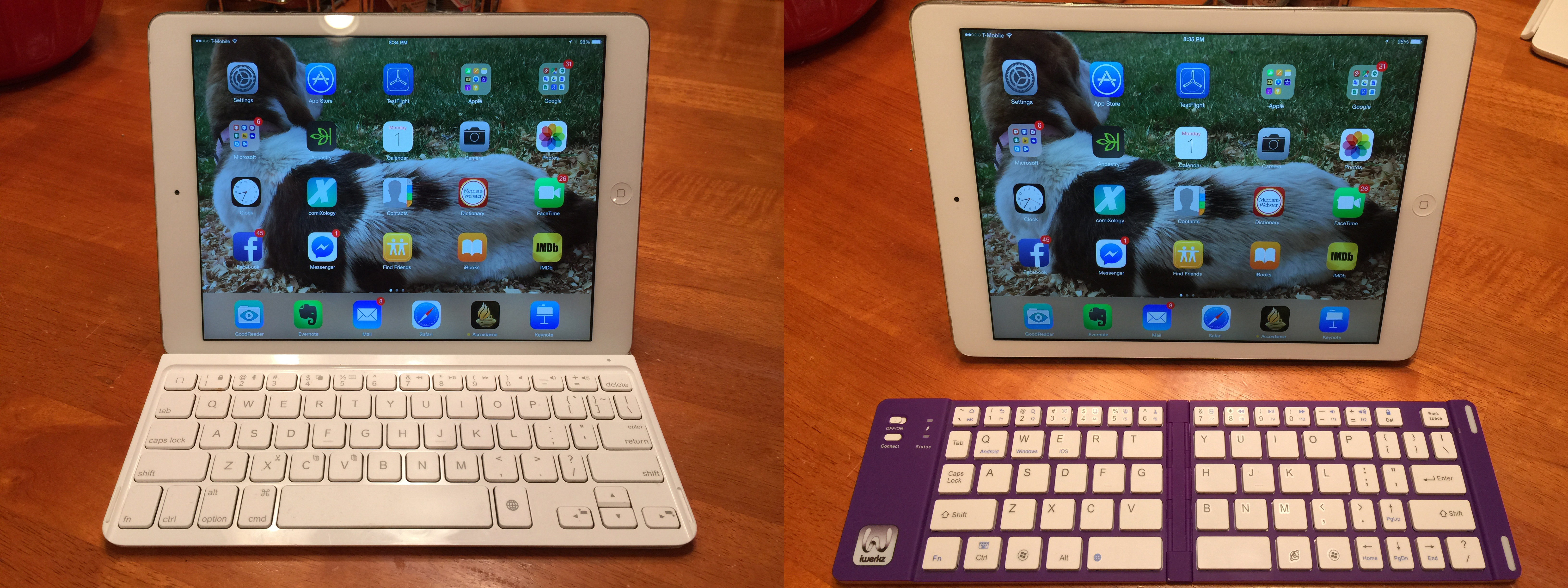
And, of course, my iPad can become a laptop replacement so easily because I can use a keyboard with it. I actually have two keyboards that work nicely with my iPad Air (first generation). I have a Logitech Ultrathin Keyboard Cover as well as an iWerkz folding keyboard that fits conveniently in the side pocket of my cargo pants. 

Logitech keyboard on the left and iWerkz keyboard on the right.

So, a little over a week ago when Kathy and I decided to take a quick vacation to New Orleans, I thought I’d try a little experiment. Truthfully, I always have to take a little bit of work with me. I have responsibilities with Accordance that I didn’t want to pawn off on anyone else for the two days we were there, and I also had a few papers to grade for IWU. Our trip was a short one, and none of this was too heavy, so I downloaded the papers ahead of time on my MacBook Pro to OneDrive and opted to take only my iPad Air.

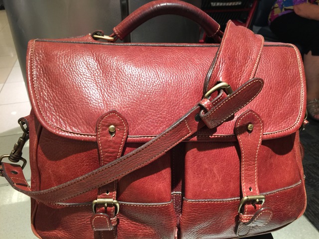
You might wonder what the big deal is in all of this, but you have to understand that I can’t even remember the last time I traveled without an actual Mac laptop of some kind. Nevertheless, since we had decided that we didn’t want to check bags, I didn’t want to lug my 15" MacBook Pro and power cord on the flights to New Orleans in addition to our carry-on luggage. Truthfully, I could’ve just carried my iPad in my hand, but since Kathy was carrying her purse in addition to her carry-on suitcase, she asked if I would take a bag over my shoulder for our iPads. I grabbed my trusty Levenger Stanley Traveler (don’t bother looking—they don’t make it anymore) and opted to take the iWerkz keyboard in a side pocket instead of the mildly added bulk of the Logitech keyboard.

The Levenger Stanley Traveler--they -literally- don't make 'em like this anymore!

So how did the iPad fair? How realistic is it to think that I could go a few days without needing a traditional computer? Well, I had mixed results, but ultimately, in more than one instance, I needed my MacBook Pro.

For grading papers, the iPad was fine. I was able to access the papers in MS Word for the iPad, retrieving them from OneDrive. If you haven’t used it, Word is quite the capable word processing solution for the iPad and since its release has become my preferred word processing tool over Apple’s iWork Pages that I had used since the iPad was first released. Word let me retrieve and save documents to OneDrive and let me add comments for my students in the margins of the document. Unfortunately, there’s no way I know of to upload the papers to Pearson Learning Studio, which is the online learning system IWU uses for its students. I could have emailed the graded papers to my students, but I decided to wait and upload them from my MacBook Pro once I got home.

Most of the work I had to do for Accordance I was able to do just fine from the iPad. I could send out social media alerts over the Accordance Twitter and FaceBook accounts, but I never could figure out how to do that for our Google+ page. On my MacBook Pro, a “Manage this page” button appears on the Accordance Google+ page, but I never could get that to appear on the iPad, regardless of whether I was in the Google+ app or in a web browser (I tried both Safari and Chrome for the iPad to no avail). There may very well have been something obvious there I wasn’t seeing, but I never found any way to leave a post in Google+.

I also had an issue using the iPad’s browser solutions with one particular aspect of the Accordance website’s backend, but it wouldn’t be appropriate for me to give details in regard to that.

In addition to the above, I also had trouble responding to a YouTube comment on Accordance’s YouTube account. This was very frustrating because whenever I went to YouTube.com, I was immediately switched over to the YouTube app. In the app I was never able to leave a comment.

I would say that I could do 75% of what I needed to do from the iPad. What I couldn’t do was quite specialized. Again, I believe an iPad or equivalent Windows or Android tablet is enough computer for most people—especially when paired with a keyboard. Nevertheless, I don’t believe I’ll be in any position to use an iPad exclusively any time soon.

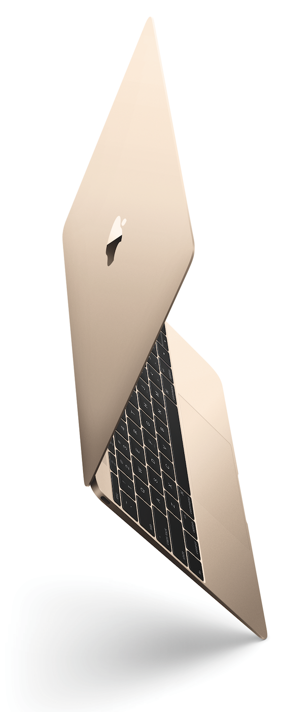
Maybe the 12" MacBook is what I need...However, this does make the new 12" retina MacBook all that more appealing to me. It has nearly the same form factor of my iPad Air paired with my Logitech keyboard and would be easy to add to the Stanley Traveler on short trips.

And, of course, I have no doubt that in time iOS will become more and more capable of handing an expanding number of tasks. While the 12" MacBook is nearing the iPad’s space, at least as far as form factor is concerned, the rumored 12" “iPad Pro” will come from the other direction to approximate the form factor of the smaller MacBook variations.

The lines between iPad and MacBook are starting to blur, and for me, that can’t come soon enough.


Questions? Thoughts? Comments? Rebuttals? Let me know what you think in the Comments section below.

Wednesday
Apr032013

Review: Microsoft Surface RT

I switched from Windows to the Mac as my main computing platform in 1998 for reasons I’ve discussed elsewhere before. Of course, I never left Windows completely behind. I’ve kept up with it over the years by running current versions first in VirtualPC and more recently in VMWare Fusion. I even spent part of last decade in a job where I administered two Windows servers and about 140 Windows client machines (all of which I managed from an eMac).

Having said that, however, I still admit that Apple’s family of devices work well for me. In our home we have iPads, MacBooks, iPhones, and an AppleTV. Everything works well together, and I have no plans on switching back to Windows.

And yet, if you don’t count the netbook I bought three years ago for the purpose of turning into a Hackintosh, the Windows Surface RT is the first new Windows machine I’ve bought in almost a decade and a half. And guess what? I like it.

For whatever reason, I was intrigued by the Surface RT since it was first announced. The tech press (of which I spend way too much time reading) has been fairly critical of the Surface RT. And yet, I discovered something very interesting a few weeks ago. I was on the website of one of the national chains selling the Surface and I looked at the customer reviews. That is, the reviews of people who are actually using these machines—not the tech writers who spent a few days with a review copy of the surface and then went back on to other equipment. I noticed in reading the customer reviews that “real life” owners of the Surface RT really seemed to like the device. The reviews were overwhelmingly positive. I checked some other sites with customer reviews and found the same situation.

Around three weeks ago, Staples offered a coupon for $100 off any Windows 8 tablet or notebook computer, so I bought the low-end Surface RT. I’m referring to the one with only a measly 32 GB of storage space, almost half of which is taken up by Windows 8.

Windows 8 has been a very polarizing operating system. I hear more negative than positive, but I also realize that people who don’t like something are usually more vocal than those who do. I’d read in a number of places that Windows 8 is best experienced on touchscreen, and I can now agree that’s completely true. In fact, I understood Windows 8 better in using the Surface RT in two days than I’d understood Windows 8 using it in VMWare for five months.

Since it's been five months since the Surface RT was released, I'm glad I waited and let the rest of the Windows faithful suffer through the early rough spots—especially after listening to some of the early SurfaceGeeks podcasts. I'm a big Evernote user, and if I can have Evernote on a device, I can get a lot done. From the sound of things, the early Evernote release was not quite up to par. Of course, I assume I could have used it on the web. Nevertheless, I find that Evernote Touch on the Surface RT is quite usable.

For those who are not in the know, Microsoft, which has traditionally been primarily a software company, has released their first tablet computers with the Surface RT and the Surface Pro. There seems to be a lot of confusion between these two devices, but basically, the Surface RT can only run Windows 8 apps and Microsoft Office (Word, Excel, PowerPoint, & OneNote only), while the Surface Pro can essentially run any Windows program. Both devices look very similar, although the Surface Pro is slightly thicker. And the Surface pro costs a good bit more than the Surface RT.

The Surface RT in many ways is meant to be the “pure” Windows 8 experience because it cannot run any older Windows programs, other than Office. Many consider the version of Windows on the Surface RT (called Windows RT) to be the future of Windows. Personally, because I do not run Windows as a primary platform, I did not need the more capable Surface Pro because I have Windows 8 Professional in VMWare on my MacBook Pro. As I said, it was the Surface RT that intrigued me, and I wanted to experience Windows 8 on a touchscreen.

In spite of much outcry against Windows 8, and regardless of the debates as to whether the direction Microsoft has taken is the right one, I do believe they should be given a little credit. It’s not easy to make a big shift in computer platforms, especially when considering the massive user base that Microsoft has with Windows. Also, I believe it’s worth noting that in a technology culture that has been so heavily influenced by Apple’s iOS, Microsoft actually came up with an interface that is significantly different.

Although it's not a strictly apples to apples comparison (no pun initially intended, but there it is), I can best compare the Surface RT to my iPad experience. And, although there are a number of important differences between the Surface RT and the iPad, I do believe this is a fair comparison. The Surface RT is distinguished from the Surface Pro in that it is intended to be a lower-cost, consumer-level tablet, much like the iPad.

What the Surface RT allows me to do that I cannot do on the iPad. I teach university classes which entails a lot of paper grading. Students upload assignments to Blackboard, and I download them and grade them on my MacBook. I can't do this on my iPad for a number of reasons. Obviously, there's not a native version of MS Word for the iPad (yet). I use Word's internal commenting system to comment or correct aspects of a student's paper. None of this is really feasible with any of the applications on the iPad that will import and export Word documents. But even if it were possible, all of the iPad applications that will read Word documents change the format of the document when it is imported and change it again when it is exported. This often can affect a document's layout in regard to headers or margins, and it would not be fair or right to do this to my students' work.

Moreover, I've yet to find a browser on the iPad that lets me navigate the Blackboard website correctly. In Blackboard, students' grades are laid out on a spreadsheet-type interface that simply cannot be moved from the left to the right (for some reason unknown to me) in any browser I've tried in iOS. Yes, there is a Blackboard Mobile Learn app, but this does not allow me to do any kind of administrative work such as grades. I can interact in discussion forums with my students or create announcements, but that's about it.

However, the Surface RT lets me do all these things. The first Saturday afternoon I had my Surface RT, I sat down in a coffee shop with only my brand new tablet and the accompanying TypeCover keyboard, and I was thrilled to know that I could access all aspects of the Blackboard website. I was able to download a student's paper, save it to the Surface in a nested folder, and edit it in a real copy of Microsoft Word. I could have just as easily uploaded the graded paper back to Blackboard, but I wanted to wait and view it on my laptop to make certain everything came out all right. And when I did this later, it was fine. Since then, I’ve graded a number of papers on the Surface and have uploaded them back for the student to retrieve afterwards.

So, I'm very pleased that I can do this. It may seem like a very simple task, but this is something that takes up a good percentage of my week. I believe it will be nice to sometimes leave my 15" MacBook Pro at home and go sit in a coffee shop and grade papers for a few hours on the Surface RT--something I cannot currently do on an iPad.

The only downside to this, however, is that I can do it much faster on my laptop. This is primarily due to the fact that Word on the Surface RT has very small touch points. This makes using Word for RT a bit more difficult and certainly slower than using a laptop. I’ve since learned that by changing the size of items on the desktop to 125%, the touch points become a bit easier to target. Nevertheless, if I were behind in my grading, which is often the case, I would not be able to use the Surface.

Yes, I bought the TypeCover, so I have a trackpad, but I'm not overly impressed with it. I’m sure that a lot of this frustration comes from being used to a large glass touchpad on my MacBook that is incredibly responsive. The tiny touchpad on the TypeCover is not as responsive, and even with tracking speed turned all the way up, it doesn't move as quickly or as accurately as I'd like it to. Perhaps this will improve with use as I grow accustomed to it, but I've also noticed that sometimes the mouse pointer on the Surface RT simply disappears, and I have to restart the machine or go into mouse settings to get it back.

On a side note, occasionally my students will want to compose a paper entirely on an iPad and submit it to Blackboard. However, no Word-compatible app on the iPad that I've seen allows for a different header on the cover page than the headers on the pages that follow. A student would, however, be able to use the Surface RT for both composition and submission of a paper that meets the style guide specifications because of having a "real" version of MS Word.

I also like the expandability of the Surface RT with its SD card slot and USB. Both of my iPads are 64 GB and both of them are completely filled up. My next iPad purchase will be one of the 128 GB models, but I like how expandable the Surface RT is right out of the box. I bought the 32 GB model, but if I were going to use this as a main device, I'm sure I would want to get the 64 GB Surface RT and then add a 64 GB flash card to it. Currently, I have 10 GB of space left on the Surface. I don’t necessarily have to depend on it, but I had a 32 GB microSD card, and it’s been a great solution for quickly transferring files back and forth between the Surface RT and my MacBook Pr.

From what I understand, the iPad doesn’t have any kind of external expansion capabilities because Steve Jobs liked smooth edges on the sides of Apple’s devices. From an aesthetic perspective, I can understand this, but after seeing how advantageous the microSD and USB slots on the Surface RT are, I really have to think, “Come on Apple, why not?”

I often teach straight from my iPad, plugged into a projector, at the university where I teach or at church. I mainly use iWork Keynote for this, and I make heavy use of presenter notes that I can see on my screen while a class looks only at my slide from the projector. Although I still find Keynote to be a more elegant presentation tool in general over PowerPoint from an audience's perspective, I can say I was very impressed with PowerPoint's presenter screen on the Surface RT. It is much more robust than Keynote's presenter screen (on the iPad, not my Mac) with more options and the ability to see my notes much better.

What the iPad allows me to do that I cannot (yet) do on the Surface RT. I've included the word yet here because a lot of what lies below has to do with app availability or compatibility, and I assume that most of this can and will improve over time.

If you're wondering what fills up my two 64 GB iPads, it's not so much from apps, video, music or pictures, but rather from the somewhere over 6,000 books, journals, magazines, and articles that I carry with me at all times. One of the aspects I've really enjoyed about having a tablet, since my first iPad in 2010, is the ability to carry an entire library with me at any time. Most of these are academic titles, and it's been great to have such a wealth of information at my fingertips.

I often digitize my own books (when I know a title is not already available in some kind of ebook form) by scanning them, adding an OCR layer over the original page, and saving them as PDFs. I use GoodReader on the iPad for PDFs. Although its interface is a bit wonky, it has great annotation features and can handle very large files (I have some PDFs that are hundreds of pages long). On the Surface RT, I've not yet seen a PDF reader that allows for the kind of heavy annotating I often do to my documents (although I'm open to suggestions).

The Kindle app (where I have about 1,000 titles) on the Surface seems comparable to the one on iOS for my purposes. I can add highlights and notes, which is important. But I use another program on my iPad called Accordance, which is for academic study of the Bible and related subjects, especially original language work. I doubt Accordance will be on Windows RT anytime soon.

There are competitive Bible programs available in the Windows Store on the Surface, such as an app from Logos Bible software and another from OliveTree. I have plenty of titles in these apps, too, but they are very limited in what they can do on the Surface RT. I was pleased to see that Greek and Hebrew texts display correctly in Logos on the Surface, but the app itself is downright anemic compared to the iPad version. The WinRT version doesn't allow me to highlight text, make annotations, copy and paste text or even perform basic searches of the text. The OliveTree Bible app has search, but for some reason most of the titles I own in that platform do not work on the Surface, including all my Greek and Hebrew texts.
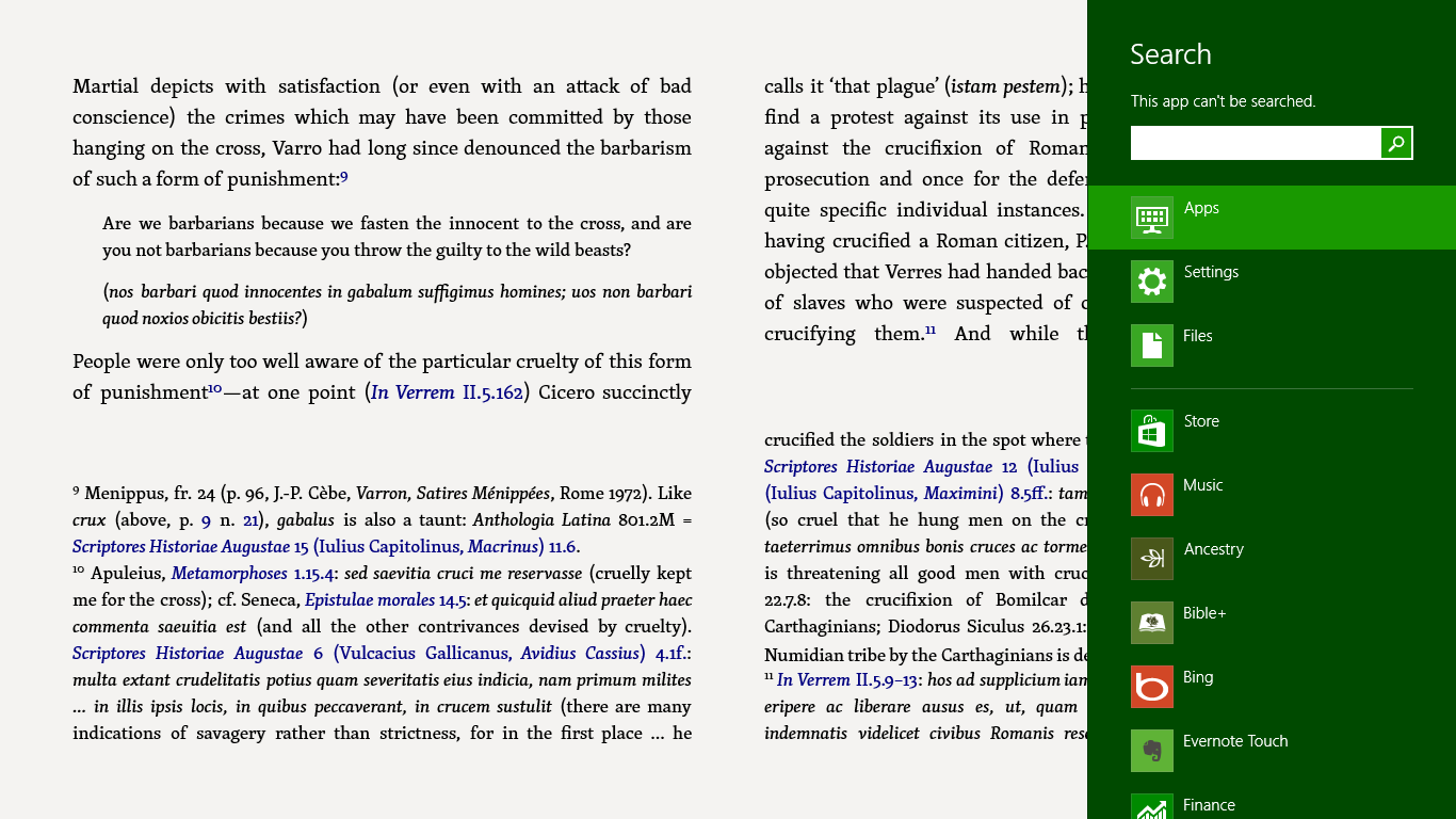
Logos for Windows RT is very limited. Note the inability to search.

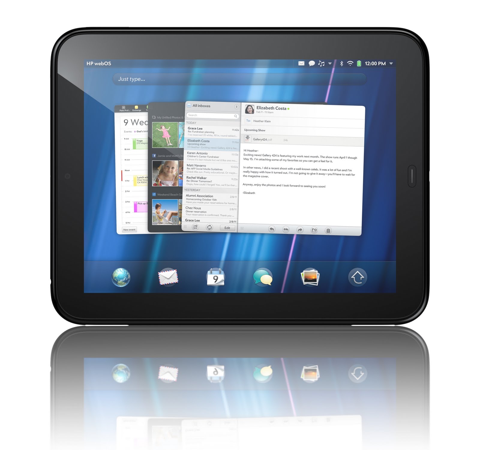
Obviously, these shortcomings are not the fault of the capabilities of the Surface RT tablet, but it is indicative of a number of apps that are available on other platforms, including both iOS and Android. Ultimately, it's a real chicken or the egg issue because software developers aren't going to invest heavily into apps for WinRT unless there are users; but users won't come in large numbers if there are not apps. In fact, the CEO of Logos has essentially said that development of their app is on indefinite hold until more users come to the WinRT platform. Both Microsoft and users of the Surface RT are going to have to be patient with the platform. Although rumors continue to fly to the contrary, all of Microsoft’s public comments have stated they are going to continue to support and develop the WinRT platform. Let’s hope so. We all remember HP’s "cut and run" only seven weeks after the release of the TouchPad. I actually thought the TouchPad’s operating system, WebOS, was a very good platform (the TouchPad devices themselves seemed to be a bit cheaply made) that just needed more time to grow its user base.

And while it seems like a simple issue, there was another task I normally perform on the iPad (and have been able to do since its release in April, 2010) that I couldn’t do on the Surface. On Sundays, I teach an adult Bible study at our church to an average of about 40 people. Typically, I use Keynote on my iPad and am plugged into a projector. As people arrive, I play a photo slideshow of about 2,100 photos taken of our group at various events over the past seven years. So that it won't start with the earliest pictures, I set the slideshow to shuffle the images. And I run this from the basic Photos app that comes on every iPad.

So, Saturday night of the first weekend I had the SurfaceRT, because I wanted to teach from my Surface on Sunday morning, I had converted my Keynote file to PowerPoint, and after a little adjusting, it was ready to go on the Surface. I copied the 2100 pictures from Aperture on my MacBook Pro to a USB thumbdrive and then copied these over to the Surface. I tried to do a test run and was surprised to learn there was no shuffle mode in the Surface's photo app. I really didn't want to start with pictures from seven years ago and run them in chronological order. So, even though it was time-change Saturday night, I stayed up way too late looking in the Windows Store on my Surface for a photo app that would shuffle photos. I couldn't find one. Knowing that I could run a slideshow straight from the folder holding my pictures on the desktop, I tried that, too, but again no shuffle feature. This obviously isn't the biggest issue in the world, but if anyone here knows of an app that will do this, I'd appreciate your letting me know. [Note: I’ve since discovered a free app called “Picture Frame Slideshow” that will shuffle photos.]

And the rest... Overall, my impressions of the Surface RT are favorable. I don't expect it or need it to be a full Windows computer (which is why I didn't want the Surface Pro). I was just intrigued by RT and wanted to experience it for myself. Like others have already said, I like the build of the machine. It seems very sturdy and put together in a manner that speaks to quality.

I bought the TypeCover because it looked nicer and more capable than the TouchCover, but after reading others' impressions, I imagine the TouchCover would have been fine for me. I'm actually a very fast typist on the iPad's virtual keyboard. Although I have had a couple of keyboards for the iPad, I hardly ever use them. It sounds to me that if someone is used to a virtual keyboard (that also doesn't have any actual tactile feedback from a moving key), the TouchCover keyboard would work just fine.

And related to that, I've tried out the Surface's virtual keyboard and have found it to be just as capable as the iPad's. I seem to be able to use it as well as I use the virtual keyboard on the iPad. It may be that the TypeCover keyboard is only going to be necessary for me when I'm using the desktop Office apps.

I've also found the responsiveness of the Surface screen to be on par with my iPad. When I had my Galaxy Tab last year, I noticed that sometimes, I had to kind of get the attention of the device because it wouldn't always respond the first time I touched it--even when it was on and I had just been using it. I've had no such problem on the Surface. It seems just as responsive and fluid as the iPad so far. As I mentioned, the only aspect in this regard I'm not impressed with is the touchpad on the Surface TypeCover, especially when using Office apps. I realize that I could use a mouse, but I have no desire to lug around a mouse to use with a tablet. Having to do that seems counterintuitive for why I would want to use a tablet in the first place.

For the most part, the Surface RT is snappy and responsive. When I first got it, some of Microsoft’s own apps were very poky, especially when starting; however, they released updates to many of these a few days ago that have improved these issues considerably. My major complaint has to do with the Mail app. Although it also received improvements a few days ago, there’s no unified inbox for multiple accounts, and there’s an extraordinary long pause when switching between one email account and another.

Some have complained that neither the Surface RT nor Surface Pro work well in one’s lap because the kickstand has a tendency to collapse. I can say that while awkward, it can be done. Nevertheless, if the Surface is in my lap, I’m usually not doing serious work on it. In my lap, I find it easier to fold the keyboard behind the Surface (which disables keystrokes) or simply remove it altogether. As already noted, the virtual keyboard works just fine, and I can surf the web or provide short answers to email.

I bought my Samsung Galaxy Tab and HP TouchPad to familiarize myself with the platforms, but I eventually sold these devices because they didn’t bring anything new to the table that I didn’t already have represented in my iPad. Considering I can actually grade papers on the Surface RT, I may hold onto this device indefinitely and let it become a regular part of my workflow (at least in the weeks in which I’m not running behind). Plus, I’m interested to see how Windows RT continues to develop. Many have predicted its demise, but Microsoft is known for often playing a long game with platforms that are of greater importance to them. Consider that Windows didn’t start to gain traction until v. 3.x, and the Xbox didn’t outsell competitors until the 360 was released.
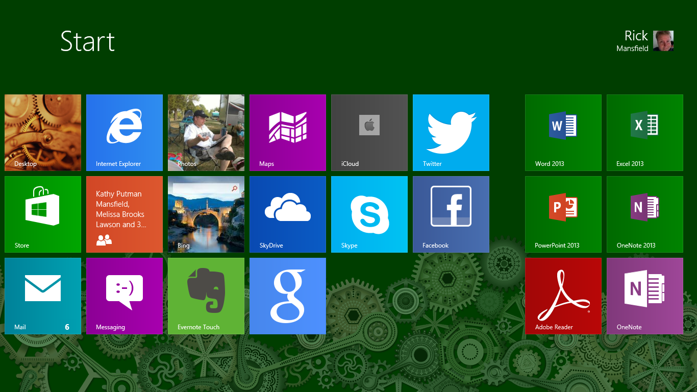
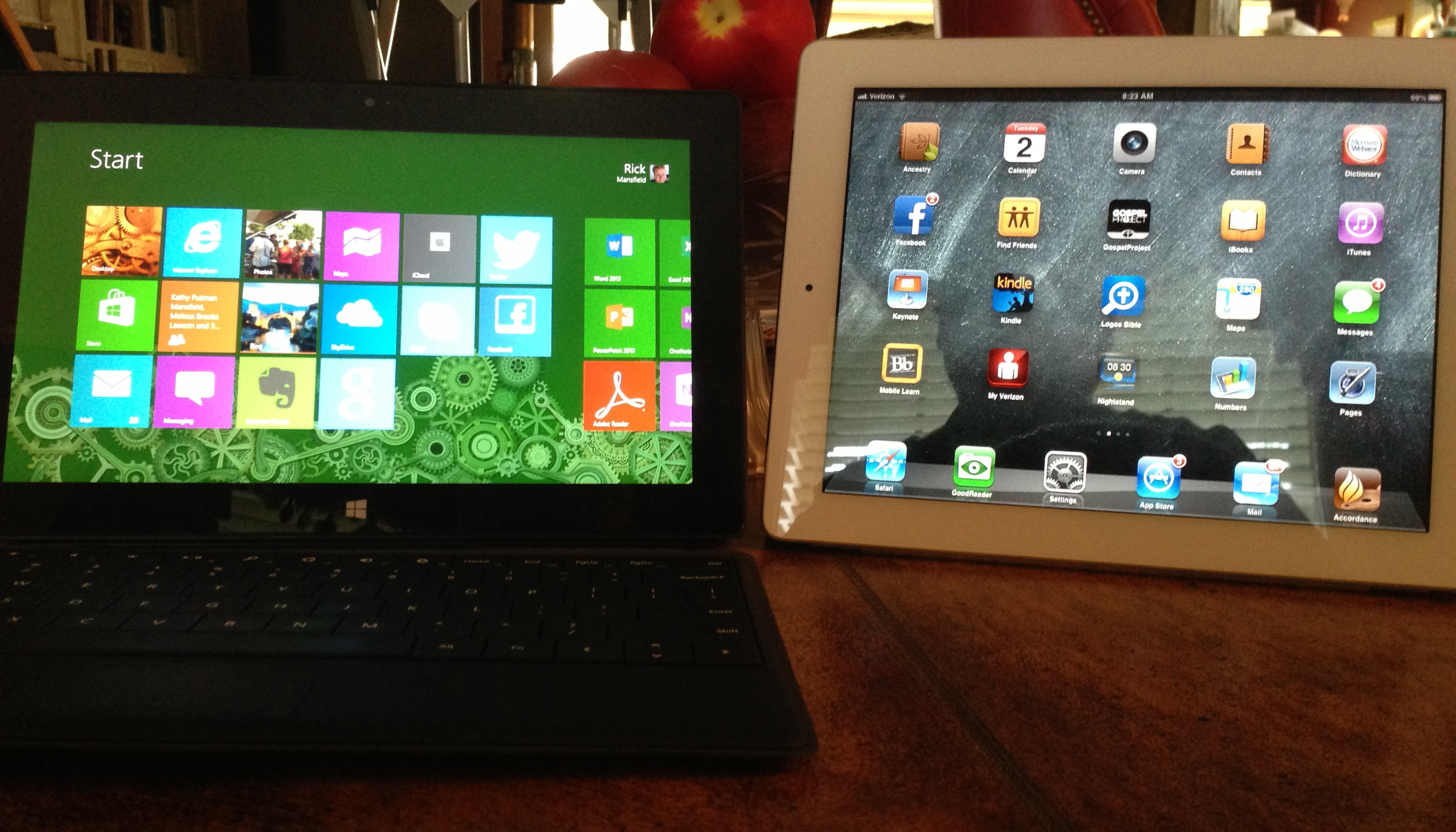
My start screen on the Surface RT

Even though I like the Surface RT, as do many other owners of them, it’s still hard to say exactly who the target customer is for this device. Certainly if someone wants a lower-priced tablet and needs a “true” version of Microsoft Office—such as a student—the Surface RT is ideal. But if Office is eventually released for iOS and Android—as current rumors suggest—the Surface RT suddenly loses much of its unique draw.

I also believe the Surface RT is priced too high. I was at a Staples just the other day, and they had an Asus touchscreen notebook computer that had a full version of Windows 8, a touchscreen, and a 256 GB hard drive—all at the sale price of $459. This is $40 less than a Surface RT at full price, and the Surface comes with only a 32 GB hard drive (at the $499 level) and no keyboard.

I have no idea what the Surface RT costs Microsoft to build, but if it were priced somewhere between $299 and $349, I believe they would have a winner on their hands. They would sell more of them, which in turn would draw more developers to the platform. Or perhaps, if history repeats itself, the Surface RT v. 2 or v. 3 may eventually be the hit that Microsoft hoped it would be in its first iteration.

This blog post was written and uploaded with the Surface RT. Your questions, thoughts, comments and rebuttals are welcome in the comments section.

Saturday
Dec172011

Kindle Fire: A Bulleted Hands-On Review

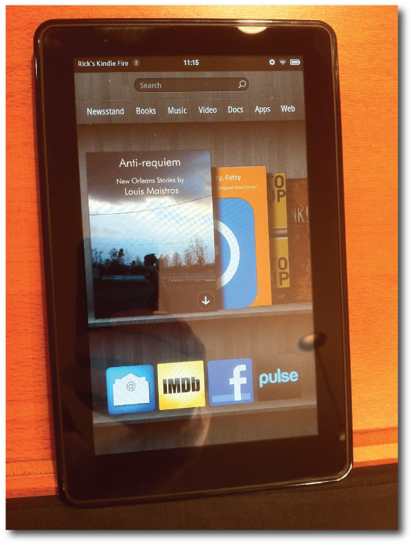
I've had a Kindle Fire "loaner" for the past three weeks or so, and before I have to give it up tomorrow, I thought I'd write down some thoughts. I'll start with the more positive aspects and gradually merge my way into some caveats and concerns.


  • For what it is—a $199 customized Android tablet—the Kindle Fire is fantastic. Although Amazon has set a new price point with devices of this size, all reports indicate that they're losing money on each Fire, while presumably making it up on content. As long as expectations aren't greater than reality, the value of the tablet is a good deal.

  • I have not had the wifi problems with my Fire that some people have reported.

  • Some have reported the Kindle Fire is too heavy. I remember hearing similar things about the iPad when it was first released. To all these folks, I want to suggest a gym membership to go with their New Year's resolutions to get in shape. I will say that the Kindle Fire feels very solid, unlike some of the cheap-feeling tablets near this price point and even higher ones.

  • Streaming video services like those of Amazon's own Prime or Netflix (which is an app that can be added to the fire), significantly add to the value of the device.

  • The Kindle Fire might be the perfect device for a child not quite old enough to have a cell phone. I think in the right context, kids could make a lot of use out of the Fire for all it's major intentions: reading, music, video and games. Kids who are casual gamers will genuinely appreciate the screen, which is larger than that of an iPod Touch or Nintendo handheld.

  • One caveat for parents who want to give a Kindle Fire to a child: parental controls are very limited as compared to an iPad. There's very little to stop a child from purchasing books, apps, movies and music and a parent's credit card could get maxed out pretty quickly. Of course, I'm certain that Amazon will improve parental controls over time, but until then a Kindle Fire for a child ought to come with a discussion about responsibility.

  • I have not used the Fire with a cover, although I'd probably recommend one for sake of protection. However, without a cover, it's still small enough to fit inside an inside jacket pocket, but the addition of a cover might make the pocket a bit snug.

  • There was an initial moment of delight, when after entering my Amazon credentials, the device immediately populated with books, music and other media I've bought from Amazon over the years. If you're already in the Amazon "ecosystem" of digital content, the Kindle Fire will be highly personalized for you from the moment you begin using it.

  • With only 8 GB of storage, the Fire truly is designed to be a cloud based device. There's no "Archive" for my books. Rather, all books are on the "carousel" on the homescreen. If I want to read one, it is downloaded by touching it. Make certain that if you are planning to travel with the Kindle Fire and want to watch movies on it, you have verified the videos are truly downloaded and can be viewed without a connection to the internet.

  • Although my feelings are generally positive about the Kindle Fire, there's no practical reason for someone such as myself, who already owns an iPad and uses it heavily to get a Fire. I've got an iPhone (smaller screen) and an iPad (larger screen), and I simply can't figure out what I'd do with an in-between screen on a regular basis. And as regular readers of This Lamp already know, when it comes to reading ebooks, I prefer the E Ink Kindle, even over the iPad.

  • There's already a lot of quality apps available for the Fire in Amazon's curated app store. Note also there is a setting in the Fire's preferences that allows other Android apps to be installed. So, yes, that means that the Kindle Fire can not only read Amazon Kindle book titles, but if the Nook app is obtained by means outside Amazon's app store, titles obtained from Barnes and Noble can be read, too.


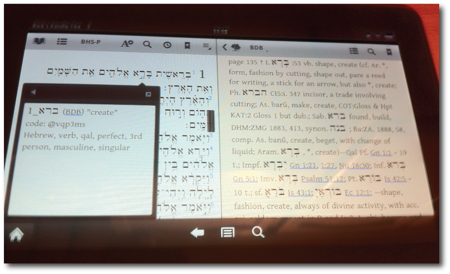
Above: Olive Tree's BibleReader app displaying a tagged Hebrew Bible on the left and the Brown-Drivers-Briggs lexicon on the right.


  • The Kindle Fire is even more zen-like in its simplicity than the Kindle Touch. Whereas the Touch has only two buttons, the Fire just has one—a power button. The Home button, ubiquitous on all other Kindle devices, is found only on the screen in nearly all applications.

  • As many have reported, because Amazon places the power button on the bottom, it really is easy to accidentally turn the Fire off while it's being used. Getting a cover for the Fire will probably solve this problem.

  • Although Amazon supposedly isn't targeting the Kindle Fire toward potential iPad customers, it will undoubtedly encroach upon Apple's lowest-cost iPad. And despite the fact that Apple says 7" tablets aren't as functional, I feel certain that they will release a 7" iPad in addition to their regular lineup, sometime in 2012.

  • If you're trying to decide between the Kindle Fire and the iPad, carefully consider what you intend to do with the device you choose. Early critics of the iPad panned it as merely a content-consumption device, not made for real work. Then people began creating content and doing real work on the iPad, significantly changing its perceived pupose. I could be wrong, but I don't expect this to happen to the Fire. I really feel it's going to primarily remain a device for media consumption—books, music, video, and games. If you think the Fire is going to be a laptop replacement or even an iPad replacement, you're probably going to be disappointed.

  • Related to the above point, when the Fire was first announced, Seth Meyers, on SNL's weekend update, said of the Fire, "It's expected to sell well among parents who always buy the wrong thing." That may or may not be true. But think carefully before buying a Fire this Christmas for someone who actually wants an iPad.

  • The Kindle Fire's screen isn't always as responsive as an iOS device, but this is true for just about every Android device I've ever used.

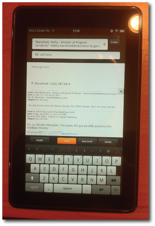
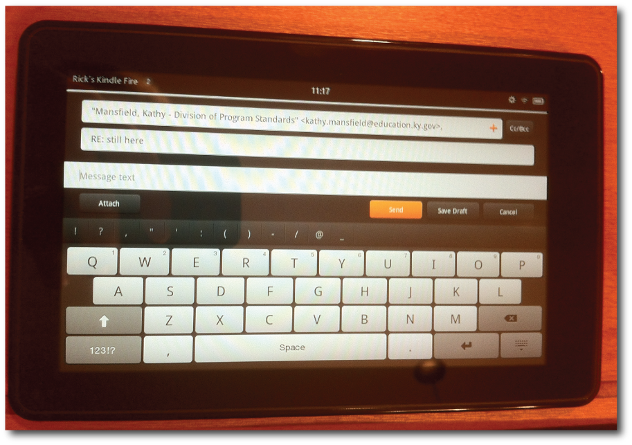
  • Although the Fire can receive and send email, like a mobile phone, it's not practical for extensive correspondence. Turned vertically, the keyboard works only with thumb-typing; and turned horizontally, the keyboard is still smaller than the tiniest netbook keyboard and can be an exercise in frustration. What's worse, when turned horizontally, only one line of edited text can be seen at a time.


Above: the Fire's email app in vertical orientation. Thumb-typing is going to work best here.

Above: email app in landscape orientation. The keyboard is bigger, but you're not going to be touch-typing. And you can see only one line of the text you're writing.


  • I didn't spend a lot of time in the Fire's "Silk" browser. It's fine for what it is, and it's better than browsing the web on a mobile phone, but I would not want to spend long amounts of time using it. If a website offers a mobile version of its content, you'll definitely want to use it when viewing via the Fire.

  • While I do believe the Kindle Fire is going to be successful, it probably won't be as successful as some might have initially thought. Millions of Fires were pre-ordered, no doubt simply based on Amazon's good reputation in regard to its previous line of Kindles. But now I'm reading reports of the Kindle Fire being returned for various reasons. Some have returned it for technical problems, while others may have simply realized it wasn't as useful as they initially thought. My concern is that for many people, after the newness of the Kindle Fire wears off, it might be shut up in a drawer and rarely used at all.

  • There's no video-out on the Fire, which is too bad. It would have been a nifty device to connect to a projector for classroom use.


Would I recommend the Kindle Fire? Absolutely, but the buyer should think about what he or she wants to do with the device and make the decision based upon whether the Fire will handle those needs. Again, it's a great value for $199, but don't be fooled into thinking it's going to match the features of larger tablets, let alone notebook computers.

Friday
Sep092011

Thoughts on the HP TouchPad Debacle, and Why This iPad User Truly Hopes That webOS Survives

Although I’ve been an iPad user since they were first released in 2010, ultimately, I’m keen on tablets in general. And I can be pretty non-partisan about it as you may have noticed if you’ve watched either of my videos about using tablets in the classroom. I’ve not given up on regular computers yet, but if I can use my iPad for a task instead of my laptop, I generally do. And I encourage others to try out using a tablet. If the iPad’s not for you, that’s fine, and no threat to me. Yet the reality is that after a year and a half, the iPad has had no real competition from any of the various offerings out there. Some have even gone so far as to say there is no tablet market, but rather, only an iPad market. I genuinely hope that’s not true because Apple needs serious competition to continue to innovate, just as competitors need Apple for the same reason. It’s an “iron sharpens iron” thing. 

That’s one reason I was genuinely excited about Hewlett's Packard's TouchPad. I’ve played with a number of Android tablets, but they’re largely uninspiring. However, the previews of the TouchPad I’d seen earlier this year seemed somewhat promising. The interface was fairly unique—different from both iOS and Android. And multitasking even seemed more robust than that in iOS 4. I’ve hated to think of tablet computing coming down to an eventual two-horse race between iOS and Android. I would have much preferred to see the Touchpad’s webOS as the biggest competitor to iOS. At least webOS seemed to have a sense of style. Unfortunately, HP released the TouchPad way too early.


Why I Couldn’t Recommend the HP TouchPad

A few days after the TouchPad’s July 1 release, I stopped by the local BestBuy to check them out for myself. There was an actual HP representative in the store who quickly intercepted me as soon as I stared at the TouchPad display for more than five seconds. She placed a TouchPad directly into my hands for her demonstration. It was not one of the ones tethered to Best Buy’s security system, but rather her very own TouchPad from what she told me. And it truly was, as I noticed when we looked at the email features. 

The HP representative was very professional and she knew the TouchPad well. The device’s ultimate failure to catch on cannot be blamed on people like her. Rather, blame the device itself, or more specifically, the PTB at HP who allowed the TouchPad to be released well before it was ready for primetime. 

While the HP rep demonstrated the features of her TouchPad, I became increasingly disillusioned, shocked and even a bit appalled at what it couldn’t do. First, I was incredibly surprised that it had no video out capability. I realize that I see the world through pedagogical lenses, but part of the iPad’s genius is that it can be connected to a TV or projector and used for presentations or educational purposes. Without a video out option, that means it’s a device that could not be used by the instructor for lessons in front of a class or for a business professional to make a presentation in front of clients. 

I asked the HP rep how I could take notes on the TouchPad if I were in a meeting. She hesitated a moment and said that it really couldn’t do that yet. I was told that it came with QuickOffice, but for right now it only viewed Word documents and couldn’t create or edit them. I should point out that a version of QuickOffice that allows editing was released for the TouchPad last week, and there have also been a handful of notetaking apps that have been released along the way.

Nevertheless, I was dumbfounded. I’ve always equated HP with business use. Yet the HP TouchPad really couldn’t be used much for business at all. The TouchPad at its release was little more than a consumption device. I can only wonder who HP saw as its target audience for the TouchPad? 

Whether comparisons between the TouchPad and the iPad are fair or not, they are impossible to avoid. The TouchPad looks very similar at first glance to a first generation iPad and the TouchPad was initially priced at $499 for the 16 GB model—the same price as the 16 GB iPad. Apple has claimed that they spend years in R&D developing the iPad and that the iPhone was an afterthought that came out of that development and ended up being released first. On day one, the iPad—despite the claims of detractors that it was only a consumption device—gave users access to a choice of a number of word processing, spreadsheet, and presentation apps of varying degrees of ability. I truly don’t mean this in a platform-partisan manner, but I know with certainty that Apple would have never released a device so prematurely as HP did with the TouchPad. 


HP’s Decision in Haste

And then, as everyone is all so well aware, the bottom fell out for any hope of the TouchPad’s success within a mere 49 days after its released. Axed quicker than a new show on the Fox network, HP surprised everyone by announcing on August 18 that they were ceasing all production of webOS hardware. In fact, they said they were getting out of computer hardware all together, although the latter has been interpreted in a number of ways in the weeks since. 

I honestly don’t know if HP panicked over the poor sales of the TouchPad, or if Best Buy’s request that HP take them back was a kind of last straw for HP’s current president, Léo Apotheker, who doesn’t seem much interested in making devices of any kind. Regardless, the TouchPad never stood much of a chance due to premature release and a price tag that was way too high.


The "Fire Sale"

Speaking of prices, before HP canned the TouchPad, they briefly brought it down one hundred dollars by marking it at $399. But even this was too expensive when a mere $100 dollars more could get you an iPad that was actually capable of doing more than passive activities. So over the weekend of August 20-21, HP surprised everyone a second time in the same number of days by slashing the cost of remaining stock to a mere $99. Suddenly, everyone wanted one, but there were none to be found!

I heard about the $99 price point on the afternoon of Saturday, August 20. As I’ve already suggested, I’m a bit of a tablet enthusiast, and I saw the true potential of webOS, despite HP’s poor implementation of it in the TouchPad. While I would never have paid $499 or even $399 for the device, like a lot of folks, I was definitely interested when they were down to $99. I thought it would be great fun to customize one to my accounts and emails and see what using it on a personal level was like. I made a quick check of eBay and saw that even used TouchPads were selling for much higher than $99, so I figured a the very least I could always recoup my money, and then some, if I decided I didn’t want it. Or I could use it as another physical tablet example to pass around the room if I did another seminar on instructional use with tablet computers. 

Unfortunately, by Saturday afternoon, I was really too late. I ran by a local Target and two separate Walmart stores, but all the TouchPads were long gone after the drop to $99. I didn’t even consider going to Best Buy because I assumed that they were probably the first stores to run out of stock. 

So that night, I went to HP’s website. Sure enough, they were in stock, but every time I tried to order one, their website would go down. I tried multiple times to order a 16 GB model, but every time I advanced a bit further in the process, the screen would display an error message. I finally got to a final payment screen, entered in everything required of me, and submitted my order. Another error screen on HP’s website! Had my order gone through or not?

I waited a couple of hours and thought I’d try again. By that time, a notice stated all 16 GB models were sold out. The only TouchPad left was the 32 GB model that originally sold for $599, but had been drastically reduced to $149. After checking eBay again to make certain I could cover the cost if I decided to sell it, I decided to try for the TouchPad with the greater memory. The process was similar to before. I’d make small gains in my order, only to hit another error screen. Finally, I got to the final screen and submitted, but then, no confirmation page or email—only an error screen.

At that point, I assumed that neither of my orders went through, but figured it didn’t really matter. Then on the following Tuesday, I got two confirmation emails and discovered I’d successfully ordered both a 16 GB model and a 32 GB model as well. A quick check of eBay and I was still assured, based on what the TouchPads were selling for, that I had nothing to worry about. In fact, I could sell the 32 GB model and essentially pay for both of them and not be out anything at all. 


HP Clearly Wasn’t Ready for a Hit

Supposedly, Léo Apotheker’s vision for HP includes making it over into a software services company for businesses. Hopefully, that doesn’t include the kind of services HP uses in-house to run it’s own ordering system. During that weekend of the $99 fire sale, HP sold more TouchPads than even existed—more than they had in inventory and more than they had coming back unsold from stores. In fact, in yet another surprising move, HP announced a few days ago that they were going back to the factory to make one last TouchPad production run to take care of the unfulfilled orders. Of course, most speculate that this last run is primarily to appease parts suppliers who were about to be stuck with a lot of custom TouchPad components. 

After HP closed sales of the $99 TouchPad in the wee hours of August 22, they put up a notice allowing customers to sign up for an email alert when more TouchPads were back in stock and orders were opened up once again. Of course, orders have yet to be opened up again. A lot of people have speculated that HP thought they were getting a number of TouchPads back from stores which they would turn around and sell. Rather, any TouchPad that came back had to immediatly be allocated to those with orders already in the system. A few days after posting the notice for email sign-ups, HP removed it. 

One of the more popular webOS enthusiast sites is precentral.net. At that site, there is a thread in the forums which will probably hit over 1800 posts within a few hours of my writing this blog entry. This thread is dedicated to a discussion among people like me who ordered their Touchpads from the HP website over the weekend of the $99 sale. In this thread order numbers are compared with posted ship dates on the HP website (very few have posted that their orders have actually shipped), examination of credit card charges and holds, tales of waiting online to speak with HP customer service only to learn nothing that isn’t in the order status on the website, and just more of the same ad infinitum. You can actually read only a handful of the posts to get the gist of all 1800 contributions. 

But it’s even more amazing to see the frustration among those who ordered TouchPads who haven’t gotten them yet. Remember that before August 20, when the price was dropped to $99, no one wanted a TouchPad. Then, when the price was right, every one wanted one. 

And then to make this particular group of backordered TouchPad seekers even more agitated, on Thursday of last week, a marketing rep at HP announced via Twitter that all those with backorders would be receiving an email within 48 hours updating them as to the status of their order. The email simply explained the fact that those who had not received their orders yet (and it seems the majority had not) would get them within six to eight weeks after the additional and final production run. 

The email promised to arrive within 48 hours was not sent to every person with a backordered TouchPad all at once. It is true that a few of those with orders placed got the email within the promised 48 hours. However, at the end of business day last Friday, the emails suddenly stopped being sent out even though many customers had not received them yet. This led to many in this remaining group panicking (based on the posts at precentral.net) that their orders were perhaps cancelled because they didn’t get this promised email within the promised 48 hours. In hindsight, it seems pretty clear that someone in customer service at HP, who was in charge of sending out the rest of the emails, must have simply taken his or her three-day Labor Day holiday, saving the remaining emails to go out until after a return to work on Tuesday. However, the emails did not, in fact, resume on Tuesday, but rather on Wednesday; and finally it now seems as if everyone has been contacted who was supposed to be. 

What’s clear from all this disorganization, lack of customer service and even professionalism on HP’s part as well as an ordering system that allowed for more orders than existing product is that HP was simply not prepared for a “hit” product. Remember that people stood in line for Apple’s iPad, even when the first generation had not been in anyone’s hand before its release. With the release of the iPad and iPad 2, there have not only been long lines, but initial shortages in stores and delays when ordering online. But at least you could place an order online and immediately be given a reasonable notice of ship time. 

What if the TouchPad had been a hit at the beginning? Could HP have handled it? The $99 fire sale clearly demonstrates that HP would not have known how to handle any kind of significant demand if the product had been a hotly sought out object of desire. 


Is there a Future for webOS?

I hope so. HP wants to license the OS, but so far it has no publicly-announced suitors. Despite all the chaos from HP, an unexpected result and silver lining from all this nonsense can be found in the fact that now the TouchPad is the second most popular tablet computer, bested only by the iPad itself. Most of the other tablets out there have only sold in the tens of thousands from all known estimates. But once all TouchPads are sold, there will probably be a million or so TouchPads out there, which is certainly not a user base that should be ignored. 

Android tablets seem to be a dime a dozen. But I really believe that an enterprising company could license webOS for their own tablet, and if any significant attention is paid to the device, and if lessons are learned from HP’s many blunders, a company would have an opportunity to differentiate itself from all the Android offerings. 

Honestly, I hope this happens. webOS seems to be a really good mobile OS with a lot of potential. It was initially developed by Palm and then Palm was bought by HP. The latter company seems to have squandered their prize, but that’s not to say that another company couldn’t do something better. 

Of course, that won’t happen immediately; such things take time. 2011 truly will be the year of the iPad 2 as Steve Jobs promised. But perhaps in 2012 or 2013, webOS will resurrect in a new and better incarnation from a company other than HP. Otherwise, I’m afraid that all we’re left with is Android as a competitor to iOS, and somehow I can’t see Android’s iron doing all that much to sharpen Apple’s mobile operating system.

I've yet to receive either of the TouchPads I have on order. Six to eight weeks means sometime before the end of October. That's okay. I've not wasted time calling HP to check on my order, and I don't obsess on the forums, althogh I have posted a few times, once even mentioning that "patience is a virtue." That little proverb didn't prove popular for HP when they were developing the TouchPad, nor when they prematurely discontinued it. My advice hasn't been followed by many of those posting on precentral.net either. And yet patience nearly always rewards those who practice it; thus it's too bad that our instant "I want it now" culture has little patience for waiting.

If I do end up with a TouchPad or two, I'll be certain to give my own review of it, although by that time, such a review may only be a curiosity and little more. When the TouchPad was first released, I couldn't recommend it, but if you can obtain one at $99, I think it's a great value as long as you understand the future of the platform is iffy as of this writing. But who knows? Maybe there's a future for webOS still. I'll definitely be disappointed if there's not.

Your questions, thoughts, comments, and rebuttals are welcome in the comment section below. 

Wednesday
Jun152011

The Empty Book Bag, Version 2.x

Some of you may remember that I presented a session at IWU's "No Educator Left Behind" conference last year on the use of the iPad in the classroom. This year, I expanded that topic to include a discussion of eReaders. My new session was titled "The Empty Book Bag, Version 2.0: Digital Instruction Using Tablet & eReader Technologies."

Below is a video of this year's session, which I presented on June 3, at the Indianapolis campus of Indiana Wesleyan Univeristy. If you have an hour to kill, enjoy!


As always, your thoughts, comments, questions, or rebuttals are welcome in the comments.

Wednesday
Jun082011

Nook Color (A Review with Images)

When powering up a Nook for the first time, you see the words "Read Forever." I simply love this slogan that Barnes & Noble has adopted for their Nook line of eReaders and tablet devices. It captures the essence of what makes me enthralled with eReaders to begin with: the ability to carry an entire library in one handheld device.

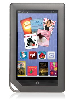
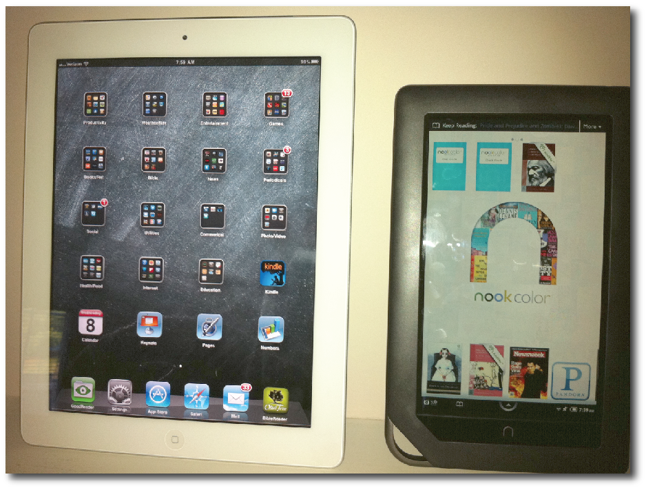
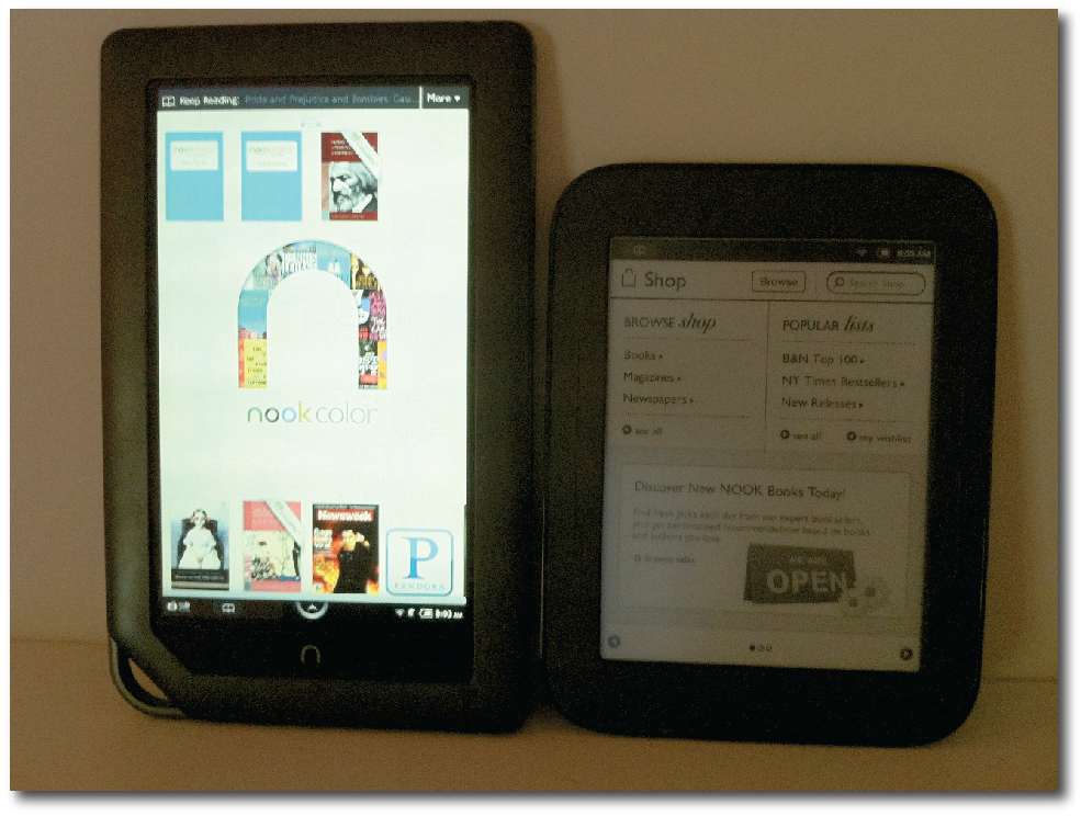
Barnes & Noble was kind enough to send me a complimentary Nook Color for use in a seminar on tablets and eReaders in the classroom, which I led at an education conference in Indianapolis last week. As of this writing, I've spent almost a month with the Nook Color, and I have to admit it's an impressive little device. I say "little" because it's difficult not to compare it to my iPad, which with a 9.7" screen is significantly bigger than the Nook Color's 7" screen. At the same time, the Nook Color's screen is slightly larger than my Kindle's 6" screen or the screen of the same size on the new second edition Nook with a touchscreen E Ink display (review forthcoming). But the Nook Color is not only dimensionally positioned between an iPad and a Kindle, it is also functionally in-between the two popular devices as well. The $249 Nook Color, existing not just as an eReader, but also as a full-fledged Android tablet, incorporates a bit of the best of both worlds for these kinds of devices that often overlap in function.


iPad & Nook Color

Now if you're a regular reader of This Lamp, you might be surprised to read my words of acclamation for the Nook after seeing so many posts about the iPad, and more recently, about the Kindle. But you need to understand that while I will use the device that suits my needs best, I'm not all that partisan. I'm simply pro-tablet and pro-eReader. If you don't have an iPad or a Kindle or a Nook or one of the many other devices recently bursting onto the market, I suggest you examine your needs and get the one best for you. I don't care if it's different than what I'm using; you should simply use whatever benefits you best.


Nook Color & Kindle 3

Moreover, although I'm partial to reading eBooks on a Kindle, Amazon needs competition to keep them honest and to keep both the market and technology moving forward. And Barnes and Noble is best positioned to do just that with a device like the Nook Color. The same can be said for the Nook Color against the iPad. Some will look at the features of the Nook Color and realize they don't need an iPad; the Nook Color handles all their needs just fine.


Nook Color and E Ink Nook (second edition)

Plus, now I don't have to feel guilty about neglecting great bookstores like Barnes & Noble. With a Nook, I can still offer give them my business. B&N has easily been the most aggressive bookseller second only to Amazon in regard to making a strong foray into ebooks and hedging their bets as the market changes (probably) more towards electronic texts and paper declines. That's not to say the physical book is ever going to go completely away. And hopefully there will always be physical B&N stores, but my hunch is there will be fewer of them in the future. Fortunately, the company is keen to discern the times and make the transition as they need to.


The always-accessible primary menu system for the Nook Color. This displays at the bottom of the device by pressing the arrow icon that appears on every screen

The Nook Color is a deceptive little device. It initially presents itself as a color eReader, but it is much more than that. In fact, it is really a tablet computer, running Android 2.2, that gives primary attention to its eReader app. The Nook Color doesn't look like a standard Android tablet because of its proprietary interface that gives emphasis to reading. But other features are as near as the menu system found by touching the arrow icon at the bottom of the screen. Pressing this symbol brings up options for Library (one's purchased books), Shop (where one can buy more books), Search (which will search books, content on the device, as well as on the internet), Apps (non-eReader programs), Web (a basic internet browser), and Settings (for customizing one's experience).


Reading a book on the Nook Color

When I set up the Nook Color, I was surprised to discover that I already had over 40 Nook titles thanks to the Nook app on the iPad and the NookStudy app on my MacBook Pro. Most of the titles I have were free, but I also have a few others that I bought because they were cheaper for the Nook or because I took advantage of special offers. Logging in with my B&N account was easy enough, and I immediately had access to all my books and even a copy of Newsweek that I'd inadvertently bought a few weeks ago, mistakingly thinking I could read it on my iPad. It wouldn't read on my iPad, but it certainly reads just fine on the Nook Color.


Magazines have been very popular on the Nook Color

In fact, the Nook Color has been very successful by taking advantage of the second part of its name: color. From what I've read, magazines have been very popular on the Nook Color, as well as children's books. Speaking of the latter, my Nook Color came with two children's books that include an optional recorded narrator's voice. This is a professional reader, mind you—not a digitized voice like on the Kindle.


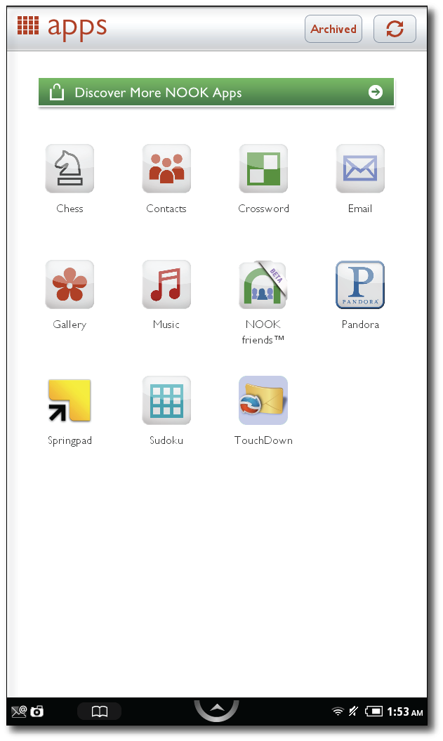
The Nook Color now has apps!

Setting up the Nook Color also involved  adding my Google account. I'm not a diehard Google user like some, but I do have an email address and at some point, I must have synced my address book with the Google address book. Once you add your credentials, the calendar and contacts app immediately populates with data. I did find the contacts app to be a bit lacking as it only allowed for one email address and phone number per person. I have listings in my address book that have multiple instances of each. However, there are already more robust PIM apps in the built-in Nook app store.


Email composition on the Nook Color. I believe this would be more functional if it could be viewed (and typed on) horizontally, but this is one of the apps that I never could get to change orientation.

The Nook Color is designed to rotate the screen when it's turned to the side. However, this doesn't always work, and evidently, some apps simply aren't programmed to do so automatically, although it always works just fine when reading. The touchscreen was also different in its responsiveness from what I'm used to with the iPad. It's not as reactive as the iPad, and often I found myself touching something multiple times before a response was acknowledged. The more I've used the Nook Color, the better I am at using its touchscreen. I'm certain that there's a different technology at play than what's in the iPad, and it simply takes some getting used to.


I was impressed that Pandora comes on the Nook Color by default. All I had to do was add my Pandora user name and password and my "channels" immediately appeared (including the 80s channel as seen above).

The Nook Color is completely navigable by touchscreen. That is to say, there are no optional page buttons like there are on the new E Ink Nook. This works fine, and pages can be turned by either swiping the screen in one direction or another or merely by tapping at the screen's edges. Of course, the downside, like on the iPad, are the fingerprints left behind. If such things bother you, keep a cloth handy or just learn to get over it.

What about memory? The Nook Color has 8 GB of built-in memory. If that sounds like a lot at first compared to E Ink eReaders, keep in mind that the Android OS and downloaded apps take up considerably more space than eBooks. On my Nook Color, I currently have about 5 GB free after loading in my books, a few of my own documents, and downloading a handful of apps. As an advantage over some devices, including the iPad, a micro-SD memory card can be added to expand memory. The memory card is protected by that funny-looking loop on the bottom left of the device. This protects the card and prevents it from accidental ejection.
Documents can be loaded onto the Nook Color. It natively reads Word documents and PDF files. These are "side loaded" via a USB cable or emailed and saved if an optional micro-SD memory card has been added (I was unable to save a document from an email without the additional memory card). Any added document is accessed on the Library screen by selecting "My Files."

I find selecting text on both Nooks more difficult with touch than selecting text on my Kindle using the five way controller, or selecting text on the iPad, for that matter. The problem is my finger is in the way, and I can't see what I'm selecting. This isn't a problem on the Kindle where the finger is not used and the screen remains unobscured. The same goes for the iPad in which a magnified portion of one's selection appears above the line. There's no such feature on the Nook, and I often find myself having trouble getting a highlight to end exactly where I want it to.

The longest uninterrupted amount of time I spent with the Nook Color was the night I first had it. After setting it up and thoroughly exploring it, my eyes were very sore after about four hours. This confirms why I prefer reading on E Ink—it's simply easier on the eyes.


More apps can be added to the Nook Color. Some are free and some for pay, but prices are comparable to what's seen on iOS devices.

The Nook Color has been extremely popular since B&N expanded its functionality a few weeks ago and introduced the ability to add apps. This move didn't diminish its role as an eReader, but certainly put it in greater standing as a full-fledged, multi-purpose tablet. At the moment, there are only a little over 200 apps available for the Nook Color, all discriminatingly selected by the PTB at B&N. That may seem like an even greater walled garden than Apple enforces with its screening process for iOS apps, but it doesn't strike me that B&N is going after high numbers of apps for the Nook. I believe they're looking to make certain that all the important categories are covered with solid representation.

For hackers, the Nook Color has been popular as a device to root and add a non-proprietary version of Android. Some have even called it one of the best Android tablets on the market, especially in its price range. And some believe it deserves that title, even as it exists out of the box.

The Nook Color also plays video, but it's not necessarily a robust video-playing device. I noticed early on in some of the tutorial videos that frame rate was a bit choppy. I doubt that anyone is going to buy a Nook Color just for playing videos, but if that's a strong need, keep in mind that this isn't the best device for that task.

Social features are built into the Nook Color. Any highlight or note can be shared over Twitter or Facebook. The Nook family also has its own social network called "Nook Friends." Adding other Nook owners you know to your circle of Nook Friends allows you to share with each other which books you're reading and allows for easy lending of books.


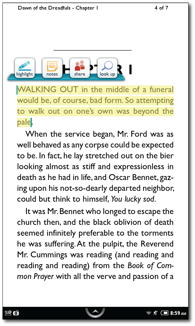
Highlighting text offers a popup menu with a number of different options.

All Nook devices primarily read titles in the ePub format. This means that ePub titles from other sources, such as Google eBooks and even Christian Book Distributors, can be read on the Nook. ePub is also the primary choice for thousands of libraries across the country that have added eBook library lending to their services (Amazon has promised that Kindles will be able to participate later this year, but they can't yet).

As already mentioned, files can be transferred via USB cable, but that cable attachment alone will not charge the battery as it will with a Kindle. The Nook Color needs to be connected to an outlet to charge. The battery won't last anywhere near the amount of time that an E Ink device will, but it's probably closer to the kind of battery life with an iPad. I never really tested the battery, and there hasn't been a time that I've used the Nook Color all day either. I would guess that if it's being used pretty heavily, in whatever manner, that it's going to need to be charge overnight daily just like an iPad.

Who is the Nook Color for? It's for the person who wants ebooks, but needs more than a dedicated eReader, and probably doesn't need or want an iPad. With the ability to carry documents and access email, calendar, and contact information, the Nook Color makes a great device for business that has a larger screen than even the most capable smartphone, yet at the same time can still fit in the average suit pocket or purse. I don't know of any way to connect the Nook Color to a projector, but it's really not designed for that.


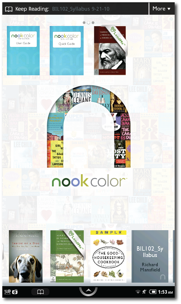
The Nook Color "home screen" which displays when turned on. Background image can be changed to another image provided by B&N or from personal pictures added by the user.

I don't know if anyone who already has an iPad needs a Nook Color. There's simply too much overlap, but that's not to say someone might very well choose a Nook Color over an iPad if it meets that person's needs. I must say, however, in evaluating the Nook Color on its own terms, I have very few criticisms.What it does, it does well, and Barnes and Noble has been aggressively improving it through software updates. And the Nook Color may just surprise you with some features you won't expect to find if you're only expecting an enhanced eReader.

Tuesday
May312011

Significant Updates to iWork for iOS: A Quick Look

Not only did Apple release "universal"  versions of their iWork Suite (Pages, Keynote & Numbers) today making them available for the smaller screens of the iPhone and the iPod Touch, the releases also included a few significant updates from previous versions on the iPad.

Here's a quick overview in pictures (click on images for a larger view).

In the "I don't know why it wasn't there in the first place" department, files in the individual apps can be sorted into folders. This works the same way that application folders are created on all iOS devices: drag one file on top of another and a folder is created that can be given any name.


Files & folders in Keynote for the iPad


Files & folders in Pages for the iPad

A folder's content in Keynote in Keynote for the iPad

Exporting and printing is now handled internally in a document rather than in the file browser as before:


Print/Export features now accessed from within the file (Keynote on the iPad)

No doubt many who teach with Keynote will be thrilled that the Keynote Remote on the iPhone can be used to control slides. The Keynote remote even gives access to presentation notes for complete classroom wandering! The two devices connect over WiFi.


Enable remote from within Keynote on the iPad (cropped image from Keynote on the iPad)


Control Keynote slides with an iPhone or iPod Touch. Presentation notes included! (iPhone screenshot) 

While the new iPad features of iWork are the most exciting to me, no doubt many will find the new iPhone/iPod Touch versions of these apps to be the really big news.

While I couldn't imagine doing serious editing of a Keynote slideshow on my iPhone, I have to admit it offers some new possibilities worth pondering. It was just a little over a year ago that we neded a full-blown laptop to use presentation graphics software. The iPad last year scaled those hardware requirements considerably. But can you imagine now—walking into a classroom and simply pulling an iPhone and an adapter out of your pocket as the only hardware needed for a presentation (assuming the projector is already in the room)?


Keynote on the iPhone: Create a presentation natively or import a PowerPoint or Keynote file created elsewhere.

Creating a new document in Pages for the iPhone

The same templates available in the iPad version are also available in the iPhone version of Pages.


Typing in Pages on the iPhone


Editing text in Pages on the iPhone


Insert a chart: all the same features available on the iPad version are available in the iPhone/Ipod Touch versions.


Again, I'm not totally psyched about the smaller versions of these apps as I doubt I will use them that much (although I may experiment with using Keynote from my iPhone), but simply giving some file management features as well as allowing remote control of presentations really begins to bring the experience up to par with using an actual laptop.


And yes, I know I've offered no screenshots for Numbers, but the same principles above (with the exception of the Keynote remote) apply to that app, too.

Thursday
Apr282011

The Amazon Kindle DX: 9 Reasons Why I Returned It


In 2010, using the Kindle app on the iPad sold me on ebooks. Amazon needs never fear (and I'm certain they don't) that the iPad is taking away sales of the Kindle. In fact, it's probably the opposite. I enjoyed reading ebooks so much on the iPad that I wanted to get a dedicated Kindle. So, in January I bought a Kindle 3 (see review here). I knew I would enjoy reading books on the Kindle based upon my iPad experience, but that wasn't the primary reason I bought the Kindle 3. I teach a good bit in both the classroom and at church. The iPad was wonderful because in one device I could have my presentation slides, textbook and course notes. The problem was that if I had the iPad connected to a projector, I didn't have easy access to these other materials. I needed a second screen—either that or go back to lugging books and notebooks with me again.

So a few months back, I bought a Kindle 3 and absolutely loved it. It did almost everything I needed it to do as a companion to the iPad (see my post about using the Kindle and iPad together), and it also brought another advantage to the table: the Kindle 3 is clearly the best device for straight reading of ebooks. I had no idea how much I would enjoy simply reading on the Kindle. However, I had one small complaint about the Kindle 3: it's small 6" screen. On a near daily basis, I access PDF articles. I found that even though the Kindle 3 would read PDFs natively, it was nearly impossible to read the print on the small screen. You can zoom in, but this is really not a practical way to read most articles. Amazon offers a free conversion service, and I was able to use this with some articles. However, this didn't work as cleanly with directly scanned-in articles, and with some articles, I need to reference original page numbers.

So, I'd been eyeing the Kindle DX—which has a much larger display—for a while, when a couple of weeks ago, Amazon offered a significant one-day discount on the device. I placed the order and received it the very next day. After having it for only a few days, I quickly knew its strengths and unfortunately, its weaknesses.

FIRST, THE POSITIVES:
(1) That fantastic 9.7" screen! Let me say up front that the screen on the Kindle DX really is great. It's got the same E ink Pearl screen as the Kindle 3, but significantly larger, and it's perfect for the PDFs that I needed to use on the Kindle.

A managerial accounting textbook (don't ask) on the iPad, Kindle DX and Kindle 3

(2) More text before turning the page. Reading is also better overall because more text fits on one page. I don't know about you, but somehow this allows me to "absorb" content more easily, and I'm not turning pages so quickly.

(3) Number keys. I like having numbers on the keyboard (accessible with an Alt button and something not available on the Kindle 3), but I have no praise for the keyboard itself (see negative #7 below).

(4) Umm...what else? Let's see...there's a James Joyce screensaver not available on the Kindle 3 (I threw this one in so I'd have one more positive).

Unfortunately, at the moment, I can't think of any other advantages. In fact, in moving from a Kindle 3 to a Kindle DX, I felt that I'd gone backwards in some areas. Why is this? Well, most people don't seem to realize (I certainly didn't) that the Kindle DX is a bit of a hybrid device. Let me explain: the Kindle DX Graphite was released only a few weeks before the Kindle 3 in the summer of 2010. It was the first Kindle to take advantage of the E ink Pearl screen, which is also a feature of the Kindle 3. I've seen the current Kindle DX referred to as a "third generation Kindle DX" and yet, I didn't realize (and I bet a lot of other folks don't realize either) that the current Kindle DX is still running Kindle 2 software (2.5.8). This has a number of implications.

BRACE YOURSELVES FOR THE NEGATIVES
(1) What? No page numbers? Since the Kindle DX is running Kindle 2 software, it has never received the page number update like the Kindle 3 and most Kindle apps. This seems very ironic considering the Kindle DX is usually the Kindle model recommended for academic use, especially with textbooks. I can understand Amazon not updating older Kindles to the newest software (although I'm certain that users of the older Kindles wish they would), but I cannot understand why a model currently being sold would not have the page number update. Even the Kindle app on my iPad has page numbers now. Why would Amazon update the software for another company's device (i.e. the iPad) and not their own? Where's the logic in that?

(2) A neglected "last year's" OS. Related to the above issue is the fact that from what I can tell from published reviews with the current DX was released, while the Kindle 3 software has received continues upgrades and added features since its release, the current OS of the Kindle DX is the essentially the same OS it shipped with it last July. My DX came with software versioned at 2.5.5, which is the same OS mentioned in reviews when the DX was first released almost a year ago. I did find out that there's a 2.5.8 update that fixes a few bugs and supposedly made it turn pages faster. But I had to discover this and install it on my on. Why wouldn't Amazon ship the DX with 2.5.8 installed Other than this minor bug fix, why would Amazon completely halt development of the software on this device—a device, I remind you, that is a model currently for sale?

(3) No following of other readers' comments. Not having the software on the Kindle DX updated means other features on the Kindle 3 are absent on the Kindle DX such as being able to follow comments of specific users (again, a wonderful feature for academic use in which an instructor can add notes to a book and let students follow them in their book).

(4) A substandard web browser. The web browser on the DX is a much less capable than the Kindle 3 browser. The Kindle DX uses this browser to tie the user's Facebook and Twitter accounts (for social sharing), but it was a pain to set up because of all the error messages I kept receiving in which it kept giving me messages that it couldn't download certain file types. I wasn't trying to download anything; I just wanted to connect to Twitter and Facebook. For what it's worth, I had no trouble setting these up on the Kindle 3 a few weeks earlier.

(5) No Audible books. The Kindle DX will not download and play Audible books like the Kindle 3 will. I realize that this might be a limitation due to the Kindle DX only having 3G service and not WiFi, but why not list Audible books in the archive anyway (as is on the Kindle 3) and allow them to be downloaded to a computer and transferred over manually?

(6) No-frills PDFs. PDF functionality on the DX is much more limited than on the Kindle 3. For instance you cannot add your own annotations or highlights to a PDF on the DX, while you can on a Kindle 3. Again, for the device most often recommended for academic use, this, too, makes no sense.

(7) A keyboard that is difficult to use. The only good feature of the DX keyboard is the easier access to numbers on the external keyboard. However, other than this, going from the Kindle 3 keyboard to the Kindle DX is really taking a step backwards. Of course even the keyboard on the Kindle 3 is not stellar, but I found that it's at least usable for quick notes once I got the hang of it. The round buttons on the Kindle 3 stand out, and I found I could run my fingers over them and quickly find the exact letter I needed. The Kindle DX keyboard has odd little horizontally oval keys, and the biggest problem is that the lettering on the keys is very difficult to see. It nearly blends in with the keys themselves, and unless I'm in really bright light, it's very difficult to see the label on the key I'm pressing. I never minded adding notes on the Kindle 3, but it was a a real pain on the Kindle DX.

(8) Battery life doesn't compare to the Kindle 3. Battery life is much shorter on the Kindle DX than on the Kindle 3. My greatest challenge in charging the Kindle 3 was locating the power cord because I rarely ever had to use it. I immediately charged my battery when I opened my Kindle DX until the light turned green. That was on a Saturday around noon. By Monday noon (approximately 48 hours later), it was completely dead. Now, it may be that I have a bad battery. Or it may be that in re-downloading my library, that temporarily heavy use of 3G radio really taxed the battery. Perhaps DX users turn off the 3G when they don't absolutely need it. However, I always left the Wifi on with the Kindle 3. I like my books to automatically sync locations with Amazon's servers, in case I need to switch temporarily to the Kindle app on my iPad. Turning the Kindle 3G signal off all the time would prevent this from happening automatically.

(9) What? I need new headphones? Since having my Kindle 3, I love letting it read to me while I drive. I've always used my headphones that came with my iPhone for this purpose and it worked fine on the Kindle 3. I tried using the same headphones on the Kindle DX, but it would not give me stereo unless I pressed in on the pause trigger on the headphone cord. And then, not only did I get stereo, but the volume seemed to triple. Obviously, I can't drive down the road holding in on on the button of my headphones to get quality sound. And before you say it, I realize that the iPhone headphones are different than normal headphones with their volume and pause/play controls, but they worked just fine on the Kindle 3 (for listening only—the buttons on the headphones obviously don't work on the Kindle). I also realize that the iPhone headphones aren't all that great as far as headphones go, but all I ever use them for is to listen to podcasts or the text-to-speech feature that worked fine on the Kindle 3. I don't want to have to buy a second set of headphones and keep up with two separate sets.

Negatives 1-6 could all be solved RIGHT NOW by a software update. I really find it hard to believe that the internal hardware of the Kindle DX is not capable of handling these extra features present in the Kindle 3. Again, this is a currently shipping Kindle, not a previous model. But it seems as if Amazon began shipping the DX and then quit any further development or refining the software for it at all. My main criticisms relate to lack of page numbers and PDF annotation, which are both present on the Kindle 3. If these aren't a big deal to you, and you need a larger screen, the Kindle DX is probably just right.

One other issue they don't tell you if you're moving from one Kindle to another: I could only transfer over six issues of my current Time Magazine subscription. I've marked every issue "Keep" on my Kindle 3 as I've received them (which is inanely required if you actually want to keep them), including an issue of Time I bought before I subscribed and two individual New Yorker issues that I bought without a subscription. But nothing beyond the last six issues of Time would transfer either from my archives or from "Manage Your Kindle" at the Amazon website. I moved the missing issues from my Kindle 3 to my computer, hoping to transfer them to my DX that way, but when I tried to open them on the DX, I got a message stating that I was not the original purchaser of these issues—something clearly not true. This makes no sense either. If I had a stack of physical magazines at my house and decided to move to a new house, I could take them with me. Why can I not take electronic issues of magazines that I paid for myself? I realize this doesn't relate specifically to the DX (I don't think), but if you're moving from one Kindle to another Kindle, keep this in mind.

So my Kindle DX review BOTTOM LINE: a fantastic screen, but hampered by a dated OS with a reduced feature set and lousy keyboard compared to the Kindle 3. If you've used a DX, I'd be interested in hearing about your experience in the comments.

Wednesday
Apr272011

My Kindle Ebook Came with a Dust Jacket—REALLY!

Very recently—I can't remember now where I heard this, but it was probably on a podcast—I heard someone complain about the lack of "back covers" on ebooks. That is, this person said he liked to read the various blurbs and content that was found on the back of most books when he pulled one off the shelf in a bookstore.

So, last night Kathy and I went to the downtown branch of the Louisville Free Public Library to hear Steven Levy talk about his new book on Google, In the Plex. I'd downloaded the book to our iPads when I noticed something very interesting.

First, I should point out that most ebooks (but not all) will retain the cover of a book. From my iPad screen, here is the cover of Levy's book:

The cover of Steven Levy's book, In the Plex. Note the touch of color, something Amazon started adding to Kindle titles after the advent of the iPad.

Kindle books by default usually open up to page one, which is sometimes an introduction and sometimes the first chapter. However, my preference is to always begin at a point earlier in the book. I suppose I've been with books too long, but I want to see the cover, the copyright page, the table of contents and only then am I ready to dive into the content of the book. If there were an option to start at the cover, I would have made that my default a long time ago.


So, after viewing the cover, I swiped the page, expecting to see copyright information. No dice. Instead I was surprised to see this:

The inside front flap


What is this? As you've probably guessed, this is the front inside flap as normally seen in a dust jacket of a printed copy. Like the cover, this is a graphic image in the Kindle file, so the text seen above is not selectable like normal Kindle titles.

Note that as is often the case in a regular printed book, the text at the bottom of the flap is interrupted mid-sentence. So, I swiped the screen of my iPad again, thinking it would take me to the continuation on the back flap. But nope. Like in a print book, I found myself at the copyright page.

On a hunch, which proved true, I immediately went to the end of the book. On the next to the last page, I found—as by this time, I guessed I would—the inside back flap of the printed edition:

The inside back flap

And as you would surely guess by now, on the next page, I found the back cover, excerpt blurb and all:

The back cover

I have no idea how widespread the practice of adding the dust jacket content into an ebook is, but surely it's a recent development. I admit that I rarely buy "hot-off-the-press" books. Levy's book costs $12.99 for the Kindle edition, but generally I wait until a book hits $9.99 or lower. It will still be there, after all, and will read just the same, regardless of price (publishers should take note of the fact that a lot of us will delay purchase indefinitely if a price is even slightly too high).

In the Plex is a Simon & Schuster title, but I don't know if other publishers are following suit or not. Regardless, I think it's a great idea. It will give some detractors slightly less reason to complain about ebooks, and now you can tell your friends that your Kindle book came with a dust jacket!

Tuesday
Apr262011

I'm Sold on the Amazon Kindle: 15 Reasons

Last week, I wrote about purchasing an Amazon Kindle 3 in January of this year. Originally, I bought it to act as a "second screen" for notes, textbooks, and articles when my iPad is connected to a projector. What I didn't realize was how much I'd enjoy using the Kindle for other purposes, especially it's primary purpose: reading books.

I've never been opposed to ebooks, having used them in one form or another for many years, especially through Bible software. However, as I've mentioned before, it was reading ebooks on the iPad that completely pushed me over to preferring ebooks over printed books. While I'm not saying I'll never buy another "dead tree format" book again, I can easily say that I don't care if I never buy another one again. I've got a dozen bookcases stacked with books in our spare bedroom. I look forward to the day that we can narrow that down to perhaps just two or three and turn the guest room into just that—a guest room—or maybe a study.

Yes, yes, I know that there are those of you out there who look down upon ebooks, who find the reading a physical book to be a be a superior experience. You like the way a book feels in your hand. You like the smell of a book whether it's an old musty smell or the aroma of a freshly printed page. You like to immediately have a sense of how far you are into a book by looking at the pages you have left. That's all fine and good. I can't deny that any of those arguments aren't good ones. All I can say is that I've merely crossed the line, and it's doubtful I'm going to look back.


For me, this statement sums up the whole issue:

"If you love books, an e-book is no substitute. But if you love reading, you'll never switch back."
(Andy Ihnatko, "iPad, Kindle, Nook or Sony? What is the best e-book reader?" August 31, 2010, Chicago Sun Times)


So what's so great about the Kindle? Let me share with you some of my favorite features:

(1) The screen. I can't exaggerate it. The Kindle E ink screen is incredible. In fact, when I first unboxed my Kindle, the screen displayed instructions about how to set it up. These instructions were so crisp looking, it didn't even enter my mind that they were actually created by the E ink display, so I attempted to peel back what I was certain was a sticker. When I realized it was actually the screen, I was stunned.

I've found that the Kindle's E ink display is much easier on my eyes that my iPad's LCD screen. This is especially true for reading for long periods of time and reading right before I go to bed. I often have a bit of eye strain by the end of any given day. However, I find it much easier to focus on the Kindle's screen than on my iPad, even with the brightness turned down on the latter.

Honestly, the quality of the text on the Kindle's screen cannot be adequately described or photographed. You really have to hold one in your hands and see it for yourself.

Click for a larger view.

Above: Together: a photo and a screen grab of the same "page." Unfortunately, neither captures the quality of the screen. You really must hold one in your own hands to see for yourself. Text is from the footnotes section in Gordon Fee's commentary on 1 & 2 Thessalonians (NICNT). Note the quality of the Greek text.


Note: I realize that E ink is not exclusive to the Kindle. It's also available for other platforms such the Sony Digital Reader and the Barnes & Noble (non-color) nook among others. Regardless, this is a technology I hope to see these companies continue investing in. I know there are all kinds of rumors flying about Amazon creating a full-blown Android tablet—which certainly makes sense for them—but I hope they always keep around a dedicated E ink version of the Kindle, too. If E ink is lost, the reading experience of ebooks will diminish in general in my opinion.

(2) Reading with fewer interruptions. I suppose I could simply be more disciplined, but I often find when reading from the iPad that my reading gets interrupted from the "ting" of a new email arriving, or a breaking news alert, or a notice that it's my turn in a Words with Friends game (my player name is Borofaxx—send me an invite). I know I can turn off notifications and turn the volume down, but even when I do this, it's still too tempting to distract myself by quickly looking up something on the internet that I've come across in what I've read.

I've found that if I really want to read with fewer chances of interruption, the Kindle is my best medium. As a dedicated eReader, I don't have to worry about it interrupting me, except for maybe a low battery (which is very rare—see #4 below). Much of my reading relates to work or academic study, and I need to be able to read without interruption. That's why I'm always glad to find a book available for the Kindle, or at times I'll convert a book to the Kindle from another source (I'll write more about this in a separate post). On rare occasion when I get to simply read for pleasure at a long stretch, the Kindle is a must. Such time is rare and certainly to be guarded.

(3) Reading more—really. The first time I ever saw a Kindle in person was at a Starbucks in the Fall of 2009. I noticed a fellow reading one, and although I didn't know him, I interrupted him (a bit hypocritical perhaps in light of the paragraph above!) to ask about it. He turned out to be a minister and was more than willing to talk about his Kindle experience, even letting me hold his Kindle myself! However, one of the points he made really stuck out to me. He said that he read more books on the Kindle than he was reading before he had one. In fact, he told me that he'd read over 50 books in previous year because of the Kindle and had actually had to slow down a bit because of cost.

Over and over again, I hear the same thing from others, and I've experienced it myself: people with Kindles tend to read more books and tend to read more often. In a sense, although books have always been a part of my life, I've had a personal renaissance when it comes to reading. I stake out times in my day and especially before I go to bed to unwind and read something that I'm not "required" to read. And that also means that I'm reading books I probably wouldn't have read otherwise.

(4) Long battery life. While I rarely drain the entire battery on my iPad, I still tend to charge it every night to make certain that I start the day with a 100% charged battery. With the Kindle, I think I'm getting about three weeks on a charge—and that's with WiFi turned on. I use the word think here because I'm really not certain. I really don't have to recharge that often.

I have a buddy who still eschews ebooks. He says to me, "At least I don't have to worry about battery life determining whether or not I can read my books." Well, this really hasn't been an issue for me either. My biggest problem is remembering where I've stashed the power cord when it does get low because I simply don't have to use it that often!

(5) Changing the font size on the fly. On most days I keep my font on the second or third lowest option. I do like to get as much content on a page as I can, but the very smallest setting is too small—even with my glasses. But at night, when my eyes are extremely tired, it's incredibly easy to go into the type settings, accessible with the "Aa" button on the keyboard, and change the text according to what I need at that moment.


I even like the default font on the Kindle. You can choose between "regular," "condensed" and "sans serif." I tend to prefer the regular/default font, which I've learned is named "Caecilia." I'm really not certain why, but I've had a handful of books with a font very much like Times New Roman. Obviously, this is not an internal font on the Kindle, so I don't know why a few books have it, but I have noticed that these books usually are not overly formatted well to adapt to an eReader screen.

I've heard quite a few stories from older people who had pretty much given up on reading, but have really embraced the Kindle as a device that allows them to read again. Think about it: no more regular print vs. large print books anymore. If necessary, every book can be a large print—or even GIANT print—book.

(6) Sharing with the family. It only makes sense to me that people living in the same household shouldn't have to buy two separate copies of a book to read it. Amazon goes a step further, allowing any supported device to be tied to a particular account. In most cases, books are allowed on up to six different devices at a time. These don't even have to be the same kind of device. I have my Kindle account set up on my Kindle, iPad and my Mac. Kathy has it set up on her iPad. My parents have it set on their iPad. We can all share books this way. If any of us create a highlight or add a note, we can all see it.

Moreover, a location in a book syncs, but you're asked before it moves your location. This is handy if I happen to jump back and forth between my iPad and my Kindle. Sometimes I open a book that either Kathy or my mom is reading, and it will ask me if I want to jump to the furthest read location. It will tell me which device has set that point in the reading. I can quickly tell if it's not me and choose not to advance to that point.

By the way, this ability to put my Kindle books on so many devices is one reason I've chosen Kindle books over Apple's iBookstore. Yes, Apple's iBooks look prettier on the page, but I'm limited to reading them only on an iPad or iPhone. For some inane reason, Apple hasn't even made an iBooks app for their own Mac platform yet, although I would think it would be logical to do so eventually.

(7) The size. With the Kindle 3 sizing in at about the same dimensions as a paperback book (and a bit thinner than most), it's easy enough to carry everywhere. It was extremely convenient during the winter months to put it in my jacket pocket and read it during unexpected breaks. It's really handy for taking advantage of any planned or unplanned downtime.

Granted, there are some limitations regarding a six inch screen, such as with with PDFs that need to remain in their native format. The PDF viewer on the Kindle will allow you to scan and zoom, but I don't find this all that practical. Look for my review of the Kindle DX, which has a 9.7" screen in a few days (I tried it out, but returned it).

(8) A library in one small device. Currently, I've got about 200 or so books on my Kindle. Like the iPad, it's amazing to carry so much in one small, book-like device. Supposedly, the Kindle will hold up to 3,500 books. I certainly don't have to worry about running out of room anytime soon, but by the time I might, I'm certain it will hold even more.

Back when I was using only an iPad, it was this aspect—carrying an entire library on one small device—that made me really begin to reconsider the old idea of hoarding physical books on physical shelves. Yes, you have to get beyond the pride of having all those cool looking bookshelves, but just think of how much easier it will be to move your books the next time you relocate if you begin transitioning over to digital.

Another aspect related to this pertains to the reality that I'm often reading more than one book at a time. Sometimes, beyond the kind of reading that I have to do for work, school, or some other project, I often choose my reading based upon mood. I enjoy reading before I go to bed, but honestly, I can't process heavy, life-changing content right before sleeping (or I won't sleep). My reading tends to be of a lighter nature late at night. With so many books on my Kindle, I don't have to worry about making certain I have the correct book with me, or keeping a dreaded stack of books on the night table. Kathy especially appreciate this.

On a related note, Amazon has a larger selection of books on the Kindle than any of its competitors. Regularly, I look around at different platforms to compare price on a digital book. Often it's available on Amazon and nowhere else. I really can't think of a time that I found a book with another company that Amazon didn't also have.

(9) Free books and not just public domain. Almost everyone who first discovers ebooks is often amazed and even overwhelmed at all the free books available. Technically, one could read nothing but free books and never pay for another book again.

Yes, there are millions of works in the public domain available for free download to your Kindle (or any other eReader device for that matter). Think about all those classics that you either enjoyed or were forced to read in high school and/or college. Almost all of that is free, although I've found that sometimes it's beneficial to pay a couple of bucks to get a better-formated copy.

However, there are also a wide number of new and current books made available for free every day. Often a publisher or independent writer is wanting to publicize a title or series by giving a book away for free. Sometimes these books remain free indefinitely, and I've seen others free only for a day. Amazon lists paid and free bestsellers in side-by-side columns. There are also websites like Kindle Nation Daily that offer daily posts listing all recent free releases, organized by most recent titles first.

In my initial experience, and from other Kindle owners with whom I've talked,  most people are not overly selective at first. It's free; I'll take it! But after a while you learn to be a bit more discriminating. I've even gone back to my "Manage Your Kindle" settings on Amazon's website and completely removed certain titles that I never even want to show up in my archives again, let alone on my device.

And yes, I know that free books are available for every eReader platform, but I've looked around a good bit and have found a better selection—especially of new free books—available for the Kindle as opposed to other platforms.

(10) Sharing quotes on Facebook and Twitter. Think about it. How often have you been reading a book and you come across something really profound that you wanted to share with others, but no one else was around? Well, I can't do this on the Kindle app on my iPad, but my Kindle 3 will let me highlight text in a book, make a note or comment and then send all three out to my Twitter and Facebook accounts. Then you can have a discussion of the idea through social networking. I've even discovered a few books I wanted to read from others doing this.

Also, there's a new feature for the Kindle (again, the device, not the app) that allows you to announce to those same social networks when you've completed a book. Of course, you will just have to decide whether or not you're being prideful and bragging about finally completing War & Peace or merely sharing your accomplishment with others who will hopefully care.

Another new feature with a lot of potential is the ability to allow others to read the same book you're reading and see (but not edit) your notes. Think about how beneficial this would be in a classroom setting in which an instructor makes his notes public on a particular assigned book so that his students can see them.

(11) Page numbers. One of the biggest complaints about ebooks has always been lack of page numbers. Because eReaders can easily change font sizes, a set page number is a bit meaningless. Unfortunately, until recently, this made reading an ebook with others who were reading printed editions a real difficulty. The solutions around this were never pretty. In reading a book together with a friend of mine, when he wanted to refer to something on a specific page, I had to search for a string of text to find the location he wanted to discuss. With one of my classes I was teaching last year, I actually spent about an hour comparing a book in the Kindle app on my iPad to a printed copy, making notes in the Kindle title in which I added page numbers on specific sections I wanted to discuss in class. After a while, I had to ask myself if simply taking the printed book with me wouldn't be a bit easier.

Nevertheless, this changed for quite a few books earlier this year when Kindle surprised everyone by adding page numbers to its books. The page numbers align with a specific edition of the book. This new feature was announced right as we were beginning a book study at church, and I was able to keep up with others who had printed books quite well. Not all books have had page numbers added to them yet, but Amazon continues to work on it, and some of the books in which I've seen page numbers have surprised me because I couldn't imagine that they would be high priority.

Now, I know that the B&N nook also has page numbers, but I cannot get a straight answer to whether these pages correspond to any printed copy. A fellow working at Barnes & Noble told me they do, but I've heard from others that they don't. Perhaps someone can clarify this in the comments. Apple's iBooks have page numbers, but they are unique to the ebook and, from what I can tell, do not correspond with a printed edition.

(12) Having the Kindle read to me. This is going to have to be an entirely separate post, but I love having the Kindle read to me when I'm driving. Some don't care for the computerized voice, but I got used to it fairly quickly. I believe it actually sounds a bit better than the voices on my Mac, although I'd have to hear the same text to determine the best voice for certain.

(13 ) Conversions. The Kindle can carry more than just books—it can carry my own personal documents, too. The Kindle will accept a variety of formats including Microsoft Word, PDF, HTML, TXT, RTF, JPEG, GIF, PNG, BMP, PRC and MOBI files. These can be transferred either manually via a USB cable from my computer or via email. My Kindle has its own email address, and I can send any file in the above mentioned formats to the address you see in the screenshot below, and it will then show up automatically on my Kindle's homes screen.

The 6" screen on the Kindle 3 is a bit small for the average 8.5 x 11" PDF, but if I write "Convert" in the subject line of the email, the PDF will be converted to a native Kindle .mobi file. Sometimes the conversion is not perfect, but I've actually had pretty good success with most of the documents I've converted.

By the way, if you are like me and have a rather large investment in ebooks from Bible software companies such as Accordance or Logos, copying text from those programs into a Word file and then sending it to Amazon for conversion is a handy way of reading content from other sources on your Kindle as well.

My Kindle has it's own email address for adding personal documents. No, don't try to spam my Kindle; your address is not authorized!
(14 ) The cover with the built in light. It's great for reading in bed without disturbing Kathy. In pitch black darkness, it's not perfect as the bottom left corner of the screen is not fully lit, but in low light settings, it's just right. Plus, I got it free. For how I did that, see below.

(15 ) Amazon customer service. Amazon proves that there is still such a thing as real customer service.

When I initially ordered my Kindle, I bought it with a standard cover identical to my now lighted cover, but without the light. Amazon's covers are a bit unique because they have hooks that reach inside the spine of the Kindle to hold it in place. The lighted cover uses the Kindle's own battery to power the light. It's these hooks that transfer power from the internal Kindle battery to the light. The non-lighted case simply had basic hooks, I believe, that were simply painted black. From what I've read online, as the black paint came off these hooks, the bare metal came into contact with leads going to the battery and could cause a Kindle to perform erratically.

I learned all this because I was having weird behavior on my Kindle soon after I got it, and I began looking online to see if others did, too. My Kindle would freeze every now and then, and it rarely kept the time very well. I contacted customer service and reported that I was having similar problems to some others were having who attributed them to the cover itself. I asked them if I could get a refund for the case and return it so I could then turn around and buy the lighted case for a slightly higher price. They went one better. They offered to refund my cost for my original case (which they let me keep) and then they gave me an additional $25 credit, which I then applied to the lighted cover (although they didn't require me to do this with the credit; I could have spent it any way I wanted).

I've had success with Amazon's customer service both via email and on the phone. Recently, I bought and then decided to return the larger screened Kindle DX (separate review forthcoming). I talked with one of their customer service reps on the phone first (I had to wait a total of one minute to get a live person!) simply to make certain that my complaints about the DX were not just related to me. And then I established my return from my account page. Easiest return I've ever made.

________________________________________________________


What could be better. Of course, not every thing is perfect. Although I'm overwhelmingly satisfied with the Kindle 3, there are always a few areas for improvement.

(1) That creepy Emily Dickenson screensaver. On the Kindle, the "screensaver" is simply the image that displays on the screen when the Kindle is not in use. It's more of a battery saver, I suppose than a screensaver. I've heard from other Kindle users who bemoan the fact that it's not as easy on the Kindle 3 to hack the system and add one's own pictures, unlike the original Kindle.

I don't mind the default pictures, with one exception. The pictures are all photos or drawings of famous authors. But there's one that I just can't stand: that creepy Emily Dickenson picture. For one,  I'm not fan of Dickenson (the person) or her poetry. I'm sorry she had a tragic love life, but I don't want her staring at me from my Kindle. Any time I turn off my Kindle and she shows up, I immediately turn it on and then back off again. I always feel like it's a good sign if I get a Jules Verne (because he's so cool looking in that picture) or a John Steinbeck (because he's such a great writer). Since we're now starting to get some Faulkner on the Kindle, perhaps we will eventually get a picture of him, too.

A sampling of my Kindle "screensavers." Emily Dickinson is always a bad omen. Verne or Steinbeck: thumbs up!

(2) Controls and headphone jack on the bottom. I find it odd that the power switch and volume rocker are on the bottom of the device. And listening to my Kindle with headphones plugged into the bottom is downright awkward. More on that when I write the separate post about listening to the Kindle.

(3) No number keys on the keyboard and the keyboard in general. Let's be honest: the keyboard on the Kindle is not great. It's impossible to type quickly on it as it has all the finesse of my 2003 Palm Treo 3. And yet, I've become used to it. I experimented with teaching a Bible study from the Kindle once, but I added all my notes through the Kindle app for my Mac rather than torture myself by typing them in on the Kindle keyboard. Having to include any number or symbol is a pain as the user has to press a symbol key and then navigate through the selections that appear on the screen. The symbol screen does not have to be immediately closed, but the note cannot be saved or posted until it is dismissed. If anything, adding one's own notes to a Kindle book is much easier on the iPad than on the Kindle itself. Nevertheless, I add notes—sometimes quite lengthy notes—fairly regularly.

(4) No touch screen. It's funny how quickly we all got used to the iPad's touch screen. Anyone I hand the Kindle to immediately tries to treat it as a touchscreen by swiping at it in an attempt to turn the page. This aspect of the Kindle is very dated at this point. Amazon has to come out with a touchscreen Kindle before long. I just hope that a touchscreen E ink model will be available, and it won't add considerable cost to the device.

(5) That weird black refresh flash. I'm actually used to this now and no longer even notice it. However, when I first got my Kindle, I wondered if it was perhaps defective because every time I advanced the page, it would quickly flash black as the E ink refreshed. I contacted a couple of my friends who had Kindles, and one of them immediately texted me back that her Kindle did not do that. Then she texted me again a few minutes later, saying that yes, it did, but she never notices it anymore. That's where I am now. I don't notice it unless I think about it, but it is very odd.

________________________________________________________


As I've said, I'm sold on ebooks regardless of platform. If you enjoy reading at any level, I encourage you to give them a try. Like me, you may never go back to collecting print books. And I can't give any higher endorsement to the Kindle and the Kindle platform. With Amazon's generous 30-day no questions asked returned policy, you have very little to lose.


Feel free to offer your questions, thoughts, comments and rebuttals in the comments below.