Search This Lamp

 
Comments Policy
 

1. Be courteous.
2. Don't make it personal.
3. Keep it Clean.
4. Don't be a troll.

See more about the comments policy here.  

Note to Spammers: All comments on this blog are moderated. This means that when you post comments linking to your imitation designer handbags, you are wasting your time because I will not approve them. Moreover, I will report you, and your IP address will be banned from all Squarespace sites.

Recent Comments 


Powered by Squarespace

Entries in Numbers (3)

Tuesday
Jan032012

Balaam in the Flesh

This past Sunday, we studied Numbers 22-24 in our Sunday morning Bible study, which is also known as "The Balaam Cycle" or "The Book of Balaam." I teach a group that uses Lifeway's Explore the Bible series, which covers Numbers and Deuteronomy this quarter. Although the curiculum focused on a very narrow portion of verses, I spent a good bit of time going over other content from the greater context as well other concepts from the culture of the time such as the various practices of divination in the ancient world. 

A few years ago, I began using Keynote presentation software which I teach at church. Although I try to stick to the outline and theme in the curriculum, I tend to supplement it a good bit, including making my own slides. I often use Accordance's graphics search to find a "just right" image for an idea or event we're discussing. However, before I search through all graphics resources, I usually first check Zondervan's Illustrated Bible Background Commentaries (OT & NT) as well as the Historic Views of the Holy Land: Bible Places-American Colony Collection. Some of the best illustrations I find come from these two sources. A very close third is Accordance's Bible Lands PhotoGuide

Finding just the right picture in Accordance is not merely a result of being able to search through titles rich in graphics. The real strength comes from being able to search only in the picture captions of these titles. Searching the captions for a name, subject, place, or even a scripture reference usually yields a "just right" picture for whatever I'm teaching on—whether at church or in the classroom. In regard to our study on Balaam, I don't believe I could have found a better picture than the one at the top of this post.

This picture came from the Historic Views of the Holy Land: Bible Places-American Colony Collection. This title is a series of photographs taken on location in Israel and surrounding areas spanning a time from the late 1800s to the 1940s (you can read about the history of the collection here). The value of these photos lies in the fact that the people and places depicted (some staged and some natural) are seen before the region became overly modernized. In fact, many of the pictures depict life as it essentially existed for centuries, even back to biblical times in some cases. 

Just look at the image at the top of the post. Perhaps it was staged, but look at the stone wall and Bethlehem in the background from a time before electricity and automobiles were ubiquitous. Yes, I know that the events of Numbers 22-24 don't take place in Bethlehem, but I cannot imagine a more perfect picture for Numbers 22-24. The exact date of the photo is not precisely known, but it was taken sometime between 1898 and 1946. There is a caption underneath the picture that reads:

“The town itself, no longer walled, is still confined within its ancient limits. There are no suburbs, and in fact, planted on the crest of a narrow spur that projects eastward from the central ridge and then abruptly breaks off, it has no room to expand. The white chalky ridge crowned with the long narrow street, with various alleys on either side of it, presents us with one of the few remaining specimens of an old Jewish city, for, excepting in the disappearance of the wall, it is probably unchanged in architecture and arrangement from what it was in the days of David”

Look at this close up of the man on his donkey. Yes, I know it could be nitpicked in some details, such as the fact that paired stirrups and even the kind of saddle in the picture would not have existed in Balaam's day. Yet when I look at the style of dress on the man and the ornate headband on the donkey, I can't help but see a well-respected and somewhat wealthy individual—prestigious—which is how I imagine the Balaam of the Bible (not to mention the Balaam of the Deir Alla inscriptions, which I also mentioned in our discussion on Sunday).

In my search of the Historical Views of the Holy Land module, all I did was search for "donkey" in the picture captions. I found a number of interesting pictures, but this one the first of the hits. From the moment I saw it, I knew I'd found my Balaam. There were some other interesting pictures, but none of them would have really worked. One showed a man riding a donkey while a woman (presumably his wife) walked on foot behind. Obviously, there's no suggestion that Balaam had a wife, let alone traveled with one. Another picture of a man on a donkey might have worked except for the fact that the man in the photo was showing off his rifle, which would have been anachronistic to a picture meant to illustrate an event from biblical times. 

I ended up using the picture of the man on the donkey in three of the twelve slides I prepared for our study. Each time I used it, it was slightly different than the others. In one photo I showed only the man on the donkey with most of the landscape cropped out. On another, I used the entire picture with its entire landscape as seen in the image at the top of this post. 

In all of my uses of the picture, I added a sepia tone layer—an easy modification from within Keynote that makes an image such as this look even more distant than the original black and white. Below is one of my uses of the image, which I only slightly cropped:
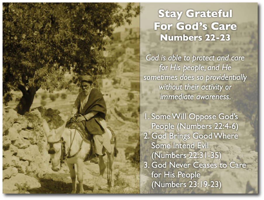
Sometimes finding a "just right" image is more challenging, but this one was perfect; and I knew from the moment I saw it that this would be the one I'd use. To me, this fellow on a donkey, photographed perhaps a century ago, is truly Balaam in the flesh.

As always, your questions, thoughts, comments and rebuttals are welcome below.


Tuesday
May312011

Significant Updates to iWork for iOS: A Quick Look

Not only did Apple release "universal"  versions of their iWork Suite (Pages, Keynote & Numbers) today making them available for the smaller screens of the iPhone and the iPod Touch, the releases also included a few significant updates from previous versions on the iPad.

Here's a quick overview in pictures (click on images for a larger view).

In the "I don't know why it wasn't there in the first place" department, files in the individual apps can be sorted into folders. This works the same way that application folders are created on all iOS devices: drag one file on top of another and a folder is created that can be given any name.


Files & folders in Keynote for the iPad


Files & folders in Pages for the iPad

A folder's content in Keynote in Keynote for the iPad

Exporting and printing is now handled internally in a document rather than in the file browser as before:


Print/Export features now accessed from within the file (Keynote on the iPad)

No doubt many who teach with Keynote will be thrilled that the Keynote Remote on the iPhone can be used to control slides. The Keynote remote even gives access to presentation notes for complete classroom wandering! The two devices connect over WiFi.


Enable remote from within Keynote on the iPad (cropped image from Keynote on the iPad)


Control Keynote slides with an iPhone or iPod Touch. Presentation notes included! (iPhone screenshot) 

While the new iPad features of iWork are the most exciting to me, no doubt many will find the new iPhone/iPod Touch versions of these apps to be the really big news.

While I couldn't imagine doing serious editing of a Keynote slideshow on my iPhone, I have to admit it offers some new possibilities worth pondering. It was just a little over a year ago that we neded a full-blown laptop to use presentation graphics software. The iPad last year scaled those hardware requirements considerably. But can you imagine now—walking into a classroom and simply pulling an iPhone and an adapter out of your pocket as the only hardware needed for a presentation (assuming the projector is already in the room)?


Keynote on the iPhone: Create a presentation natively or import a PowerPoint or Keynote file created elsewhere.

Creating a new document in Pages for the iPhone

The same templates available in the iPad version are also available in the iPhone version of Pages.


Typing in Pages on the iPhone


Editing text in Pages on the iPhone


Insert a chart: all the same features available on the iPad version are available in the iPhone/Ipod Touch versions.


Again, I'm not totally psyched about the smaller versions of these apps as I doubt I will use them that much (although I may experiment with using Keynote from my iPhone), but simply giving some file management features as well as allowing remote control of presentations really begins to bring the experience up to par with using an actual laptop.


And yes, I know I've offered no screenshots for Numbers, but the same principles above (with the exception of the Keynote remote) apply to that app, too.

Monday
Apr052010

Two Days with the iPad: 41 Reflections, Discoveries, Critiques & Tips


No, I'm not going to write a formal review of the iPad. There are a thousand of those out there, and I doubt I could add anything relevant. After having spent the last couple of days with the device, though, I've discovered a number of interesting things in my poking around that I thought I'd share. These aren't in any particular order, but I'll try to keep similar items together.


  1. Yes, as everyone else says, the iPad is heavier than what one first expects. While some have criticized this aspect, I like it. The iPad feels solid.

  2. Those who still criticize the iPad for not having a widescreen display don't get it. It would be so awkward goofy to hold it and turn sideways if it were widescreen. Watching movies would benefit from a widescreen, but few other things. This is more akin to holding a book. I don't want a widescreen book.

  3. While the screen seems just the right size at the moment, I don't know if other sizes might be appreciated, too. A full 8.5 x 11" screen might be nice to use. I've heard rumors that Apple may offer different sized screens in the future.

  4. Immediately upon turning the iPad on for the first time, you will have to connect it to a computer to set it up. This is not an independent machine at all. While I think the iPad would be great for taking notes in a classroom setting, the university that announced a few days ago that all incoming freshman would get an iPad instead of a MacBook need to rethink that strategy. The students will have to have a computer, too. This situation may change in a few years, but right now, the iPad is not an independent platform.

  5. Those who criticize the iPad for not replacing a computer, don't understand it. The iPad is clearly intended to be a secondary machine. Of course, it's also criticized over this. "Why do I need another device to carry around?" That's not getting it either. I still remember the first time I saw an entire computer dedicated for use as a cash register. I thought that this was a waste as this computer could do so much more. An entire computer wasn't needed to simply function as a cash register in my opinion. Regardless of whether you agree with that (or even if I still agree with that), the reality is that often I take my MacBook Pro into situations in which a much lesser device would better suffice. I'm not getting rid of my MacBook Pro. I still need it for "heavy lifting," but there are many contexts in which all I need is something like the iPad. I am thinking of those times such as going to a faculty meeting or a deacons meeting at church in which I basically need to take a few notes and have access to my calendar. Yesterday, I took my iPad to church and taught our Bible study using Keynote for the iPad. It was a nice change of pace to not have to lug my entire laptop bag.

  6. For both Kathy and me, the first sync was excruciatingly long. We both opted to include our photos in iPhoto on the iPad. I have over 10,000 pictures, and she has over 6,000. iTunes has to "optimize" the photos for the iPad just as it does for the iPhone. Then, it still has to copy them. This took about two hours for each of us.

  7. When connected to WiFi, the iPad continues to receive mail—even beeps—just like the iPhone when turned off (or technically in sleep mode). That may seem like an obvious feature, but my computer doesn't do that. What's really weird is having my Mac running with my iPad and iPhone in the same room. Three beeps for every one email!

  8. Like I've always done with computers and my iPhone, I turned up the brightness to full capacity. I soon found this hurting my eyes. Really, all the average person will need is the brightness set to the middle position in preferences. Really.

  9. The interface animations are extremely fluid. Pick one up and slide from the first screen to the second. You'll see what I mean.

  10. Speaking of interface, I'm very impressed with the aesthetic detail of some of the iPad apps. I can't remember such attention to visual interface details on standard computers since...well...ever. To me applications like Contacts and Calendar look gorgeous. Not all agree. Paul Thurrott wrote yesterday, "Contacts is ridiculous. Apple needs to get over its desire to ape real world interfaces. That does not work." To each his own. I think it looks great. It has an old school charm, even down to the stitching in the center of the address book. Perhaps, this is why Paul prefers Windows :-)

  11. I love reading and respond to email on the iPad. It's not just a great interface, but also a very handy and comfortable form factor. However, I dislike not having a junk mail filter. I could easily see myself using the iPad for email more than my Mac, but I don't like the junk mail that gets through.

  12. Biggest complaint against Mail app on the iPad: no integrated inbox—not even an option for this. I thought Steve promised this a couple of weeks ago in an email? Hopefully that's coming.

  13. The virtual keyboards work great. In landscape mode, the keys are the size of a regular keyboard. In portrait mode, I'd equate my typing to that on some of the smaller netbooks I've tried. I've actually got the external keyboard dock on order and it should arrive this week. But I've found that I'm actually pretty fast in landscape mode. It's easily the size of a regular keyboard sans the numeric keypad. However, I keep trying to hit an apostrophe and end up hitting the return key. Actually, one really doesn't have to enter apostrophes at all as the interface will simply add them to common contractions and even some possessives. Like the iPhone, the apostrophe key is on a second keyboard layer. Yet the exclamation mark and question mark are included on the regular comma and period keys, respectively, by using the shift key. I understand having two separate keyboard layers (really three) on the iPhone, but with the larger keys on the iPad, I believe many of them could serve for two separate characters like most keyboards. That means adding an actual number row above the character rows.

  14. The iPad offers four different slide show modes: Cube, Dissolve, Ripple, Wipe and Origami. The last is easiest the most fascinating and fun to watch. Unfortunately, when I connected the iPad to a projector yesterday to show a shuffled rotation of over 1300 photos in our Bible Study group, I could only choose from the Dissolve transition. Clearly, that's the least interesting. I don't know why it would be limited to just this one.

  15. My biggest gripe about the iPad is the lack of an accessible file system. Each application has to hold its own files and you cannot create folders. Why would this be an issue? Well, for instance, I'd like to see if I could use the iPad in the classroom. For any given course I teach, I have multiple files: syllabus, gradebook, Keynote presentations, etc. It's convenient to keep them in one folder or a grouped nest of folders. The iPad simply doesn't work that way. Each file has to be transferred to its own program.

  16. One would think that the above issue could be overcome by placing folders in my MobileMe iDisk. And while the MobileMe iDisk can be accessed on the iPad via its iPhone app, I can't simply tap on a Keynote file and have it open in Keynote on the iPad. I have to transfer a Keynote file either through iTunes on my computer or email it. Why the iWork apps don't have access to my iDisk built in is beyond me.

  17. PDF documents create an interesting issue. Yes, if someone emails me a PDF file, I can view it in the Mail app, but there's no way for me to group a batch of separate PDF files. To me there ought to be some kind of application built in just for reading emails. Fortunately, I found an excellent app for 99¢ called GoodReader. It will connect to a MobileMe disk, email account, network server, Dropbox, Google Docs and more to retrieve documents and group them in the application. It works well and has a very intuitive interface.

  18. I spent quite a bit of time in the three iWork apps: Pages, Keynote, and Numbers. Here's what's interesting. The iPad apps are not actually sharing a common file format with their counterparts on the Mac. It doesn't matter whether you have a Pages file or a MS Word file, both have to be imported to Pages on the iPad and then exported back out. I guess in the final analysis, it doesn't really matter, but I do find it very interesting.

  19. If you have iWork '08 or earlier, you're out of luck. iWork on the iPad won't read your files. You have to have iWork '09.

  20. Some things about the iWork apps are not intuitive at all. There's no menu system because the interface has been completely rethought for touch. But this can cause problems. How do you rename a file? How do you perform a "Save as" for a file. I had to go online for these answers. You have to rename a file in the "My Documents" section of your app by tapping on it. I don't think I could have figured that out on my own. If you want to do a "Save as," do it before you edit the file by choosing to duplicate the file.

  21. Interface conventions are not always consistent across the board, but some are. Double-tapping a word in programs like Safari, iBooks, and the iWork apps selects the word. The iWork apps allow you to triple-tap a word to select the entire paragraph, but this doesn't work in any of the other apps. You might want to do this in the other apps to copy text.

  22. Neither text nor graphics can be copied out of the iBooks app or the Kindle app.

  23. I bought the initial April 12, 2010 issue of Time Magazine released for the iPad. I like the interface in which each article can be read on one screen with vertical swipes while swiping horizontally to move to the next article. However, Time is extremely overpriced at $4.99 an issue. Last week, I updated our print subscription to Time for the entire year for $20. That's about 40¢ an issue. There's no way I'd choose digital over print at those prices.

  24. I'm astonished at the fact that Pages does not allow footnotes. Really. Or even endnotes. In fact, if you import in a document with footnotes or endnotes, it removes them—completely strips them out! There's an alert upon conversion to this regard, but frankly it's startling to me. I cannot even write a thank-you note without footnotes! I've seen text conversions between word processors on the computer in which footnotes might be converted to endnotes, but strip them out completely? If Apple wants the iPad to receive heavy use from students, let alone academics, Pages will have to include the ability to add footnotes. Either that, or another company has a chance to come along and create a much more robust word processor for the iPad.

  25. I've already noted that the iWork apps on the iPad are not truly sharing the same file format. That also means that like the footnotes that are stripped out, other things can be stripped out as well. First page headers and footers get deleted. An alert is offered if a particular font is not available. Keynote will accept some video formats in a presentation but not others. I'm not certain yet which ones work and which ones don't. As soon as you import a file, an alert is offered to tell you what will be missing. Needless to say, you need to fully check any imported files before rushing out the door to a context in which you'll need them.

  26. Some apps like the iWork and iBooks app do not reset when closed. I was initially worried about this based upon my experience with the iPhone in which many apps have to completely "restart." In iBooks, the page opens right where you left off. If you are working on a document in Pages, you can go read your email and then come back to pick up right where you left off.

  27. The most egregious missing feature in iWork for the iPad for me is presenter notes in Keynote. And it doesn't make sense because when connected to a projector, the iPad creates the equivalent of an extended desktop. It's not a plain mirror of what's on the iPad. So why not have a presenter's screen with notes like on the Mac version of Keynote? I haven't printed out notes in at least three years and to do so seems like such a step backwards and the antithesis of what the iPad is supposed to represent. I hope that a future revision will remedy a lack of presenter notes. .

  28. I've actually managed to completely crash the iPad once. I imported a particularly media-heavy Keynote file that I used on Sunday a few weeks ago, only to watch as Keynote crashed during the import process. Then the entire iPad rebooted. There's no warning if an app crashes; the iPad just goes out to the desktop. And if the iPad itself crashes, it simply reboots on its own.

  29. I was particularly interested to see how Pages (and Keynote) would handle biblical original languages texts. Since there is a Logos app on the iPad (no Accordance app yet and Olive Tree's iPad-specific BibleReader app has not made it to to the app store as of this writing), I thought I'd try copying text from the Greek New Testament and Hebrew Bible. After struggling a while to copy text, I realized that the Logos app doesn't allow for copying. A comment on their website forums says it's coming in a future revision. So, on my Mac I copied unicode texts of Genesis 1:1 from both the Hebrew Bible and the Greek Septuagint from Accordance into a Pages file and imported it into Pages on the iPad. Both texts showed up great, and the Hebrew text even read from right to left correctly except for bere’shit at the beginning of the Hebrew text. I could change the font size, but I could not edit text. I couldn't even place a cursor in the middle of the Hebrew text, and while I could do that in the Greek text, neither would allow me to edit in Hebrew or Greek. I have no idea how to switch to a unicode keyboard in the application for this level of editing.

  30. There is an updated WordPress app for the iPad. It's somewhat better than the iPhone version, but really with the larger screen, I don't know why one wouldn't want to simply use the WordPress admin site in Safari. I'll have to try this later and get back to you.

  31. iWork apps come with 43 fonts. From what I can tell, they're not system-wide for other apps to use, but I could be wrong.

  32. Pages and the other iWork apps don't convert straight quotation marks to "curly" quotation marks. A lack of such is so 1991. You can achieve them manually, however, by holding down the quotation mark key and selecting the symbol you want (do you have any idea how difficult it was to get that screenshot?).

  33. I would not want to do a lot of data entry in Numbers using the virtual keyboard. I updated our monthly budget for April using Numbers on the iPad based on last month's budget file. Although Numbers is smart enough to change the keyboard based upon what kind of data fill you're in, a spreadsheet is just a bit awkward. It would definitely be better with an external keyboard—one that had both a tab key and a numeric keypad, to boot.

  34. There are too many steps to change fonts and font sizes in Pages. I recognize the power of predetermined styles, but that doesn't mean I don't want to occasionally make minor changes to a selection of text that I don't need to create a style for. Right now, simply to change the font of a word (without using a predetermined style), here are the steps: (1) selection your text, (2) select the inspector, (3) scroll down past all the styles, (4) tap "Text Options," (5) tap "Font," (6) scroll through the fonts, and (7) tap the font you want. This should be easier.

  35. Ironically, iWork Pages on the iPad autosaves in spite of the fact that its Mac equivalent does not.

  36. As I mentioned,  took my iPad with me to church yesterday. It was a nice change of pace to simply carry my Bible and and the iPad in its case. It really looked and felt like I was carrying two books with me. This is again why I say that the form factor on the iPad is just right. So why did I need to carry a Bible if I have Bible apps on the iPad? I needed it because I planned to teach from Keynote on the iPad, so I needed a separate Bible. This is really not a big deal as I usually have my Bible, MacBook Pro and my laptop bag. I felt much lighter yesterday!

  37. While sitting in church as our pastor gave his message, I decided to use my iPad instead of my printed Bible to follow along. Lately they've been turning the lights too low during the message to actually see a Bible anyway. Although my pastor was teaching from the NLT, I decided to use Crossway's dedicated ESV iPad app. It opened to Genesis, and it took me a moment to figure out how to get to John 21 which was the text of the day. After I figured it out, I was delighted to see what a nice app for the iPad that the Crossway ESV app is. Certainly, it doesn't have all the frills of a larger suite of software like the offerings from Logos or Olive Tree, but it doesn't have the distractions either. At one point, I accidentally double-tapped some of the text only to see a window pop up showing the single verse, cross references, and a place to add my own notes. As an added bonus, text can be copied out of the ESV iPad app and pasted into other apps such as iWork Pages. I was very impressed by this app as having more depth and features that I originally realized. I know that some of you reading this are heavy ESV users, and I think that you would probably want to check out this app if you have an iPad.

  38. Also, toward the end of my pastor's message, I had an idea for an extra slide in my Keynote presentation which I was going to use in our Bible study that was to follow the service. It was so easy with my iPad already opened to simply add a new slide and the text I needed. Previously, opening my entire MacBook Pro would have seemed just a bit too conspicuous.

  39. Speaking of my Keynote presentation, I created the entire file with nine slides on the iPad. While it's very nice to be able to do that, and especially nice to do quick updates unnoticed, I imagine I will normally want to create them on my Mac. Like my mention of spreadsheets above, I believe that some things are still going to be easier and faster to do on a regular computer as opposed to a touch interface.

  40. On Saturday, when I tried logging into the Logos app (you have to log in to access the books that you own in the desktop software), I was initially confused by the process. There was a place for my user name and password and two buttons: one that read "Skip" and one that read "Sign Up." Well, I didn't want to do either. But I went ahead and entered my information and checked "Sign Up." That took me to a screen to create an account which is not what I wanted to do. After going back to the first login screen, I noted that the virtual keyboard had a "Go" button instead of the normal "Return." I've discovered that the iPad will often change types of keyboards based on what type of task the screen requires. So this time, I hit the Go button and—voila!—I was logged in. Although I tend to use Accordance primarily and Logos secondarily on my Mac, I can see very real potential for reading some of my Logos books from beginning to end on the iPad because of both the book-like form factor and the higher resolution screen that will be easier on the eyes. Although I have thousands of books on my Mac, I use them more for reference than straight reading because I find it difficult to read for long periods of time on the computer.

  41. Speaking of reading books, I tried out both the iBooks app and the Kindle iPad app. The Kindle app downloaded my four previously acquired Kindle books with no difficulty. Both are very straight forward, although the iBooks app has animated page turning. I don't know if this will get annoying or ignored in reading, say, a 300 page book. There should probably be a preference to keep the animation from occurring. Regardless, it seems to impress those to whom I've shown my iPad.

All in all, despite having some "version 1" gotchas, I'm very pleased with my iPad. Again, it's not made to replace anything, but can be a very nice secondary alternative. It has that "curl up on the couch" feel that a laptop or even a netbook does not have. I plan to carry it with me instead of my laptop to those places that don't require the extra computing power that a laptop or desktop computer offers. The iPad is my way to go "lite" and realistically, this may be for half or more of my normal computing needs.

When I bought my MacBook Pro in 2008, I purposefully spent extra money and bought a high end model that could be upgraded and would last me for a while. I even said at the time that this was my main computer and I wouldn't replace it for at least five years. I still plan to hold to that time frame, but in 2013 when I go to buy a new Mac, maybe I won't need a laptop after all. Maybe I can go to a less expensive iMac desktop Mac, knowing that the iPad of 2013 may very well be all I need for portable purposes.