My Preferred Apple Watch Face (At Least for Now)
 Sunday, May 17, 2015 at 8:55AM
  Granted, it may not be as cool as expanding flowers and flapping butterfly wings, and it's certainly not as fun as Mickey tapping his foot to keep track of passing seconds, but I've found that for me, the watch face called "Modular" is the best suited for my uses.
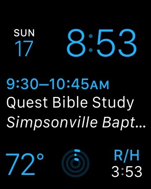
You can see the image to the left. Let me take you through its functions. Obviously, on the top row, you have date and time. Below that is the next event on my calendar. Tapping on either the date in the top left or on the calendar event will take me to the Calendar app on the watch where I can get more details about an individual event or my entire day.
On the bottom row at the far left is the current temperature. This automatically updates to my location. So no more asking of Siri, "What's the temperature outside?" on my iPhone." Funny, she's never been able to tell me what the temperature is inside. Tapping on the icon brings up the Weather app.
In the middle of the bottom row is an icon for the Fitness Tracker (move, exercise, and stand). Tapping on the icon launches the app on the watch where I can get more details. I'm actually paying attention to this, and hopefully that will result in better health. Don't judge me on so little progress so far for the day--it's early!
And then finally, on the far right is a work-related time zone of which it's helpful for me to keep track. Tapping on that icon brings up the World Clock app.
I like the Modular face because it is extremely functional. Yes, it's not as cool or fun as other faces, but that's okay. And there are also some very nice faces that emulate moving hour, minute and second hands, but let's be honest--why do we really need hour and minute hands on a digital watch? I suppose some people will like them for the same reason they put old fashioned phone rings on their iPhones--it harkens back to those older interfaces--but to me emulating a traditional watch face is the ultimate in skeuomorphism. Hour and minute hands on a watch that has actual gears turning inside makes sense, but I don't really need it for a smartwatch. Even if it only takes milliseconds, the brain has to process the meaning of the minute and seconds hands, and this is not as efficient as simply looking at the time represented in numbers for hours and minutes.
Nevertheless, there are choices here, so we don't all have to agree--and that's a good thing. What about you? If you have an Apple Watch, what's your favorite face to use as your primary display? Do you use other ones at other times of the day? Let me know in the comments.
 R. Mansfield
Quick Tip:How to Get a Screen Capture on an Apple Watch
Getting a screen capture on an Apple Watch, like the one at the beginning of this post, is pretty simple: simply press both the Digital Crown and the Side Button at the same time. You should only have to press (quickly) once. If you've done it correctly, the screen will briefly flash, you'll hear the sound of a camera shutter, and you'll feel a taptic impression on your wrist.
Then the image will be with your photos. It should sync over to the Photos app on your iPhone or any other Apple device. Once there, you can use it however you like!
 Apple Watch in
  Technology

Reader Comments