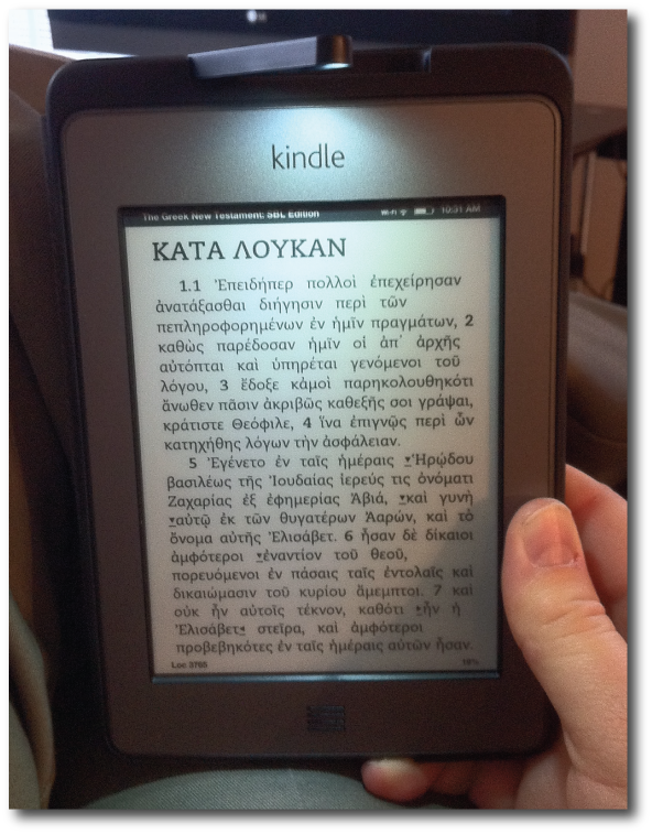
 Above: Kindle Touch with Lighted Cover displaying the SBL Greek New Testament from OSNOVA
I've said it was the iPad that sold me on the idea of valuing ebooks over physical books (in most situations). However, after I was convinced that ebooks were the way to go, I didn't simply intensify my reading on the iPad; no, I turned around and bought a Kindle. At the time, that device was known as the "Kindle 3" (now known as "Kindle Keyboard"), and it became an indispensable part of my life and routine.
Although I've always been a strong reader (so declared by my elementary school teachers), like a lot of people, I can honestly say that I read more because of the Kindle. It's so highly portable, I can carry a library of books with me in a jacket pocket allowing me to read at any point of the day—especially those unplanned times of waiting for something or someone that we all regularly find ourselves in.
The Kindle didn't cause me to give up my iPad; in fact, because there's a Kindle app on the iPad, and because I depend on my iPad now for so many other things, if I had to choose between the two, I'd reluctantly give up the Kindle and keep my iPad. Yet I'm glad that I don't have to make that kind of choice. For periods of reading longer than 10 minutes, I find the E Ink screen of my Kindle highly preferable to reading on the iPad. Reading the Kindle instead is like reading paper vs. reading a computer screen—it's simply easier on the eyes for extended sessions.
In the time I've had my Kindle, I've observed a very interesting phenomenon when I hand it to the uninitiated for examination. Almost without fail, anyone who handles my Kindle immediately touches the screen or tries to swipe it to turn the page. I think we can safely call this "the iPad effect" because Apple's tablet has definitely changed our expectations for the way we interact with our devices.
Thus, I knew for the last year that a touchscreen Kindle was inevitable, especially after Barnes & Noble released their own touchscreen E Ink Nook (see my review here) a few months back. When Amazon announced the new Kindle Touch, I immediately put in my order. This was in spite of the fact that the new Kindle Fire, announced at the same time, received much more attention from the press and customer anticipation.
I was out of town at ETS/SBL when my new Kindle Touch arrived. Although I had to wait a few more days than some to get my new ereader, at least I had my trusty Kindle 3/Keyboard to bide my time. And then, in my time of waiting, I started reading reviews of the Kindle Touch and was surprised to see how many of them were negative. Quite a few reviewers, who had been longtime Kindle aficionados, spoke of returning the Kindle Touch simply to stick with the previous model.
After finally getting my hands on the Kindle Touch, I saw what so many had been so upset about: although a touchscreen Kindle is a welcome advance to most, the reality is that the interface on the Kindle Touch is much less intuitive than that of any of the previous non-touch-interface Kindles.
This is pretty understandable. The interface of the previous models is fairly clear when there are buttons labeled "Back" and "Menu" on the front of the device. However, with only two buttons on the Kindle Touch—the Home button (which looks like a grill more than a button and is labeled in no way at all) and a power button on the bottom—the user essentially had to figure out everything on his or her own.
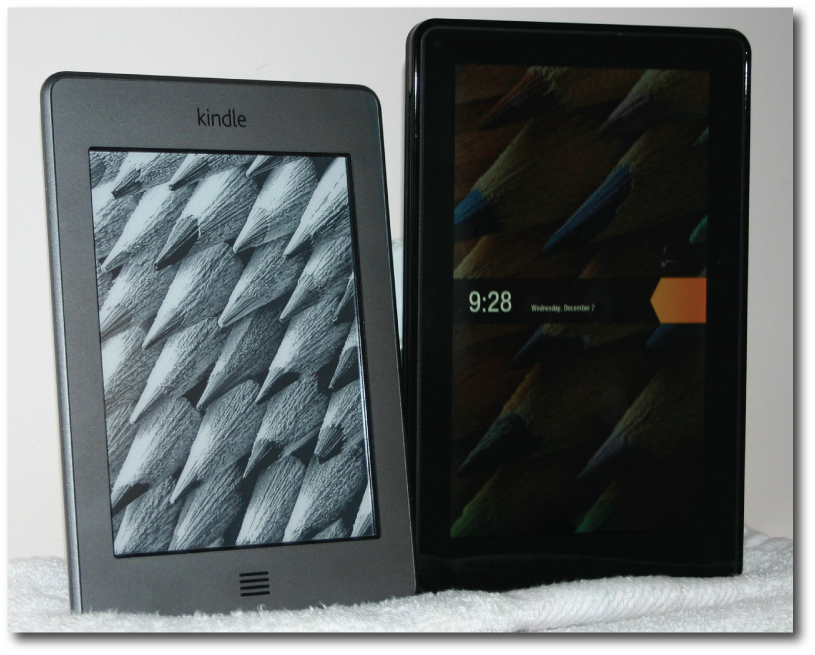
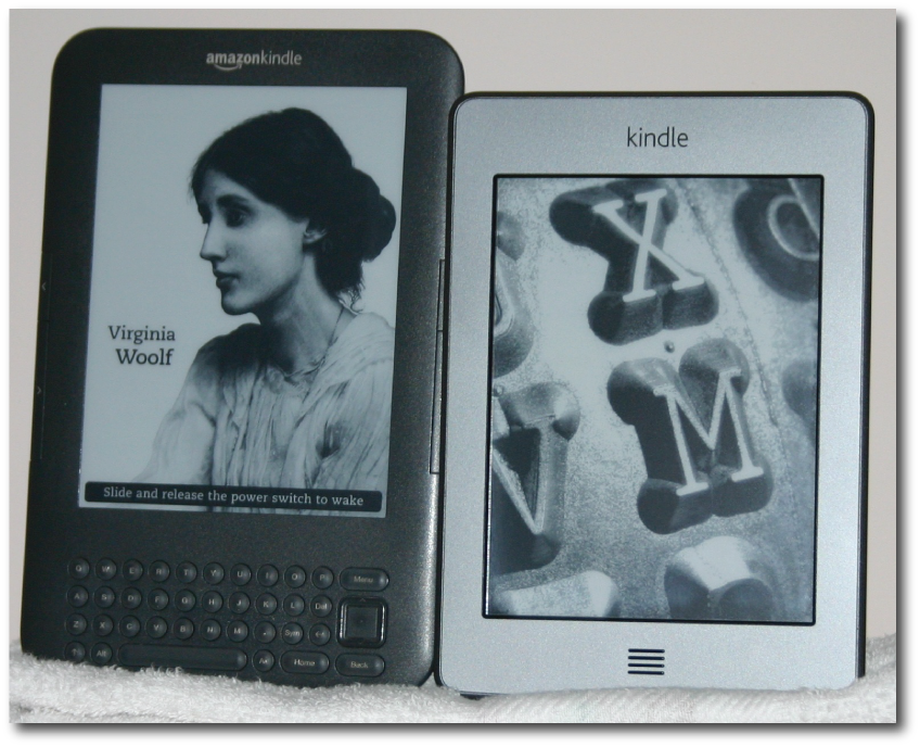 My original Kindle 3 (now called Kindle Keyboard) on the left and the new Kindle Touch on the right.
Of course, that's not entirely true. Upon powering up the Kindle Touch for the first time, there are three "tip" screens that offer an explanation of the vast majority of how the eReader works.
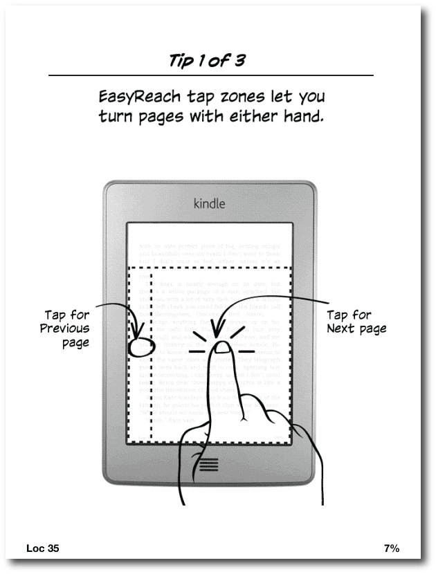 Screenshot above: Tip #1 that shows the "zones" on the Kindle Touch for moving to a next page or previous page. Note that the next page zone is much larger because there's an assumption that one advances a page more often than going backwards. There are no physical buttons for page turning as their are on previous Kindles or the Nook Simple Touch.
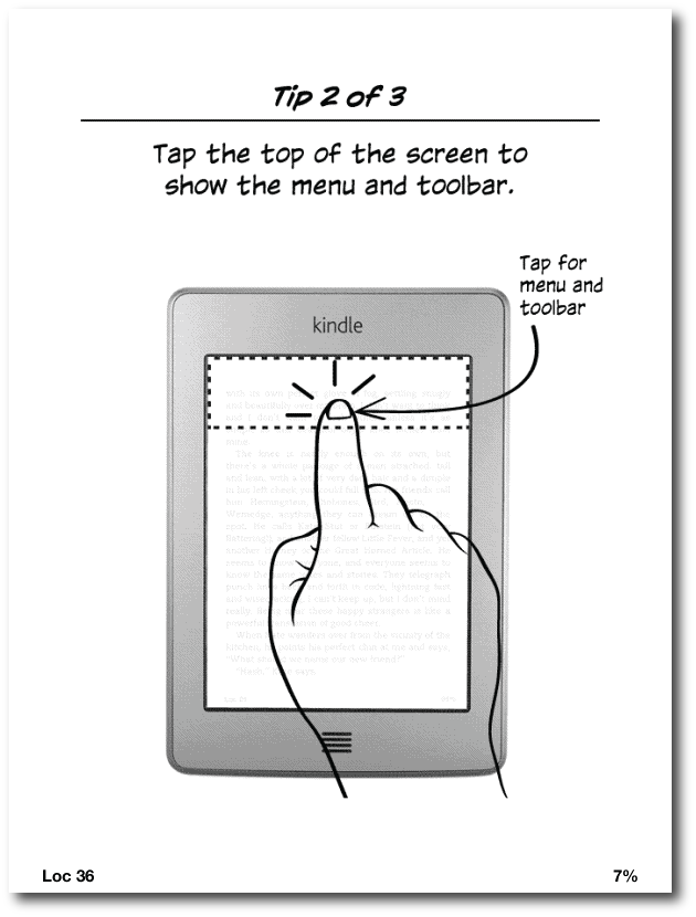 Screenshot above: Tip #2 shows the zone for accessing the Kindle's interface from within any book being read.
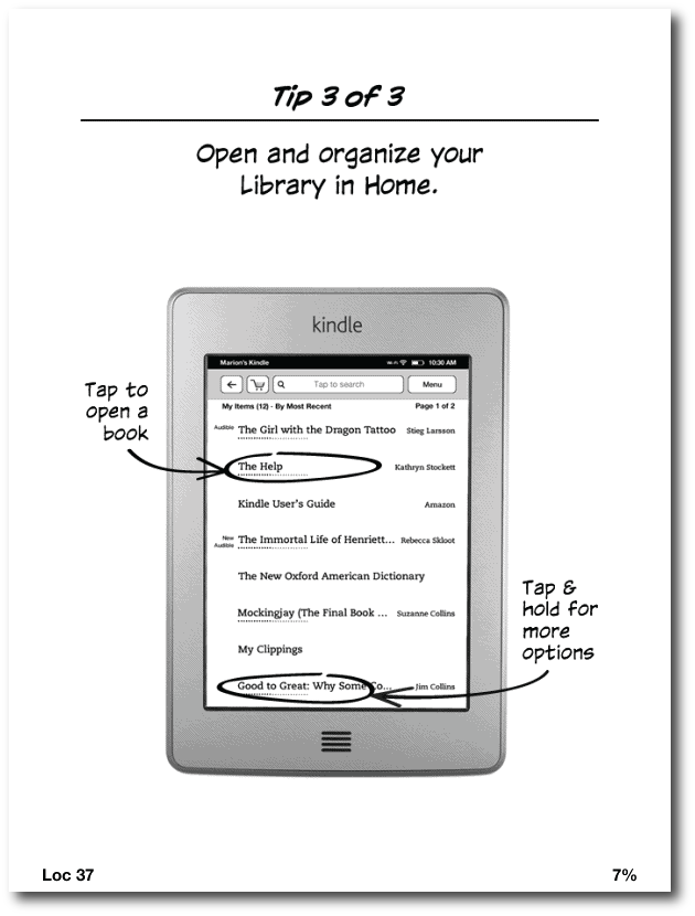 Screenshot above: Tip #3 explains how to work with titles from the Kindle's home screen.
However, if the average user is like me, I quickly moved past those screens, wanting to simply "jump in" and explore the device for myself. Later, after downloading a few hundred books from my personal Kindle library, I realized how valuable those early help screens really were, but I wasn't certain how to get back to them (FYI: they're in the Kindle User Guide on the device).
Again, most of what one needs to know to navigate the Kindle's interface is available in the above three tips, but if someone is very familiar with previous Kindle generations, the new way of doing things may seem confusing. Below are some more screenshots that demonstrate the new way to interact with the Kindle.
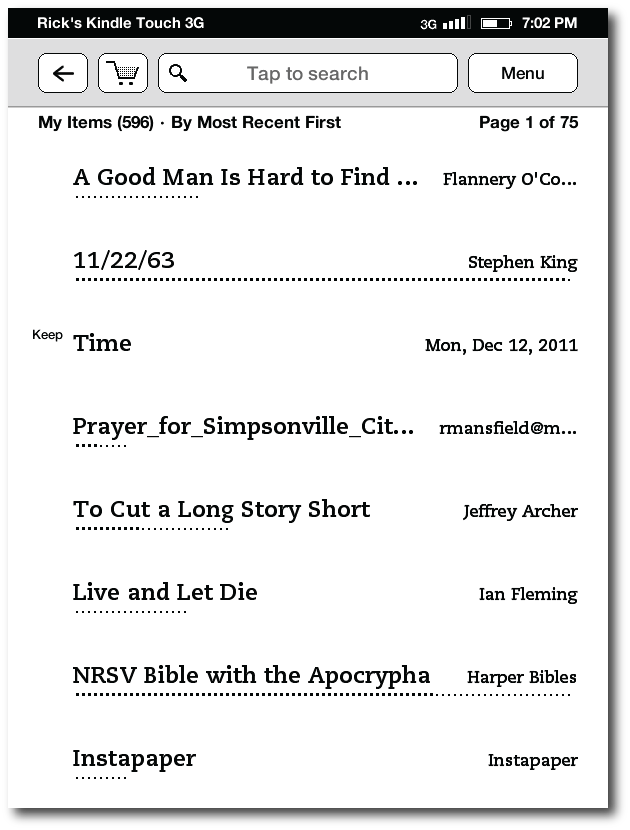 Screenshot above: the new touch-based interface home screen
As you can see in the image above, not too much has changed for the Kindle home screen with the exception that there are buttons at the top of the screen instead of a text-based interface as with previous Kindles. The leftward-pointing arrow serves as the back button throughout the device, and the shopping cart takes the user straight to the Amazon store, making new purchases both quick and easy.
However, the interface is not consistent. On the previous Kindle, if you wanted to change sorting order among the Most Recent, Title, Author and Collection options, you used the five-way controller until you reached the text displaying the way the list was currently sorted. On the new Kindle, I saw no button for this function; nor was it an option on the menu. I suppose there's a "Duh!" kind of logic to the fact that now, to change the order, all I had to do was touch that text to bring up this screen:
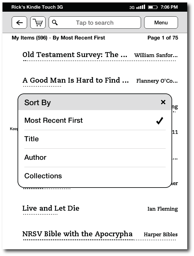 Screenshot above: sort your books by any of the four options.
Nevertheless, this means that some options on the Kindle are chosen by touching a button and others are made by touching text. This is not immediately apparent unless one has studied the user guide. Another inconsistency (from my perspective) had to do with advancing a page. As already mentioned above, when reading a book, to advance the page, all one has to do is to swipe or even just touch the larger zone on the right of the screen. However, I found that when viewing my list of titles (such as seen in the two images immediately above, a touch or a right-to-left swipe resulted in opening a title. Instead, to advance to further pages of titles, I had to swipe in a vertical motion from the bottom of the screen upwards, thus advancing to the next page.
Now, it could be argued that this makes sense because these titles are a list and not actual "pages." However, note in the screenshots above that the Kindle reports that I am on "Page 1 of 75." If I turn a page one way when reading a book, I'm inclined by sheer habit to turn any other page the same way, even here on the homescreen.
Opening a title is as easy as simply selecting it by touch, allowing it to open to the last read page. As with previous Kindles, if you read your Kindle titles on more than one device, a message will pop up asking if you want the device you're holding to be synced to the furthest location read on the other device. This is fine unless you are reading the same title with a family member using the same account.
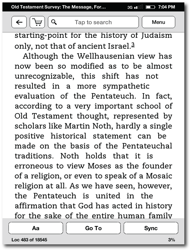
 Screenshot above: A basic view of the Kindle Touch's screen when reading a book.
If you're reading a book and want to access the Kindle's options, tap the top of the screen, which will result in this view:
 Screenshot above: page with interface displayed
For my purposes, the greatest advantage that the Kindle Touch brings relates to making personal notes on a book with greater ease. I had actually become pretty swift at taking notes on the Kindle 3's physical keyboard, but it was a pain to have to hit the symbols button to bring up a separate screen for any numbers or punctuation, and then remember to get out of the symbols screen before saving the note. I will still use my iPad or MacBook Air if I need to make extensive notes on a title, but the addition of a virtual keyboard is a great improvement overall for those of us who enjoy annotating what we read with our own thoughts.
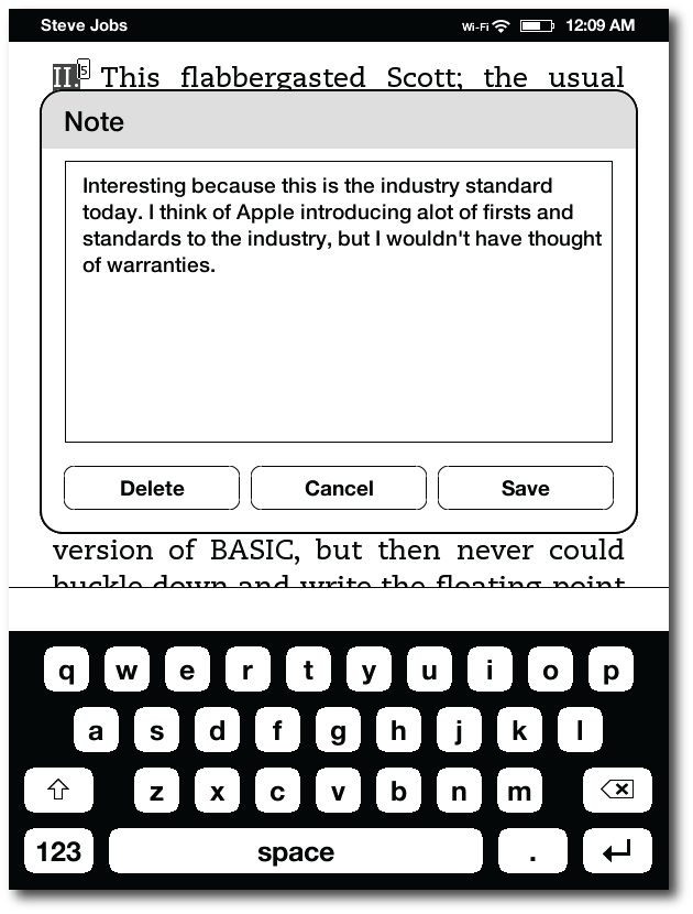 Screenshot above: editing a note with the virtual keyboard is much easier to do than with previous models. Unfortunately, there's still no spellchecker to catch the mistakes I made above.
I should also note that it is much easier to select text for highlighting or notetaking on the Kindle Touch than on the Nook Simple Touch, where it's quite frustrating, even after a software update a few weeks back. As neither device has a "true" sensor-based touchscreen (an infrared sensor tracks your finger movement on both), I assumed the awkward text selection on the Nook was merely a result of the infrared technology; however, selecting text on the Kindle Touch is quite easy and works as I would expect it to. Evidently, the problem on the Nook lies within its software.
Regarding the physical aspects of the Kindle Touch, like the other Kindles of this generation (i.e. the Kindle 4 and the Kindle Fire), I find that Amazon if finally making hardware that doesn't look like a device Apple would have made in the nineties. It is sleek and minimalist in design (perhaps too much so) with only two buttons: the home button under the screen (which doesn't look like a button) and the power button on the very bottom of the device.
Placing the power button on the bottom of the device is clearly a mistake. On previous Kindles, there was a slider that kept the device from accidentally being turned on and off. However, on both the Kindle Touch and the Kindle Fire, having a power button on the bottom makes it far too easy to turn the device off while using it. In fact, when attempting to take photographs of the Kindle Touch and the Kindle Fire for this review, I had to place a thick cloth under them because the sheer weight of the devices (which is not a lot—especially for the Touch) kept turning them on or off. And when the device is standing on end and the button is held down, it will actually reboot after a certain amount of time.
 Above: the Kindle Touch on the left and the Kindle Fire on the right.
I believe I will also miss the page advance and back buttons from my previous Kindle. As you can see in the picture at the very top of this review, I tend to hold the Kindle in such a way that to advance the page, I will now have to move my thumb or finger across the text to advance it. This causes a problem because I read fast enough that I'm used to hitting the page advance button as I'm on about the next to last line, allowing my eyes to see the remaining text while advancing to the next page. Now, I have to wait until I've read the bottom of the page to advance, which actually makes me read a bit slower. Ultimately, I imagine I'll just have to get used to turning a page differently, perhaps by touching a higher part of the screen.
In the other side of the fence, when B&N released the Nook Simple Touch earlier this year, they opted to keep the page back and advance buttons, thus making the Nook a bit wider than the newer Kindles, which is taller. Although a Nook Simple Touch can be advanced by touching the screen, too, after reading a few thousand pages on the device, I found myself preferring the buttons for the reason described in the paragraph above. I can appreciate Amazon's desire for minimalism, but they may have sacrificed functionality for the sake of clean design.
;) Above: the Kindle Touch on the left and the Nook Simple Touch on the right (page buttons and all!)
Above: the Kindle Touch on the left and the Nook Simple Touch on the right (page buttons and all!)
Also gone from the external shell of the Kindle Touch are the volume controls, which are now fully on screen. This, too, may be a loss of functionality for sake of design. With the Kindle 3, I could have my ereader in my pocket, listening to it via headphones; and if I needed to adjust the volume, I could do so simply by feel. Likewise, if I needed to pause it, I could hit the spacebar (the largest button on the keyboard). Now, I'll have to physically remove the device from my pocket and look at the screen to adjust the volume or pause text to speech or an audio recording.
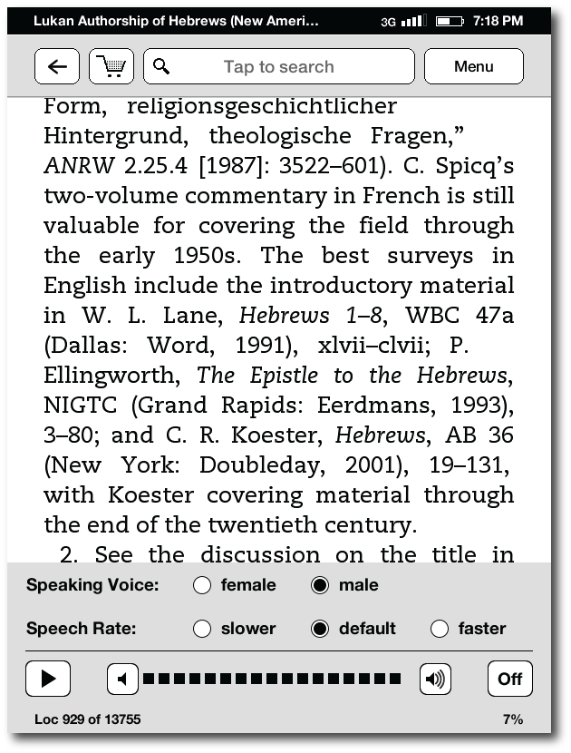 Screenshot above: text to speech controls (accessible from the menu button)
Of course, I've never understood why Amazon doesn't make all of their Kindles compatible with Apple's earbuds, which include volume and play/pause controls. The Kindle does not come with headphones of its own, but almost everyone has a pair or two of Apple's earbuds (love them or hate them) from all the iPods and iPhones sold over the years. This is what I use when listening to my Kindle (technically, I use the slightly more comfortable Apple in-ear headphones with controls and mic), but I've been shocked to discover that these do not work with the Kindle Touch—I could hear no sound at all through them—even though they worked fine on my Kindle 3. I've not taken the time to plug in a generic set of headphones (do I even have any?) to make certain that it's not a faulty sound jack, but if it's not, I do not look forward to having to carry around a second pair of headphones to accommodate the Kindle.
Not much needs to be said about the 3G capabilities of the Kindle that hasn't been written about elsewhere. My previous Kindle was wifi-only, but there were a number of instances over the past few months when I wanted to access a book either from my archives or purchase from the Amazon store; or I just wanted to share something I'd read on my Kindle via Twitter or Facebook, and I couldn't get online to do it. I've also found that in some public locations with wifi, certain login screens don't work with the Kindle browser, which is unfortunately still "experimental." So, I opted for the 3G version this time, and I'm very satisfied with my choice. I did not get the Kindle edition with special offers, but considering I'm not overly excited about the new batch of non-authorial sleep-mode images, I may turn that option on every now and then to see what specials Amazon is running.
There's a part of me that feels a twinge of guilt to think about devices such as this as a consumable product—to already be thinking about the next model. Yet, I believe the current Kindle Touch is going to be a transition device for Amazon, moving from an era of keyboard based E Ink ereaders to one that is solidly touchscreen based. I'm certain that Amazon will continue to make E Ink Kindles (with color E Ink as the next major step), and we'll see a successor to this Kindle Touch in a year or so. In that time, Amazon needs to rethink some of the flaws in the current implementation. Does this device really need to be so minimalist? Even the iPad has external, physical volume controls! Would it be so bad to have optional page navigation controls external to the screen as the Nook Simple Touch does?
Of course, what really needs the most work is the touchscreen interface. Maybe it's because I was so used to Kindle 3, but the Kindle Touch's interface is not only not as intuitive, it also seems to be less straightforward than the interface on the Nook Simple Touch. There's definitely some work to be done here, and no doubt Amazon will learn from their mistakes and correct the Kindle Touch's shortcomings in next year's release.
No, I'm not sending my Kindle Touch back as some have done. I assume I'll get used to the changes in the interface, and I'll have to train myself to somehow turn pages differently and not set the device down on a surface that will accidentally turn it off (my new lighted cover will take care of the latter). I have not had trouble with slow page turns as some have reported. When I briefly owned the Kindle DX, I realized that I was not going to be able to use it instead of my Kindle 3 because I lost functionality with it. I can't see where I've lost any functionality with the Kindle Touch with perhaps the exception of not being able to select text from one page to the next. However, this could easily be fixed by Amazon in software; and for right now, I've found that if I change the size of the text, it re-wraps the page allowing me to select the content that I need to.
I've also read complaints concerning how easy it is to lose one's place if the Kindle is laid face down in bed. Since the screen uses infrared tracking to note movement, anything can trigger a page turn, even wrinkles in a bedsheet. But this is not new to the Kindle Touch. I had the same issue months back with the Nook Simple Touch (but I don't remember hearing the same complaints so loudly). The solution is simple (no pun intended): like a lot of the differences with the device, you simply learn to change a few habits, including laying the Kindle Touch face down on the bed without turning it off first.
There is another Kindle out called unofficially the "Kindle 4" and officially just the "Kindle." Some have preferred it to the Kindle Touch because of the problematic issues with the latter I've described above. Unfortunately, the low end Kindle would never work for me because it does not have sound or a convenient method for adding notes—both of which I use regularly. So this Kindle Touch is a keeper for me in spite of its issues. However, if you are quite satisfied with an earlier Kindle, such as the Kindle 3/Keyboard, you might consider waiting another year before upgrading.
Since this review is running long, I'll save my thoughts of the new Kindle Touch Lighted Cover and Kindle Fire (which I have as a temporary loaner) for separate posts in the next few days.
As always, your questions, thoughts, comments, and rebuttals are welcome in the comments below.